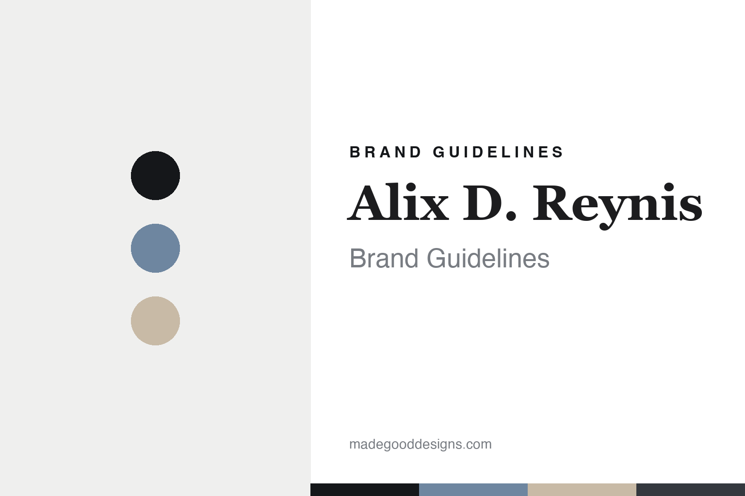
Alix D. Reynis Brand Guidelines
The fine porcelain.
Aa
Two constants: a powder-and-biscuit palette and a refined serif register. Abstract homage — not an Alix D. Reynis piece or wordmark.
The fine porcelain
Alix D. Reynis casts delicate, neoclassical porcelain in Limoges.
Alix D. Reynis is a lesson in delicate fine porcelain as the identity. A French house from Paris, it makes refined, neoclassical porcelain — white, moulded, delicate — in the Limoges tradition.
Its identity is the fine porcelain. Alix D. Reynis’s delicate white porcelain — tableware, vases and boxes with sculptural relief, plus cast-porcelain jewellery — is the work it is known for. Porcelain as refinement. The moulded detail, kept fine.
(Honest notes: Alix D. Reynis is a French porcelain house based in Paris, in Saint-Germain-des-Prés, founded by Alix Depondt-Reynis — note the name is a contracted wordmark, “Alix D. Reynis,” not “de Reynis” — a former notary who became a self-taught sculptor. It dates to 2011, when its first dinnerware appeared, having begun with cast-porcelain jewellery and small objects before that, so we date it to 2011 and flag the earlier jewellery start. Its signature is delicate white Limoges porcelain — neoclassical, refined, with sculptural relief and moulded detail across tableware, vases, boxes and lighting, alongside cast-porcelain and gold-vermeil jewellery, drawing on museum pieces and classical art. On production, the porcelain is made in Limoges, France — importantly, through artisan partner workshops there rather than a fully in-house factory, with jewellery hand-finished in her Paris workshop. It is independent and founder-led. Its moulded collections and jewellery designs are IP we describe but don’t reproduce. There’s no official brand hex — these tones are an unofficial interpretation. This is design commentary and does not promote any product.)
Colour
Alix D. Reynis lives in a powder-and-biscuit palette. Click a swatch to copy the hex.
Alix D. Reynis’s identity is delicate, neoclassical and refined — a powder, an ink, a biscuit, a graphite, and a porcelain white. The palette leans powder and biscuit — the register of pale, delicate porcelain and unglazed biscuit detail. It signals refinement and craft rather than novelty. The honest caveat: with no published brand hex, these tones are an original, unofficial interpretation, not first-party values.
The lesson is a powder-and-biscuit palette signals fine porcelain. Alix D. Reynis’s world is a delicate, neoclassical, refined object. For designers, it is a reminder that a material and a sensibility — fine white porcelain, moulded with classical detail — can be the whole identity, and that a pale, refined palette signals that delicacy. Because a mid powder can fail as small text, keep type dark and let the colour live in the accents, palette and band. The takeaways: refine the detail; keep it delicate; work with the makers; and treat any single hex as unofficial.
Typography
The register is a refined serif — delicate, classical, elegant.
Alix D. Reynis’s identity carries a delicate, classical, elegant spirit — a refined, moulded object. An elegant, high-contrast serif captures the mood: it is graceful and classical, the register of neoclassical porcelain. Set in a powder-and-biscuit palette, the refined serif feels delicate and classical — exactly the personality Alix D. Reynis carries. It is elegant rather than plain, mirroring a moulded porcelain piece. (Alix D. Reynis’s real collections and wordmark are works we describe but do not reproduce, and the exact typeface is not ours to use.) Because it is not ours to use, the honest description is “a refined serif spirit,” shown here in a stand-in. The type behaves like the brand: delicate, classical and elegant.
Aa
A refined serif spirit — delicate and classical. (Specimen set in Cormorant Garamond, an elegant serif STAND-IN; NOT the Alix D. Reynis wordmark.)
Delicate fine porcelain as identity
Alix D. Reynis stands for the fine porcelain.
Alix D. Reynis is a lesson in making a material and a sensibility the identity. A powder-and-biscuit palette, a refined serif and a moulded porcelain piece make delicate fine porcelain the whole brand — delicate, neoclassical, refined. The refinement is the differentiator. The differentiator is a sculptor’s eye applied to Limoges porcelain: fine white forms with classical, moulded relief, made through the region’s artisan workshops.
Put to work, the identity is a sensibility as design. A founder building in this spirit would bring one clear point of view — here, a sculptor’s neoclassical refinement — to a heritage material, and work with the craftspeople who know it best, so the pieces feel both personal and expertly made. The lesson Alix D. Reynis teaches is that a sensibility plus a heritage craft can build a brand: a distinctive delicacy, Limoges manufacture, and an elegant, classical design language give it an identity that reads as one designer’s hand. The refinement is the signature, and Limoges is the substance.
For designers and brand-builders, Alix D. Reynis offers a clear takeaway: bring a sensibility to a heritage material. The lessons: refine the detail; keep it delicate; work with expert makers; and be honest about the story. It is also a reminder to stay accurate: the name is a contracted wordmark, not “de Reynis,” it dates to 2011, and its porcelain is made through Limoges artisan workshops rather than a fully in-house factory — the palette here is an unofficial interpretation. And it is a reminder that made-where honesty matters: the porcelain is made in Limoges, France, which we state plainly. Alix D. Reynis made the fine porcelain the brand — proof that a sensibility can be the difference.
Explore & save
Keep Alix D. Reynis’s identity on hand — save it to a board in the Made Good inspiration library.
Alix D. Reynis identity set
Pin the powder-and-biscuit palette and the refined-serif register to your own board.