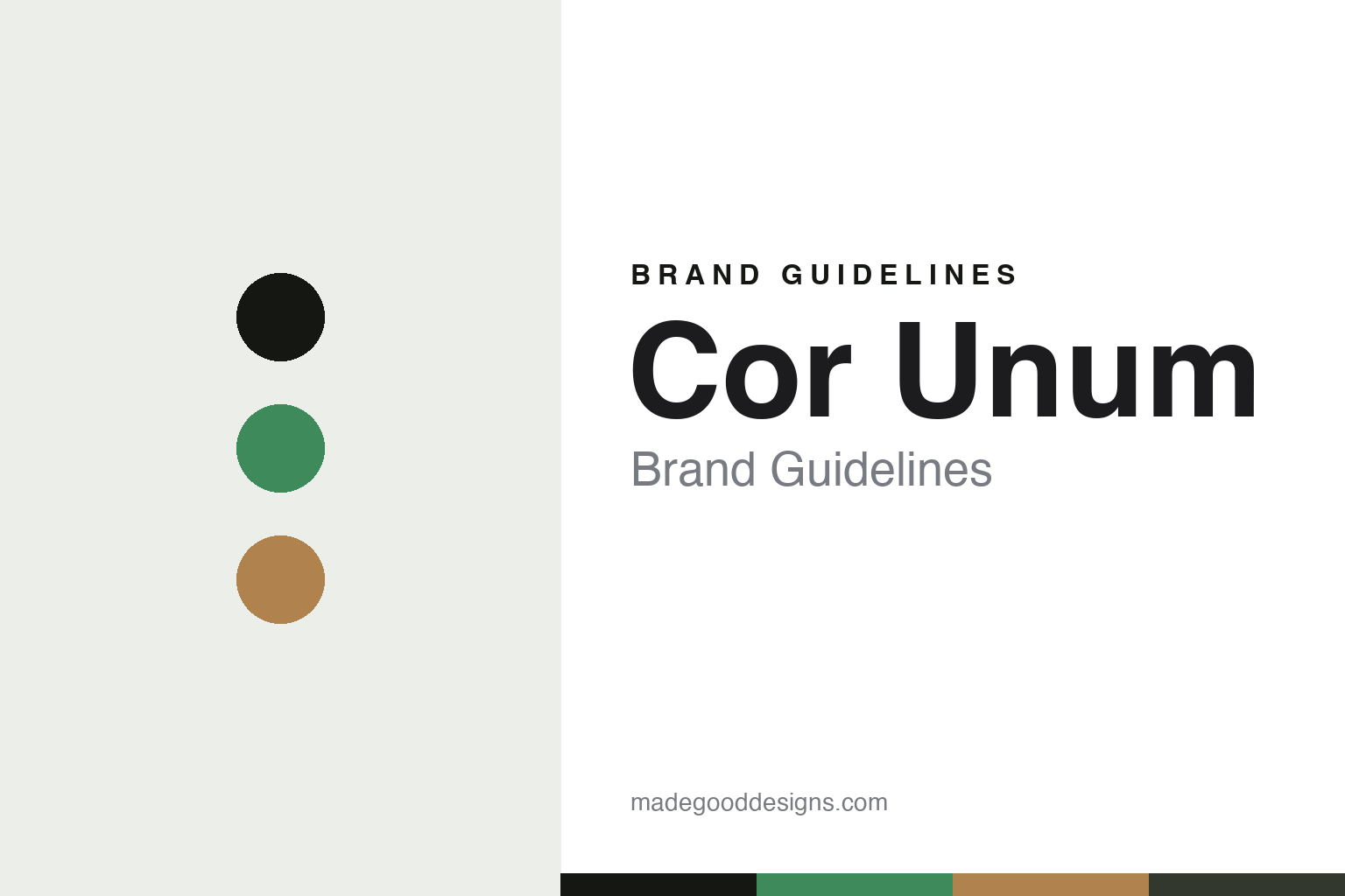
Cor Unum Brand Guidelines
The shared workshop.
Aa
Two constants: a green-and-clay palette and a structured sans register. Abstract homage — not a Cor Unum piece or wordmark.
The shared workshop
Cor Unum makes design ceramics — and a place to work for those who need one.
Cor Unum is a lesson in design and social purpose as one identity. A Dutch ceramics house in Den Bosch, it produces design ceramics with renowned designers while giving work to people who might otherwise struggle to find it.
Its identity is the shared workshop. Cor Unum’s ceramics — made with celebrated designers, produced by a mixed team — are the work it is known for. Clay as a shared purpose. Design and inclusion, in one place.
(Honest notes: Cor Unum is a Dutch ceramics production house in ’s-Hertogenbosch — Den Bosch — in North Brabant, founded in 1953 by the Roman Catholic Church as a sheltered workshop giving employment to people with disabilities. The ceramicist Zweitse Landsheer was artistic director from 1959 for around thirty years, turning it into a creative hub; it was privatised in 1998 and is now led by his daughter, Charlotte Landsheer — so we keep the 1953 founding, the 1959 direction and the 1998 privatisation distinct. Its signature is design plus social purpose — it co-creates and produces ceramics with renowned designers, from Ron Arad and Marc Newson to Marcel Wanders, Jasper Morrison and Konstantin Grcic, in collections like its Unica art line, while employing people with a distance to the labour market alongside students, professionals and volunteers. On production, it is genuinely made in-house in its Den Bosch workshop, using black- and white-fired clay techniques. On structure, it is a social enterprise, privatised and independent, though its exact legal form isn’t confirmed, so we don’t assert one. Crucially, the designers’ works are their own IP — so we describe Cor Unum as the production house and collaborator, and reproduce nothing. There’s no official brand hex — these tones are an unofficial interpretation. This is design commentary and does not promote any product.)
Colour
Cor Unum lives in a green-and-clay palette. Click a swatch to copy the hex.
Cor Unum’s identity is purposeful, human and crafted — a green, an ink, a clay, a graphite, and a chalk. The palette leans green and clay — the register of a living workshop and raw, worked clay. It signals purpose and craft rather than novelty. The honest caveat: with no published brand hex, these tones are an original, unofficial interpretation, not first-party values.
The lesson is a green-and-clay palette signals a shared workshop. Cor Unum’s world is a purposeful, human, crafted object. For designers, it is a reminder that a mission — making excellent design while giving people meaningful work — can be the whole identity, and that a natural, living palette signals that purpose. Because a mid green can fail as small text, keep type dark and let the colour live in the accents, palette and band. The takeaways: pair design with purpose; produce in-house; credit the designers; and treat any single hex as unofficial.
Typography
The register is a structured sans — clear, purposeful, modern.
Cor Unum’s identity carries a clear, purposeful, modern spirit — a human, crafted object. A structured, contemporary sans captures the mood: it is legible and steady, the register of a workshop with a mission. Set in a green-and-clay palette, the structured sans feels clear and purposeful — exactly the personality Cor Unum carries. It is purposeful rather than decorative, mirroring a collaboratively made piece. (Cor Unum’s real pieces, its designers’ works and the wordmark are things we describe but do not reproduce, and the exact typeface is not ours to use.) Because it is not ours to use, the honest description is “a structured sans spirit,” shown here in a stand-in. The type behaves like the brand: clear, purposeful and modern.
Aa
A structured sans spirit — clear and purposeful. (Specimen set in Archivo, a structured sans STAND-IN; NOT the Cor Unum wordmark.)
Design and social purpose as identity
Cor Unum stands for the shared workshop.
Cor Unum is a lesson in making purpose part of the identity. A green-and-clay palette, a structured sans and a collaboratively made piece make design-with-purpose the whole brand — purposeful, human, crafted. The purpose is the differentiator. The differentiator is a double mission: making excellent design ceramics with celebrated designers, and providing meaningful work to people who need it — both at once, in one workshop.
Put to work, the identity is purpose as design. A house building in this spirit would refuse to choose between quality and mission — collaborating with the best designers, keeping production in-house, and building a mixed team — so the social good and the design are inseparable. The lesson Cor Unum teaches is that purpose and craft can build a brand: world-class collaborations, in-house making, and a clear, purposeful design language give it an identity that is both admired and meaningful. The mission is the heart, and the design is the proof it need not compromise.
For designers and brand-builders, Cor Unum offers a clear takeaway: let purpose and quality reinforce each other. The lessons: pair design with purpose; produce in-house; credit the designers; and be honest about the story. It is also a reminder to stay accurate: it was founded in 1953, shaped by Zweitse Landsheer from 1959, and privatised in 1998, and the designers’ works are their own IP — the palette here is an unofficial interpretation. And it is a reminder that made-where honesty can be a genuine boast: Cor Unum makes in-house in Den Bosch, and that is worth stating plainly. Cor Unum made the shared workshop the brand — proof that purpose can be the difference.
Explore & save
Keep Cor Unum’s identity on hand — save it to a board in the Made Good inspiration library.
Cor Unum identity set
Pin the green-and-clay palette and the structured-sans register to your own board.