arteBA Brand Guidelines
The Buenos Aires art fair run by a non-profit since 1991.
Aa
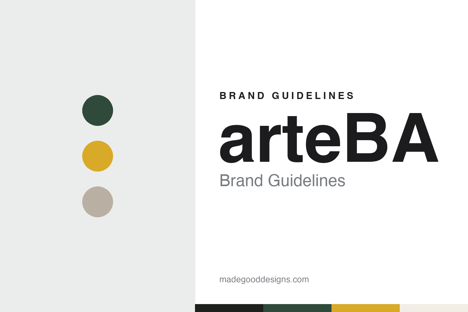
Two constants: a pampas green, pavilion yellow and Recoleta stone palette of our own and a lowercase geometric sans register. Abstract homage — not an arteBA asset; no logo, campaign image or artwork is reproduced.
A foundation, not a company
A non-profit body that has run a fair since 1991.
arteBA began in Buenos Aires in 1991. Its organiser, Fundación arteBA, describes itself as a non-governmental, non-profit organisation founded in the city on 16 October 1991, set up to encourage contemporary art production in Argentina and to bring more people to it by helping works of art circulate. Forbes Argentina reported on 30 October 2026 that the fair of 1991 was organised at the Centro Cultural Recoleta.
The founder’s role was marked at the 35th anniversary. Perfil reported on 16 October 2026 that the official presentation of that year’s edition, held on 14 October at the Museo Nacional de Bellas Artes, included a tribute to Jacobo Fiterman, whom the paper described as the founder of arteBA and the president of the institution during its first decade. Quoted in that report, Fiterman said that arteBA had kept to the principle of a non-profit foundation to which each person contributes for the good of Argentine art.
The structure is a non-profit one. An Artforum diary published on 5 June 2014 noted that, unlike most fairs, arteBA was operated as a non-profit directed by a board of trustees. The foundation’s own pages today describe a board of directors, a circle of former presidents and an international committee, whose members work for it on an unpaid basis, and say that its non-profit status lets it draw on public and private sponsorship.
The board is chaired by Larisa Andreani, named on the foundation’s website as its president. Speaking at the 2026 presentation, as Perfil reported, she said that a cultural institution stays alive when its history works as a starting point rather than a limit. The foundation also runs activities across the year, among them a club for new audiences that Andreani told Forbes Argentina had been set up about three years earlier, with visits to artists’ studios and galleries.
Colour
Committees, sections and a move between halls.
By the mid-2000s the fair had settled into a large exhibition ground. On 19 May 2005 Página/12 reported that the 14th edition of arteBA was opening at La Rural, the exhibition grounds in Palermo, with 57 galleries from Argentina, Brazil, Chile, Ecuador, Spain, the United States, Mexico, Uruguay and Venezuela. A committee of collectors, critics, gallerists and directors of art spaces assessed the galleries’ proposals in several stages, the paper said, and about thirty cultural institutions, dealers and specialist publications also took part.
The same report described the sections that sat around the main fair. A space called Barrio Joven, the “young neighbourhood,” gave 400 square metres to twelve projects, each “house” with its own look, from a recreated hotel room to a bus. A Matching Funds programme let national museums acquire works their collections lacked during the fair; that year the paper named the Caraffa museum in Córdoba, the Castagnino in Rosario and MAMBA and Malba in Buenos Aires. Round-table talks were held in an auditorium that could be reached from outside the fair.
Nine years later the format had widened. The Artforum diary of June 2014 described the 23rd arteBA, which opened in May that year at La Rural, with a main section of 45 galleries. The fair had once been limited to Argentine galleries, it said, and had extended its reach over the previous three years to attract dealers from abroad, with guest curators choosing artists for separate sections, each backed by a different corporate sponsor, among them “U-Turn Project Rooms by Mercedes-Benz” for international galleries. The diary named Julia Converti as the fair’s director at the time.
Venues have changed with the years. Infobae reported on 29 August 2025 that the 2025 fair was being held at Costa Salguero, and that it had two sections: the main section and Utopía, where newer and more experimental galleries and projects showed, fifteen of them that year.
The 2026 edition returned to La Rural. On 18 August 2026 the foundation announced the fair for that venue, and on 3 September it set the final dates as 30 October to 1 November 2026, with previews on 28 and 29 October, in the Pabellón Amarillo, the yellow pavilion. The foundation listed 70 galleries from ten countries; Perfil counted 69 galleries, work by more than 400 artists and a route of 11,000 square metres. The main section was chosen by an independent committee of five gallery directors and curators, and Utopia by a two-person team of an artist and an artist-curator.
A third area, the Zona de Diálogo Internacional, ran for a second year. Perfil named among its galleries Galeria Vermelho of São Paulo, Galerie Jocelyn Wolff of Paris, 3+1 Arte Contemporânea of Lisbon and Cecilia Brunson Projects of London, and said the section was accompanied by Mercedes-Benz. The foundation named Santander as the fair’s principal sponsor, host of the opening visit on 28 October, while a talks programme was held at the Museo Sívori and a guided route, “Asombroso,” was offered to children aged five to twelve.
Typography
How satellite, regional and newer art fairs build an identity.
Many newer art fairs choose their dates in one of two ways. Some open in the same week as a larger fair in the same city, so that collectors and curators who are already in town can walk from one to the other: VOLTA was founded in Basel in 2005 as an alternative fair during the week of Art Basel, and Paris Internationale runs in Paris each October alongside what is now Art Basel Paris. Others take a slot of their own in the calendar and build an audience around it, without a larger neighbour to draw on.
Either way, the name is what holds steady. The city, the building and the edition number change, while the wordmark carries over. VOLTA writes its name in capitals and adds the city, as in VOLTA Basel and VOLTA New York; Paris Internationale kept its Paris name when it held its first edition in Milan in 2026, adding only Milano. A short name travels easily from one city to another and from one building to the next.
Who takes part is decided before the doors open. Some fairs invite their exhibitors; others take applications and pass them to a selection committee, often made up of gallerists, which chooses galleries for the projects they propose as well as for their programmes. The resulting exhibitor list, with each gallery’s city, is published ahead of each edition, as both VOLTA and Paris Internationale do.
The visit itself is designed. Floor plans and maps tell visitors how to move through a hall, a tent or a building of several floors; signage, printed guides, websites and apps carry the exhibitor list, the sections and the programme of talks and tours. At a fair that changes buildings, the signage and stand walls may be reused from year to year, while the campaign image and the venue give each edition its own look.
Aa
A lowercase geometric sans for a fair that now writes its own name in small letters. (Specimen set in Sora, a sans STAND-IN; NOT the arteBA logo.)
arteBA
A name in small letters and a renewed look.
The name has two spellings in print. The press has written arteBA, as Página/12 did in 2005 and Forbes Argentina did in 2026, while the foundation’s website now sets it entirely in lowercase, as “arteba,” in its headings, its news items and its copyright line. In its preview of 26 October 2026, Perfil wrote that the fair was presenting a renewed visual identity intended to dispel solemnity.
In its closing note of 1 November 2026, the foundation said that the five days at La Rural, which it called the space that saw the fair grow, had drawn more than 41,000 people.
The pattern that runs from the 2005 report to the 2026 edition is one of committees and sections. Galleries apply and are selected by named panels; younger galleries and projects have had their own area, from Barrio Joven to Utopia; and international galleries have been brought in through a separate, sponsored zone rather than mixed into the main floor.
For a design guide, arteBA shows how a fair run by a foundation can keep a steady name across changing halls, from the Centro Cultural Recoleta to La Rural and Costa Salguero, while letting the way the name is written change. Compare SP–Arte, the art fair of São Paulo, and Zona Maco, another Latin American fair. For this guide we use a pampas green, a pavilion yellow and a Recoleta stone on plaster with a sans, an unofficial interpretation; no product or logo is reproduced.
Explore & save
Keep arteBA’s identity on hand — save it to a board in the Made Good inspiration library.
arteBA identity set
Pin the arteBA pampas green, pavilion yellow and Recoleta stone palette and the lowercase geometric sans register to your own board.
Source & notes
Frequently Asked Questions
What font can I use to match the arteBA look?
This guide describes arteBA’s type as “A lowercase geometric sans for a fair that now writes its own name in small letters”. Its type specimen is set in Sora from Google Fonts as a stand-in; Sora is not arteBA’s own lettering.
What colours are in the arteBA palette?
This guide’s arteBA palette is Pampas green #2F4A3A, Pavilion yellow #D9A928, Recoleta stone #B9AFA2, Plaster #F2EEE6 and Ink #1E201D. The tones are the guide’s own unofficial interpretation, not official arteBA hex codes.
When was arteBA founded?
arteBA was founded in 1991 (foundation 16 October 1991), in Buenos Aires, Argentina.