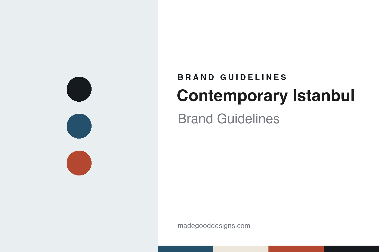
Contemporary Istanbul Brand Guidelines
The autumn fair founded in 2006 and now held at Tersane Istanbul.
Aa
Two constants: a Golden Horn blue, limestone and brick red palette and a wide grotesque register. Abstract homage — not a Contemporary Istanbul asset or mark; no logo, campaign image or artwork is reproduced.
A December fair that moved to September
How Contemporary Istanbul began in 2006.
Contemporary Istanbul opened its first edition in December 2006. An announcement the fair published through e-flux on 11 December 2006 gave the dates as 20 to 24 December, with an invitation-only vernissage on the first day, at the Istanbul Convention and Exhibition Center, and said that more than 65 galleries and art initiatives would take part. The same announcement named Deutsche Bank as a sponsor and set the second edition for September 2007, in the opening week of the 10th Istanbul Biennial. The gallery list printed with it included Galeri Nev Istanbul and Pi Artworks, two Istanbul galleries that The Art Newspaper still counted among the exhibitors in September 2026.
The fair’s founder is Ali Güreli, who chairs its board. The Art Newspaper has described him as founder and chairman in reports from 2024 to 2026. The Istanbul magazine ArtDog Istanbul, in a September 2025 feature on the fair’s twentieth year, named Rabia Bakıcı Güreli as vice chair of the board.
ArtDog Istanbul divided the fair’s history into stages. It described the first five years, from 2006 to 2011, as the period in which the fair set out to bring Istanbul to the attention of the international contemporary art scene. It credited the years up to 2014 with a section called Plugin, which presented digital art at the fair. Between 2015 and 2020, the magazine wrote, the fair spread beyond its exhibition halls into parks, streets and online platforms, including an online platform called Virtual CI.
Colour
Four autumn editions at Tersane Istanbul.
In recent years the fair has been held at Tersane Istanbul, which The Art Newspaper described in 2025 as a restored shipyard complex overlooking the Golden Horn. The Art Newspaper reported the 18th edition there in 2023, opening on 26 September and running until 1 October, with 67 galleries from 22 countries; the paper quoted the fair’s director at the time, Aslı Ünal. The 19th edition opened with a preview on 23 October 2024 and ran until 27 October, with 53 galleries from 14 countries and a special focus on galleries from Spain and Latin America. The 20th edition, in September 2025, brought together 51 galleries from 16 countries and coincided with the Istanbul Biennial, the paper reported.
The 21st edition ran from 23 to 27 September 2026. Before the opening, The Art Newspaper reported more than 70 galleries from 24 countries, with almost half of them based in Istanbul, including Zilberman. Its report after the fair counted around 70 exhibitors from more than 15 countries. The fair occupied a newly designated single-floor site at Tersane, a layout of 6,000 square metres with nine-metre ceilings spread across two adjacent halls, plus a separate space for its Dialogues talks programme. Güreli told the paper that there was a great advantage in having the entire fair on the same floor. Established Istanbul galleries, among them Dirimart, took large booths for group presentations, the paper reported.
Each edition is organised around sections and focus programmes. The New Ground section spotlights emerging galleries and artists, The Art Newspaper wrote in September 2026. After the Spanish and Latin American focus of 2024, ArtDog Istanbul described a Focus America programme created for the 2025 anniversary, and in 2026 the fair turned to Asia, with galleries from Hong Kong, Tokyo, Seoul, New Delhi and Singapore. In 2024 the fair also staged the fourth edition of The Yard, its public art programme, with nearly 20 artists. Ahead of the 2026 edition the fair introduced a partnership with Turkish Airlines to help exhibitors with the cost of shipping work, The Art Newspaper reported.
Typography
How satellite, regional and newer fairs build an identity.
Many newer art fairs choose their dates in one of two ways. Some open in the same week as a larger fair in the same city, so that collectors and curators who are already in town can walk from one to the other: VOLTA was founded in Basel in 2005 as an alternative fair during the week of Art Basel, and Paris Internationale runs in Paris each October alongside what is now Art Basel Paris. Others take a slot of their own in the calendar and build an audience around it, without a larger neighbour to draw on.
Either way, the name is what holds steady. The city, the building and the edition number change, while the wordmark carries over. VOLTA writes its name in capitals and adds the city, as in VOLTA Basel and VOLTA New York; Paris Internationale kept its Paris name when it held its first edition in Milan in 2026, adding only Milano. A short name travels easily from one city to another and from one building to the next.
Who takes part is decided before the doors open. Some fairs invite their exhibitors; others take applications and pass them to a selection committee, often made up of gallerists, which chooses galleries for the projects they propose as well as for their programmes. The resulting exhibitor list, with each gallery’s city, is published ahead of each edition, as both VOLTA and Paris Internationale do.
The visit itself is designed. Floor plans and maps tell visitors how to move through a hall, a tent or a building of several floors; signage, printed guides, websites and apps carry the exhibitor list, the sections and the programme of talks and tours. At a fair that changes buildings, the signage and stand walls may be reused from year to year, while the campaign image and the venue give each edition its own look.
Aa
A wide grotesque for a two-word, city-named title. (Specimen set in Archivo, a sans STAND-IN; NOT the Contemporary Istanbul logo.)
Contemporary Istanbul
Two words, two letters and a waterside venue.
The fair’s name joins a genre and a city in two English words, and it has stayed the same since the first announcement in 2006. In everyday use it shortens to two letters. The Art Newspaper writes CI in its reports, and the same initials run through the fair’s family of events: Virtual CI for the online edition, and CIF Dialogues for the talks programme of the Contemporary Istanbul Foundation, as ArtDog Istanbul listed them in 2025. A short set of initials of this kind lets one name carry a main fair, an online platform and a foundation without new branding each time.
The venue now shapes much of the visit. ArtDog Istanbul reported in 2025 that since the move to Tersane Istanbul the fair’s presentation techniques, architecture and overall visual identity had been undergoing significant changes. The 2026 layout put the whole fair on one floor across two halls, with talks in a separate space, a plan that The Art Newspaper described as giving a more seamless and spacious experience.
The calendar is the third constant. The announcement of the first, December edition already set the second for September, every edition from 2023 to 2026 was held in September or October, and in 2025 the fair’s dates coincided with the Istanbul Biennial, so that visitors to one event could see the other in the same week. Focus programmes change every year, from Spain and Latin America to America and then Asia, while the name, the initials and the autumn slot stay fixed.
For a design guide, Contemporary Istanbul shows how a two-word name and a pair of initials can hold together a main fair, an online platform and a talks programme. Compare Art Dubai and viennacontemporary, two other city-named fairs. For this guide we use a deep Golden Horn blue, a pale limestone and a brick-red accent with a sans, an unofficial interpretation; no product or logo is reproduced.
Explore & save
Keep Contemporary Istanbul’s identity on hand — save it to a board in the Made Good inspiration library.
Contemporary Istanbul identity set
Pin the Contemporary Istanbul Golden Horn blue, limestone and brick red palette and the wide grotesque register to your own board.
Source & notes
Frequently Asked Questions
What font can I use to match the Contemporary Istanbul look?
This guide describes Contemporary Istanbul’s type as “A wide grotesque for a two-word, city-named title”. Its type specimen is set in Archivo from Google Fonts as a stand-in; Archivo is not Contemporary Istanbul’s own lettering.
What colours are in the Contemporary Istanbul palette?
This guide’s Contemporary Istanbul palette is Golden Horn blue #24506B, Night ink #16191D, Limestone #EDE7DB, Brick red #B4472F and Brass #A58A4F. The tones are the guide’s own unofficial interpretation, not official Contemporary Istanbul hex codes.