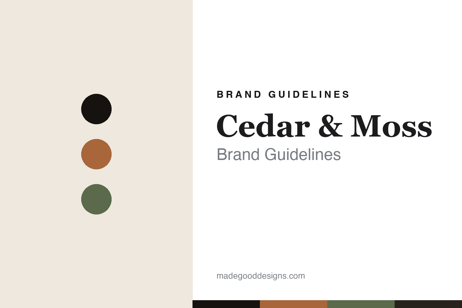
Cedar & Moss Brand Guidelines
Mid-century, made warm.
Aa
Two constants: a terracotta-and-moss palette and a warm serif register. Abstract homage — not a Cedar & Moss light or wordmark.
Mid-century, made warm
Cedar & Moss makes mid-century-influenced lighting, made to order in Portland, Oregon.
Cedar & Moss is a lesson in mid-century warmth as the identity. An American studio in Portland, Oregon, it makes mid-century-influenced lighting — sconces, pendants, flush mounts, chandeliers and table lamps — in ceramic, glass, metal, wood and linen, warm and minimal, made to order in the Pacific Northwest. Mid-century, made warm.
Its identity is mid-century, made warm. Cedar & Moss’ warm, minimal fixtures are the work it is known for. A period, made present. A studio with a soft, modern hand.
(Honest notes, so the story stays precise. Cedar & Moss was founded in 2013 by designer Michelle Aaro, after she couldn’t find the right lighting while renovating a mid-century home, and it is independent and founder-led. Its fixtures are designed and assembled to order in Portland, Oregon, from custom components made predominantly by US artisans and small businesses — with a few sourced internationally — so we don’t claim “100% American-made” or that its ceramic shades are thrown in-house. Its signature is warm, mid-century-influenced minimalism; its flagship “Aaro Lamp” is named after the founder, not a Scandinavian collaborator, and its collection names (Terra, Tumwater, Fjord and others) are its own. Anchor the name to the Portland lighting studio to avoid same-name confusion. Its fixtures and wordmark are its IP, described but never reproduced, and there is no official brand hex — these tones are an unofficial interpretation. This is design commentary and does not promote any product.)
Colour
Cedar & Moss lives in a terracotta-and-moss palette. Click a swatch to copy the hex.
Cedar & Moss’ identity is warm, natural and minimal — a terracotta, an ink, a moss, an ochre, and a cream. The palette leans terracotta and moss: the register of warm mid-century colour and natural material. It signals warmth and restraint over gloss. The honest caveat: with no published brand hex, these values are an original, unofficial interpretation, not first-party colours.
The lesson is a terracotta-and-moss palette signals a mid-century identity. Cedar & Moss’ world is a warm, natural, minimal object. For designers, it is a reminder that an earthy mid-century palette — terracotta, moss, ochre — can carry a brand built on warm minimalism. Because a mid terracotta can fail as small text, keep type dark and let the colour live in the accents, palette and band. The takeaways: build on a period warmly; keep the palette earthy; make to order; and treat any single hex as unofficial.
Typography
The register is a warm serif — soft, characterful, mid-century.
Cedar & Moss’ identity carries a soft, characterful, mid-century spirit — a warm object, not a cold one. A warm serif captures the mood: humane, gently retro and inviting, the register of mid-century-influenced lighting. Set in a terracotta-and-moss palette, the warm serif feels soft and characterful — exactly the personality Cedar & Moss carries. It is mid-century rather than clinical, mirroring a warm ceramic sconce. (Cedar & Moss’ real fixtures and wordmark are things we describe but do not reproduce, and the exact typeface is not ours to use.) Because it is not ours to use, the honest description is “a warm-serif spirit,” shown here in a stand-in. The type behaves like the brand: soft, characterful and mid-century.
Aa
A warm-serif spirit — soft and characterful. (Specimen set in Fraunces, a warm-serif STAND-IN; NOT the Cedar & Moss wordmark or any light design.)
Mid-century warmth as identity
Cedar & Moss stands for mid-century, made warm.
Cedar & Moss is a lesson in making mid-century warmth the identity. A terracotta-and-moss palette, a warm serif and warm, minimal fixtures make mid-century design the whole brand — warm, natural and made to order. The warmth is the differentiator. The differentiator is a genuine mid-century sensibility made by hand — lighting that feels of a period yet present, assembled to order rather than mass-produced.
Put to work, the identity is a period as design. A studio building in this spirit would draw on a real design era warmly and make to order, letting natural materials carry the mood, so the customer buys into warmth and craft rather than a trend. The lesson Cedar & Moss teaches is that a clear influence plus real making can build a brand: the mid-century roots give it warmth, and the made-to-order craft gives it substance. The period is the personality, and the warmth is the proof.
For designers and brand-builders, Cedar & Moss offers a clear takeaway: make an influence warm and real. The lessons: draw on a period; keep the palette earthy; make to order; and be honest about the story. It is also a reminder to stay accurate: Cedar & Moss is an independent, founder-led Portland studio (Michelle Aaro, founded 2013), designing and assembling to order in Oregon from predominantly US-made components — not “100% American-made” — with the palette here an unofficial interpretation. Cedar & Moss made mid-century warmth the brand — proof that a period can be the difference.
Explore & save
Keep Cedar & Moss’s identity on hand — save it to a board in the Made Good inspiration library.
Cedar & Moss identity set
Pin the terracotta-and-moss palette and the warm-serif register to your own board.