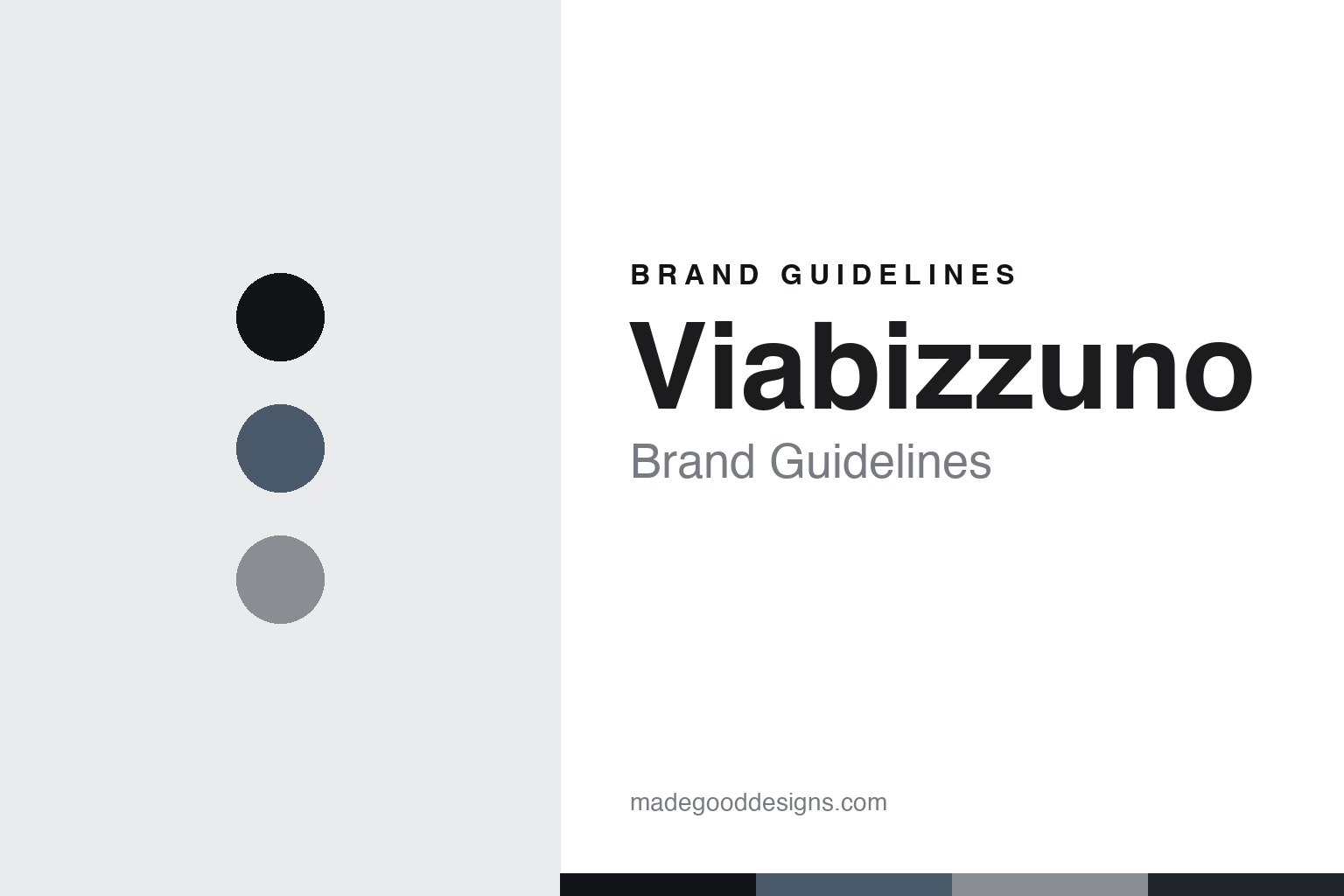
Viabizzuno Brand Guidelines
We design the light.
Aa
Two constants: a slate-and-silver palette and an architectural grotesque register. Abstract homage — not a Viabizzuno fixture or wordmark.
We design the light
Viabizzuno designs bespoke architectural lighting built into architecture itself.
Viabizzuno is a lesson in light as architecture as the identity. An Italian house near Bologna, it designs bespoke architectural lighting — light conceived with and into architecture rather than as decorative fixtures alone — with deep technical rigour, many patents, and a “culture of light” philosophy summed up as “we design the light.” Light, made architecture.
Its identity is we design the light. Viabizzuno’s integrated, engineered, architectural lighting is the work it is known for. A fixture, made architecture. A house that builds with light.
(Honest notes, so the story stays precise. Viabizzuno was founded in 1994 by Mario Nanni in Bentivoglio, near Bologna, and it is Italian-made from there — but the ownership story matters and is often told wrong: since January 2022 it has been majority-owned (around 82.6%) by Clessidra Private Equity, and Mario Nanni left the company in 2022 to focus on a separate foundation and lighting school, so it is now management-led, not founder-led, and we don’t write “Nanni’s Viabizzuno” in the present tense. Its signature is bespoke architectural, integrated lighting — including the n55 and n35 bulbs Nanni invented — and collaborations such as the Vals-named pieces tied to Peter Zumthor’s Therme Vals, which we describe without reproducing or implying endorsement. The name styles as one lowercase word, “viabizzuno,” after the locality via Bizzuno. Its fixtures and wordmark are its IP, described but never reproduced, and there is no official brand hex — these tones are an unofficial interpretation. This is design commentary and does not promote any product.)
Colour
Viabizzuno lives in a slate-and-silver palette. Click a swatch to copy the hex.
Viabizzuno’s identity is architectural, technical and restrained — a slate, an ink, a silver, a graphite, and a paper. The palette leans slate and silver: the register of architecture, precision engineering and controlled light. It signals rigour and integration over decoration. The honest caveat: with no published brand hex, these values are an original, unofficial interpretation, not first-party colours.
The lesson is a slate-and-silver palette signals an architectural identity. Viabizzuno’s world is an architectural, technical, restrained object. For designers, it is a reminder that a cool, monochrome palette can carry a brand built on light integrated into architecture. Because a mid slate can fail as small text, keep type dark and let the colour live in the accents, palette and band. The takeaways: integrate the light; keep the palette restrained; engineer it; and treat any single hex as unofficial.
Typography
The register is an architectural grotesque — precise, technical, exact.
Viabizzuno’s identity carries a precise, technical, exact spirit — an engineered object, not a decorative one. An architectural grotesque captures the mood: rational, modern and disciplined, the register of light designed like architecture. Set in a slate-and-silver palette, the architectural grotesque feels precise and technical — exactly the personality Viabizzuno carries. It is exact rather than ornate, mirroring integrated, engineered light. (Viabizzuno’s real fixtures, patents and wordmark are things we describe but do not reproduce, and the exact typeface is not ours to use.) Because it is not ours to use, the honest description is “an architectural-grotesque spirit,” shown here in a stand-in. The type behaves like the brand: precise, technical and exact.
Aa
An architectural-grotesque spirit — precise and technical. (Specimen set in Archivo, an architectural-grotesque STAND-IN; NOT the Viabizzuno wordmark or any fixture design.)
Light as architecture as identity
Viabizzuno stands for we design the light.
Viabizzuno is a lesson in making light-as-architecture the identity. A slate-and-silver palette, an architectural grotesque and bespoke, integrated lighting make architectural light the whole brand — technical, restrained and exact. The integration is the differentiator. The differentiator is treating light as architecture itself — engineered, patented, built into a space rather than hung within it.
Put to work, the identity is a philosophy as design. A house building in this spirit would treat light as a material of architecture and back it with real engineering, so the customer — often an architect — buys into an integrated system rather than a fixture. The lesson Viabizzuno teaches is that a clear philosophy plus deep technique can build a brand: the idea gives it coherence, and the patents give it substance. The philosophy is the personality, and the engineering is the proof.
For designers and brand-builders, Viabizzuno offers a clear takeaway: make light a material of architecture. The lessons: integrate rather than decorate; keep the palette restrained; engineer it seriously; and be honest about the story. It is also a reminder to stay accurate: Viabizzuno was founded in 1994 by Mario Nanni near Bologna, but since 2022 it has been majority-owned by Clessidra Private Equity and Nanni has departed — so it is management-led, not founder-led — Italian-made, with its Zumthor-linked pieces described but never reproduced, and the palette here an unofficial interpretation. Viabizzuno made “we design the light” the brand — proof that a philosophy can be the difference.
Explore & save
Keep Viabizzuno’s identity on hand — save it to a board in the Made Good inspiration library.
Viabizzuno identity set
Pin the slate-and-silver palette and the architectural-grotesque register to your own board.


