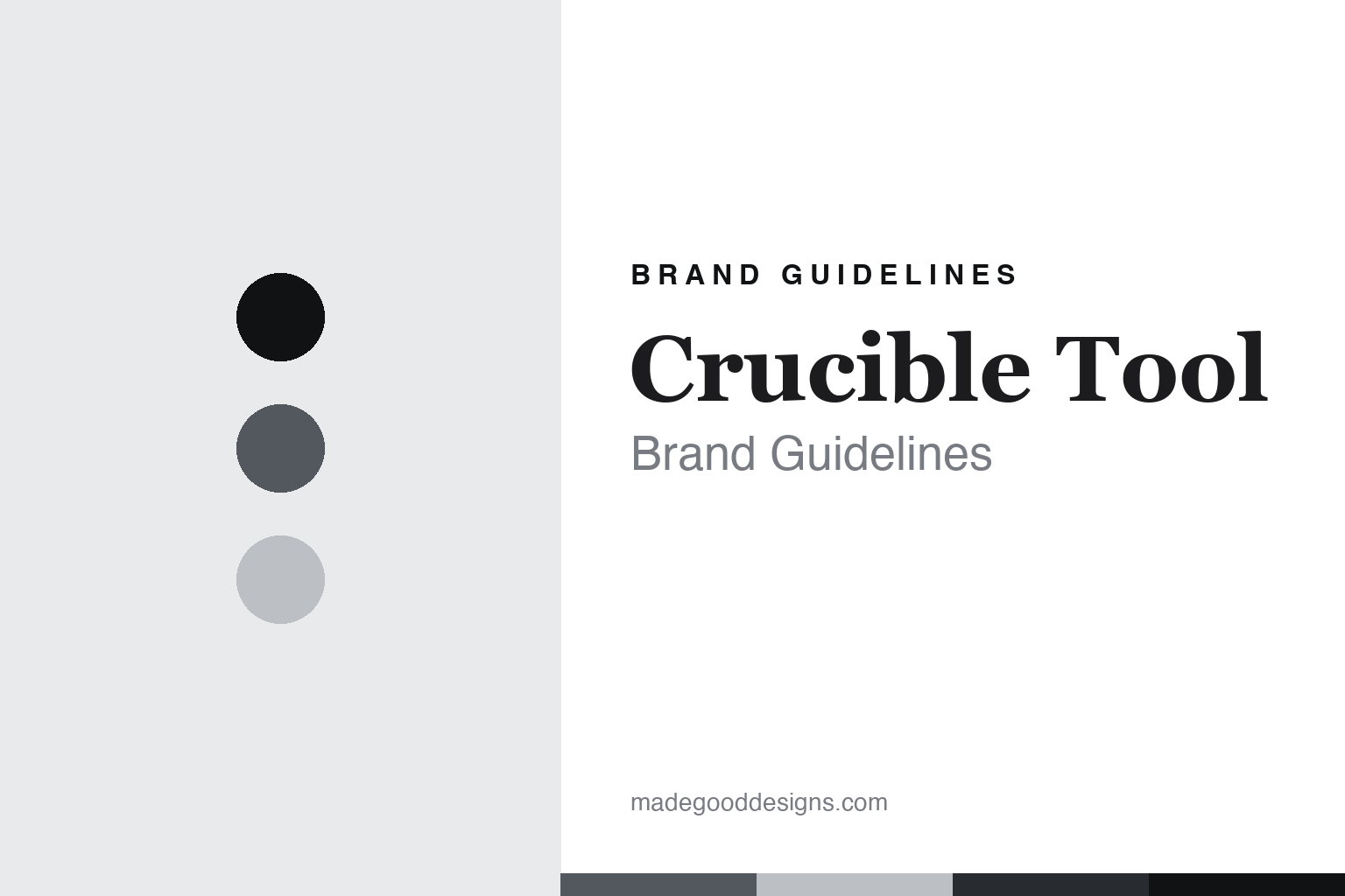
Crucible Tool Brand Guidelines
The woodworker-designed tool.
Aa
Two constants: a cast-iron palette and a woodworker-serif register. Abstract homage — not a Crucible tool or mark.
The woodworker-designed tool
Crucible Tool is the American maker of hand tools designed by woodworkers and made in the USA with named foundries and machinists, operated alongside Lost Art Press.
Crucible Tool closes the round — and the vein — with the most transparent where-made story of all. It makes a small, curated range of woodworking hand tools designed by woodworkers who use them daily: dividers, an iron holdfast, a sliding bevel, a lump hammer, a card scraper. Its answer to how a maker becomes a name is design plus honesty: design the tools yourself, make them in the USA, and name the foundry and the machine shop that make them. An American tool, made in the open.
Its identity is the woodworker-designed tool. Crucible’s designed-by-woodworkers tools, its US making and its named partners are the work it is known for. A divider, made in America. A tool that tells you who made it.
(Honest notes, so the story stays precise. Crucible Tool is operated alongside Lost Art Press, the woodworking publisher founded in 2007 by Christopher Schwarz and John Hoffman in Covington, Kentucky; Raney Nelson is reported as a Crucible co-founder, which we attribute, and Crucible launched in the mid-2010s, reported around 2016, which we present without a hard year. On where to buy it, Crucible now sells through the Lost Art Press store, with its former standalone site redirecting there. On what it makes, a small range — dividers, an iron holdfast, a sliding bevel, a lump hammer, a card scraper and a few more; we do not list a “design curve,” which is not in the current range. On where it is made — the capstone of this round — Crucible designs and finishes its tools and makes them in the USA with named partners: its dividers are CNC-machined by a Kentucky shop and assembled in Kentucky; its iron holdfast is cast in a family foundry in Illinois that has run for more than a century; its card scraper is made entirely in the United States from domestic materials. This is the honest opposite of a vague made-in claim — it names the makers. On ownership, its exact corporate relationship to Lost Art Press we could not pin down, so we say operated alongside it and treat the founders, well-known woodworking authors, with public-facts care. The card scraper’s design, credited to the Welsh chairmaker Chris Williams, we attribute. Its name and marks are IP, described but never reproduced, and there is no official brand hex; these tones are an unofficial interpretation. This is design commentary and does not promote any product.)
Colour
Crucible Tool lives in a cast-iron palette. Click a swatch to copy the hex.
Crucible’s identity is designed, American and honest — a cast iron, an ink, a pale steel, a deep iron, and a paper. The palette leans cast iron and steel: the register of a ductile-iron casting and machined steel. It signals tools designed and made in the open. The honest caveat: with no published brand hex, these values are an original, unofficial interpretation, not first-party colours.
The lesson is a cast-iron palette signals a designed, made-in-USA identity. Crucible’s world is a designed, iron-and-steel, American object. For designers, it is a reminder that a cool cast iron and a pale steel can carry a woodworker-designed toolmaker — the grey of a casting and the neutral of machined steel. Because these tones can fail as small text, keep type dark and let the colour live in the accents, palette and band. The takeaways: design what you use; make it at home; name your makers; and treat any single hex as unofficial.
Typography
The register is a woodworker serif — plain, considered, made.
Crucible’s identity carries a plain, considered, made spirit — a woodworker-designed toolmaker, not a marketing brand. A woodworker serif captures the mood: literate, careful and traditional, the register of a publisher-maker. Set in a cast-iron palette, the woodworker serif feels considered and made — exactly the personality Crucible carries. It is design and honesty rather than a logo, mirroring a pair of dividers. (Crucible’s real wordmark and the Lost Art Press mark are things we describe but do not reproduce, and the exact typeface is not ours to use.) Because it is not ours to use, the honest description is “a woodworker-serif spirit,” shown here in a stand-in. The type behaves like the maker: plain, considered and made.
Aa
A woodworker-serif spirit — considered and made. (Specimen set in Cormorant Garamond, a serif STAND-IN; NOT the Crucible or Lost Art Press logo.)
The new toolmakers
Crucible stands for the tool designed by woodworkers and made in the open.
Crucible Tool closes the round, and the vein, with its clearest idea: a tool that names its makers. A cast-iron palette, a woodworker serif and a pair of dividers make one thing — the woodworker-designed tool — the whole identity: designed, American and honest. The designed-by-woodworkers tools are the differentiator, and the named US partners are the meaning. The point is a small maker that designs the tools it uses at the bench, makes them in the USA, and tells you the foundry and the machine shop that make them.
Put to work, the identity is design and transparency, honestly told, as design. A maker in this spirit would design what it uses, make it at home, and name its makers — dividers, a holdfast, a card scraper, made in the USA with a named Illinois foundry and a Kentucky machine shop. A brand learning from it would see that transparency is a durable identity — that a tool whose casting and machining you can name earns a trust a vague made-in claim cannot — and that being precise, operated alongside Lost Art Press, launched in the mid-2010s, made in the USA with named partners, keeps the story honest. Crucible is the perfect close for a vein whose strongest spine has been where-made honesty. Across four rounds the tools ranged from all-in-country to mixed to murky to defunct; Crucible ends it at the most honest extreme, a maker that does not just say “made in the USA” but names exactly who casts and machines each tool. The honest editorial moves are to attribute the co-founder and the launch year, to say operated alongside Lost Art Press rather than guess the structure, and to drop the product not in the current range. The lesson Crucible teaches is that transparency can hold an identity: the US making gives it substance, and the naming of its makers is the substance made visible. The transparency is the personality, and the American-made divider is the proof.
For designers and brand-builders, Crucible closes the new toolmakers, from the United States: design what you use, and name who makes it. The lessons: design from the bench; make in-country; name your foundry and machinist; attribute what you cannot verify; and never reproduce a logo. It is also a reminder to stay precise: Crucible Tool is the American maker of hand tools designed by woodworkers and made in the USA with named foundries and machinists, operated alongside Lost Art Press — with the palette here an unofficial interpretation. Crucible made transparency the identity — proof that a woodworker-designed tool, honestly told, can be the difference.
Explore & save
Keep Crucible Tool’s identity on hand — save it to a board in the Made Good inspiration library.
Crucible Tool identity set
Pin the cast-iron palette and the woodworker-serif register to your own board.


