Hendrick ter Brugghen painted people lit from one side, close to the picture plane, against fields of near-darkness. Look at a single canvas and you can read the whole layout at once: a bright face, a pointing hand, a book or a flame, and a large area left empty. That clarity is why his work still teaches designers about hierarchy, contrast and restraint, more than four centuries after he began to work in Utrecht.
For public domain images from many cultures, browse the MGD museum inspiration collection.
Who was Hendrick ter Brugghen?
The Metropolitan Museum of Art, the Art Institute of Chicago and the Cleveland Museum of Art all give his dates as 1588 to 1629. The Met’s biographical line reads “The Hague? 1588–1629 Utrecht”, with a question mark over the birthplace. The Oberlin Allen Memorial Art Museum records that he grew up in Utrecht and spent most of his life there.
An early biographer, Joachim von Sandrart, writing in 1675, says he studied with the Utrecht painter Abraham Bloemaert. Oberlin’s account has him travelling to Italy as a teenager and staying mainly in Rome for close to ten years. The exact dates of that stay are less settled: the Dayton Art Institute points out that he would have been the only Utrecht Caravaggist to see Rome while Caravaggio was still alive, but only if he arrived early enough, and the evidence for the timing is thin.
By the mid-1610s he was back in Utrecht. The Leiden Collection and the National Gallery of Art in Washington place his entry into the city’s painters’ guild and his marriage, to Jacomijna Verbeeck, in 1616. He died in Utrecht in 1629, aged about forty-one. Britannica groups him with the Utrecht followers of Caravaggio, a circle that also included Gerrit van Honthorst and Dirck van Baburen. For the wider context of the Dutch art of his day, see our guides to Dutch Golden Age painting and Baroque art, and for the Italian source of his lighting, Caravaggio.
Key works you can date
Saint Jerome, about 1621 (Cleveland Museum of Art). An old man leans his head on one hand and points at an open book, with a skull beside it. The museum records a signature and date, “H TBrugghen 1621”, written upside down on the open book. The Cleveland catalogue notes that the museum long thought the sitter was the philosopher Heraclitus, because of his tears, but the book and skull identify Saint Jerome.
Roman Charity, 1622 (The Metropolitan Museum of Art). An oil on canvas measuring about 148 by 137.5 centimetres, acquired by the Met in 2020 with the Wrightsman Fund. The Met describes a daughter, Pero, who keeps her imprisoned father Cimon alive by nursing him in his cell. The museum catalogues it as 1622; the Dutch museum network CODART lists 1623. We discuss it in text only: the composition is a dark ground, a red cloth across the lower right and a pale lace sleeve, and the tenderness of the subject is carried by posture rather than detail.
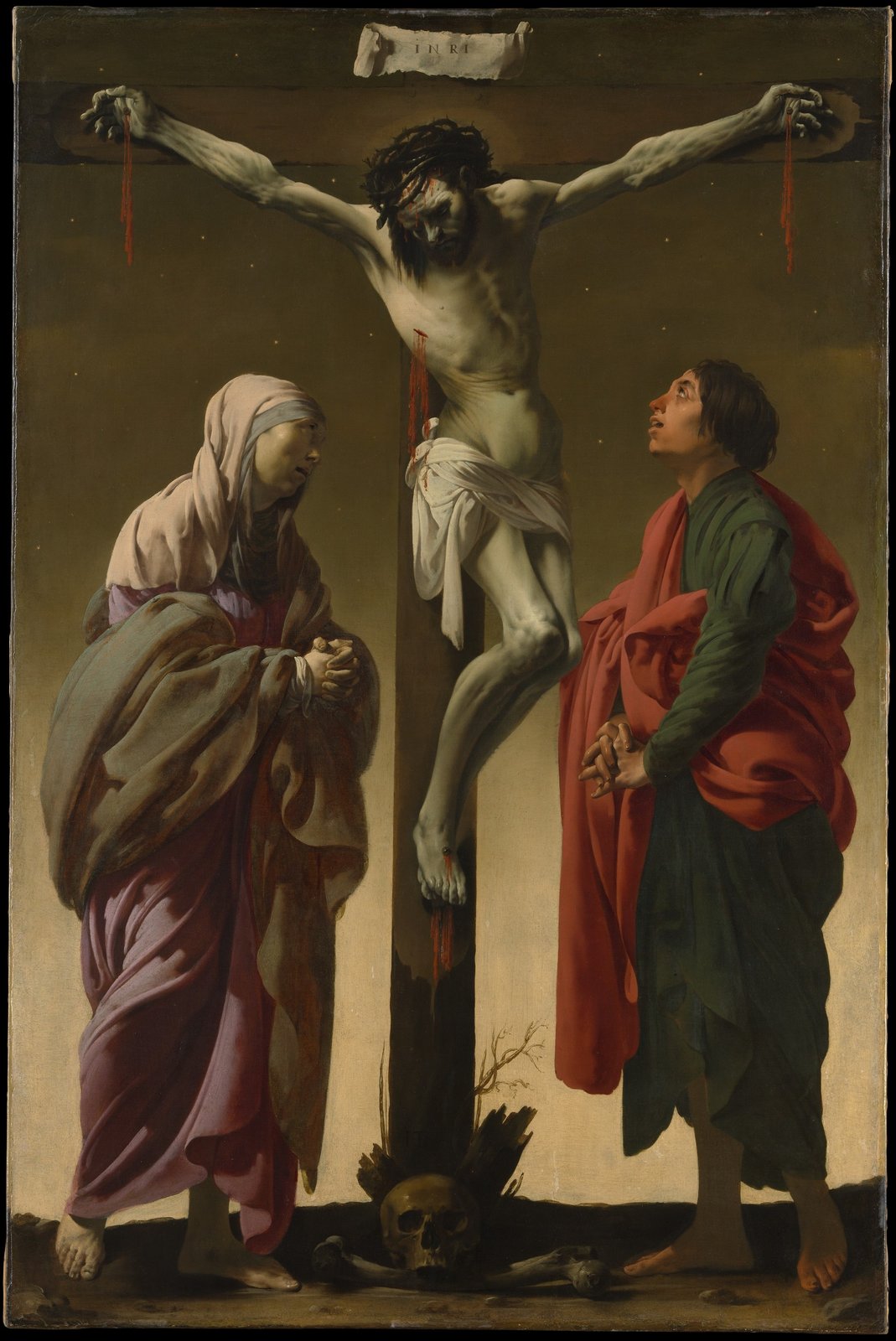
The Crucifixion with the Virgin and Saint John, about 1624–25 (The Metropolitan Museum of Art). A tall canvas, about 155 by 102 centimetres, bought for the Met in 1956 with funds from various donors.
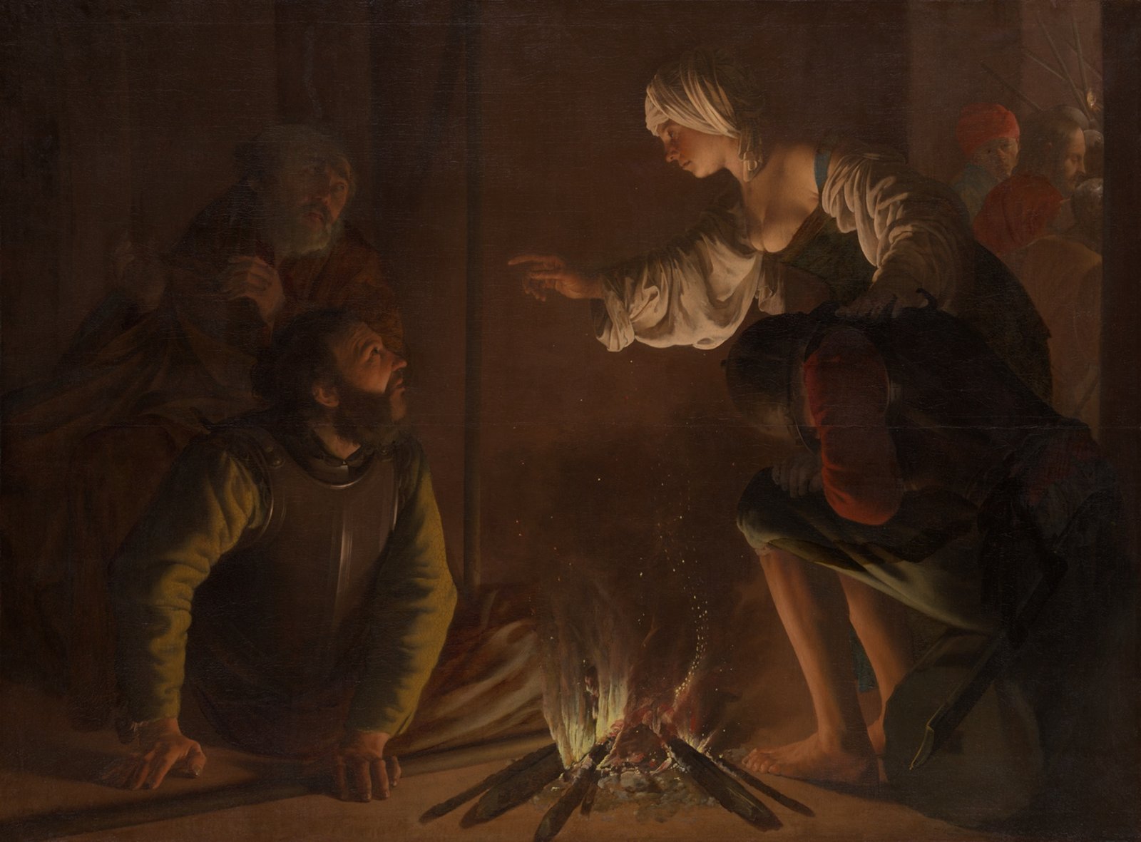
The Denial of Saint Peter, about 1626 (Art Institute of Chicago). A wide canvas of about 132 by 178 centimetres, lit by a small fire. The Art Institute’s provenance records it at Gaunø castle in Denmark by about 1750 and its purchase in 1969.
What to look at: light as a layout tool
The Art Institute’s own commentary says he took from Caravaggio the strong contrast of light and shadow and the emotional urgency, and that in The Denial of Saint Peter the sparks of the fire light up a servant’s accusing finger while leaving the frightened apostle in shadow. In the Chicago picture the brightest points are the flame, the servant’s sleeve and pointing hand, and the soldier’s breastplate. Everything else recedes. The eye travels from the flame to the finger to the faces in a diagonal route, and the narrative follows the same path.
The Met’s Crucifixion works differently. The light is even and pale, and the structure comes from the upright of the cross, which runs down the centre of the canvas and sets two flanking figures against each other. The Virgin on one side and Saint John on the other face inwards and balance each other, one in cool pink, grey and violet, the other in green and red. The ground behind them goes from olive-brown at the top to a pale, warm cream near the horizon, a gradient that gives the figures a stage without adding scenery.
Palette: a limited range with one hot note
The colours below were measured from the museums’ scans of these paintings, not from the original pigments, and will shift with each photograph and screen.
- Met Crucifixion: a dark olive-brown field around #42341C, a pale ground near the horizon around #B79B6C and a red-brown in the drapery around #803E25.
- Art Institute Denial of Saint Peter: deep shadow near #1E120C, with warmer, fire-lit browns around #623D20 and #956D47.
- Cleveland Saint Jerome: a dark ground near #24201B, with the skull and the sitter’s face around #684A2E and #A38866.
The pattern holds across the three. Most of the surface is a narrow range of dark, earthy neutrals, and one or two warm or saturated notes sit on top of them: a red mantle, a flame, a pale skull. Drop these values into the colour palette generator for a quiet but not flat scheme.
Line, gesture and lettering
Ter Brugghen builds his compositions on gestures that read as arrows. The servant’s hand in the Chicago painting, Jerome’s index finger in Cleveland and the folded hands of the two mourners in New York all point to where the story is. Little landscape or architecture competes with them.
Lettering appears only where it is needed. In the Met Crucifixion, a curled paper strip at the top of the cross carries the four letters INRI in small, evenly spaced capitals. In the Cleveland Saint Jerome, the signature is written upside down on the page of the open book, so it reads from the viewer’s side of the table and belongs to the scene rather than hovering over it. Both are useful models for designers: put type on an object inside the picture, keep it small, and give it a clear surface to sit on.
Technique
All the works above are oil on canvas, according to the Met, the Art Institute and the Cleveland Museum. In the museums’ photographs the drapery is handled in broad, simplified folds, and the shapes of the cloth are as important to the composition as the figures wearing it.

How designers can borrow his ideas today
- Pick one light source and commit to it. On a poster or hero image, decide where the brightest area is and let every other element sit below it in value. Fewer bright areas make a stronger hierarchy.
- Use dark as negative space. The empty dark fields in the Cleveland and New York paintings are the same thing as generous margins. Set a headline in the dark area, aligned to the edge of a lit shape.
- Limit the palette, then add one hot note. Build a layout from three to five near-neutrals, then add a single saturated colour for the call to action, as the red cloth does in Roman Charity. The vintage colour palettes guide offers more earthy schemes to start from.
- Point with gestures and diagonals. Photographs of hands, arrows made from edges, or a diagonal from a bright shape to the headline do the same job as the servant’s finger in the Denial.
- Contrast warm and cool. The cool flesh and olive ground against red drapery in the Crucifixion is a ready model for a two-temperature scheme.
For a comparison from the same Utrecht circle, see Gerard van Honthorst.
Frequently asked questions
Who was Hendrick ter Brugghen?
He was a Dutch painter, born in 1588 (probably in The Hague, according to the Met) and active mainly in Utrecht, where he died in 1629. He is counted among the Utrecht Caravaggisti, painters who took up Caravaggio’s dramatic light and realistic figures.
What is Hendrick ter Brugghen known for?
He is known for religious scenes, half-length figures and night scenes with strong light and shadow, such as The Denial of Saint Peter in Chicago and The Crucifixion with the Virgin and Saint John at the Met.
Where can I see Hendrick ter Brugghen paintings?
The Metropolitan Museum of Art holds Roman Charity and the Crucifixion, the Art Institute of Chicago holds The Denial of Saint Peter and the Cleveland Museum of Art holds Saint Jerome. Check each museum for current display.
Are Hendrick ter Brugghen’s paintings public domain?
He died in 1629, so his paintings are old enough to be in the public domain in the United States. The Met, the Art Institute of Chicago and the Cleveland Museum of Art flag the works pictured here as public domain or CC0 in their open-access data. Check each museum’s terms and each country’s rules before commercial reuse.