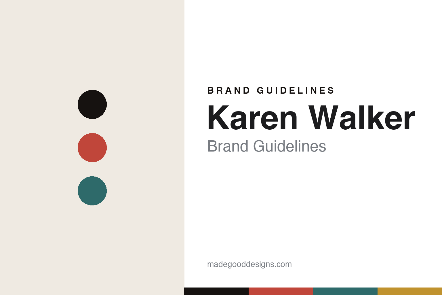
Karen Walker Brand Guidelines
The retro cat-eye.
Aa
Two constants: a retro-bold palette and a retro sans register. Abstract homage — not the Karen Walker frames, arrow motif or runaway-girl logo.
The retro cat-eye
Karen Walker made the cat-eye a signature.
Karen Walker Eyewear is a lesson in a fashion sensibility applied to eyewear. The eyewear line of the New Zealand designer Karen Walker, launched in 2005, brought a retro-modern fashion eye to sunglasses — most of all the cat-eye.
Its identity is the retro cat-eye. Karen Walker Eyewear makes sunglasses and optical frames in bold, retro-modern, oversized and cat-eye shapes — its “Number One” cat-eye an icon — as the eyewear arm of a broader independent fashion house. Fashion, in a frame. A cat-eye with attitude.
(Honest notes: this is the eyewear line of New Zealand fashion designer Karen Walker (who founded her Auckland label in the late 1980s), launched in 2005, with a first dedicated optical collection in 2019 — so it is a fashion designer’s eyewear line, not a standalone eyewear-only brand. Its signature is retro-modern, cat-eye and oversized shapes (the “Number One” cat-eye is iconic). On production, there is no official manufacturing statement we could confirm, so we don’t assert a country — designed in New Zealand, made where not officially confirmed. It is independent and founder-led (Karen Walker with her husband Mikhail Gherman); any eyewear licensing structure is unconfirmed. Its arrow motif and “runaway girl” logo are protected marks we describe but do not reproduce. There’s no official brand hex — these tones are an unofficial interpretation. This is design commentary and does not promote any product.)
Colour
Karen Walker lives in a retro-bold palette. Click a swatch to copy the hex.
Karen Walker’s identity is retro, bold and fashion-led — a coral, an ink, a teal, a mustard, and a cream. The palette leans retro bold — the register of retro-modern, oversized shapes. It signals fashion and personality rather than novelty. The honest caveat: with no published brand hex, these tones are an original, unofficial interpretation, not first-party values.
The lesson is a retro-bold palette signals a fashion eyewear line. Karen Walker’s world is a bold, characterful object. For designers, it is a reminder that a fashion house can extend into eyewear by carrying its sensibility — retro-modern shapes, a strong point of view — rather than just stamping a logo, and that owning a shape (the cat-eye) helps. Because a coral can fail as small text, keep type dark and let the colour live in the accents, palette and band. The takeaways: carry the fashion eye; own a shape; brand quietly; and treat any single hex as unofficial.
Typography
The register is a retro sans — bold, characterful, fashion-forward.
Karen Walker’s identity carries a bold, characterful, fashion-forward spirit — a retro-modern object. A distinctive display sans captures the mood: it is stylish and confident, the register of a fashion house. Set in a retro-bold palette, the retro sans feels bold and characterful — exactly the personality Karen Walker carries. It is fashion-forward rather than plain, mirroring a cat-eye. (Karen Walker’s real frames, arrow motif and runaway-girl logo are works we describe but do not reproduce, and the exact typeface is not ours to use.) Because it is not ours to use, the honest description is “a retro sans spirit,” shown here in a stand-in. The type behaves like the brand: bold, characterful and fashion-forward.
Aa
A retro sans spirit — bold and characterful. (Specimen set in Syne, a distinctive display sans STAND-IN; NOT the Karen Walker wordmark.)
A fashion eye applied to eyewear
Karen Walker stands for the retro cat-eye.
Karen Walker Eyewear is a lesson in extending a fashion sensibility into eyewear. A retro-bold palette, a retro sans and a cat-eye frame make a designer’s eye the whole line — retro, bold, fashion-led. The sensibility is the differentiator. The differentiator is a fashion house’s point of view carried faithfully into frames.
Put to work, the identity is a house voice extended, not a logo licensed. A designer building in this spirit would translate a fashion label’s aesthetic into eyewear on its own terms — distinctive shapes, a recognisable attitude, discreet branding (an arrow rather than a name on the temple) — so the eyewear feels like the label, not a bolt-on. The lesson Karen Walker teaches is that owning a shape is powerful: the “Number One” cat-eye became a signature people recognise, and a subtle motif in place of loud logos signals fashion confidence. Being honest that manufacturing isn’t disclosed keeps the focus where it belongs — on the design point of view.
For designers and brand-builders, Karen Walker offers a clear takeaway: extend the house voice, don’t just license it. The lessons: carry the fashion eye; own a shape; brand quietly; and be honest about the story. It is also a reminder to stay accurate: it is the eyewear line of NZ designer Karen Walker, launched in 2005, known for the retro cat-eye — and its manufacturing country is not officially confirmed, so the palette here is an unofficial interpretation. Karen Walker made the retro cat-eye the line — proof that a fashion eye can be the difference.
Explore & save
Keep Karen Walker’s identity on hand — save it to a board in the Made Good inspiration library.
Karen Walker Eyewear identity set
Pin the retro-bold palette and the retro-sans register to your own board.


