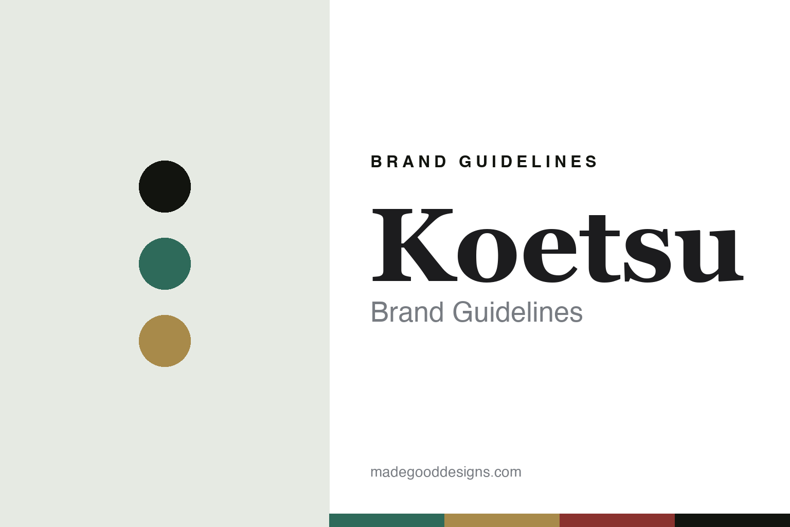
Koetsu Brand Guidelines
The jewelled cartridge.
Aa
Two constants: a jade-and-gold palette and a jewel serif register. Abstract homage — not a Koetsu cartridge or wordmark.
The jewelled cartridge
Koetsu hand-builds jewel-bodied phono cartridges in Japan — lacquered wood and semi-precious stone.
Koetsu is a lesson in a jewelled body as the identity. A Japanese maker of hand-built moving-coil phono cartridges, it is famous for bodies made of exotic materials — urushi lacquer over rosewood, and semi-precious stone such as jade, onyx and coralstone — turning a tiny transducer into a small jewel. Precision, made a treasure.
Its identity is the jewelled cartridge. Koetsu’s lacquered and stone-bodied cartridges, hand-built with hand-wound coils, are the work it is known for. A material, made a signature. A maker that treats a cartridge like a gem.
(Honest notes, so the story stays precise and respectful. Koetsu was founded by Yoshiaki Sugano, a former painter and swordsmith who named it after the Edo-period artist Hon’ami Kōetsu; he died in 2002, and his son Fumihiko, who had continued the craft, died in 2023. After that the workshop went quiet, and in 2025 the brand was resurrected — by Analog2Fidelity, which reassembled Koetsu’s original master artisans and suppliers — so we describe it as recently revived, hand-built by the original craftsmen rather than run by the family today, and we write both Suganos in the past tense. The cartridges are hand-built in Japan, with hand-wound copper coils and jewel-like lacquer or stone bodies. Its designs and name are its IP, described but never reproduced, and there is no official brand hex — these tones are an unofficial interpretation. This is design commentary and does not promote any product.)
Colour
Koetsu lives in a jade-and-gold palette. Click a swatch to copy the hex.
Koetsu’s identity is jewel-like, rich and artisanal — a jade, an ink, a gold, a lacquer red, and a rice cream. The palette leans jade and gold: the register of semi-precious stone and gilded lacquer. It signals craft and preciousness over restraint. The honest caveat: with no published brand hex, these values are an original, unofficial interpretation drawn from its jewelled materials, not first-party colours.
The lesson is a jade-and-gold palette signals a jewelled, artisanal identity. Koetsu’s world is a rich, jewel-like, hand-made object. For designers, it is a reminder that a palette of stone and gilt can carry a brand built on materials as treasure — the jade of a stone body and the gold of lacquer. Because these tones can fail as small text, keep type dark and let the colour live in the accents, palette and band. The takeaways: treat the object as a jewel; hand-build it; honour the craft; and treat any single hex as unofficial.
Typography
The register is a jewel serif — refined, ornate, precious.
Koetsu’s identity carries a refined, ornate, precious spirit — a jewel, not a component. A jewel serif captures the mood: elegant, high-contrast and a little ornate, the register of lacquered and stone-bodied craft. Set in a jade-and-gold palette, the jewel serif feels refined and precious — exactly the personality Koetsu carries. It is ornate rather than plain, mirroring a gem-like cartridge body. (Koetsu’s real cartridges and wordmark are things we describe but do not reproduce, and the exact typeface is not ours to use.) Because it is not ours to use, the honest description is “a jewel-serif spirit,” shown here in a stand-in. The type behaves like the maker: refined, ornate and precious.
Aa
A jewel-serif spirit — refined and precious. (Specimen set in Newsreader, a jewel-serif STAND-IN; NOT the Koetsu wordmark or any cartridge design.)
A jewelled body as identity
Koetsu stands for the jewelled cartridge.
Koetsu is a lesson in making a jewelled body the identity. A jade-and-gold palette, a jewel serif and lacquer- and stone-bodied cartridges make preciousness the whole maker — jewel-like, rich and artisanal. The material is the differentiator. The differentiator is a genuine, jewel-maker’s craft — a tiny transducer given a body of stone or gilded lacquer, hand-built and hand-wound.
Put to work, the identity is material as treasure. A maker building in this spirit would treat a functional object as a jewel, keep the hand-work rare, and be honest about who makes it now, so the customer buys into craft and preciousness rather than a spec. It would let the body — the stone, the lacquer — carry the brand, so that a cartridge is coveted as an object. The lesson Koetsu teaches is that a jewelled material craft can build a brand — and that such a brand can be carefully revived, when its makers carry the craft forward after its founders. The material is the personality, and the craft is the proof.
For designers and brand-builders, Koetsu offers a clear takeaway: make a material into a jewel. The lessons: treat it as a treasure; hand-build it; honour the makers; and be honest about the story. It is also a reminder to stay accurate: Koetsu was founded by the artist Yoshiaki Sugano, who died in 2002, and continued by his son Fumihiko, who died in 2023; after a pause it was resurrected in 2025 with its original artisans, hand-building jewel-bodied cartridges in Japan — with the palette here an unofficial interpretation. Koetsu made the jewelled cartridge the maker — proof that a material can be the difference.
Explore & save
Keep Koetsu’s identity on hand — save it to a board in the Made Good inspiration library.
Koetsu identity set
Pin the jade-and-gold palette and the jewel-serif register to your own board.