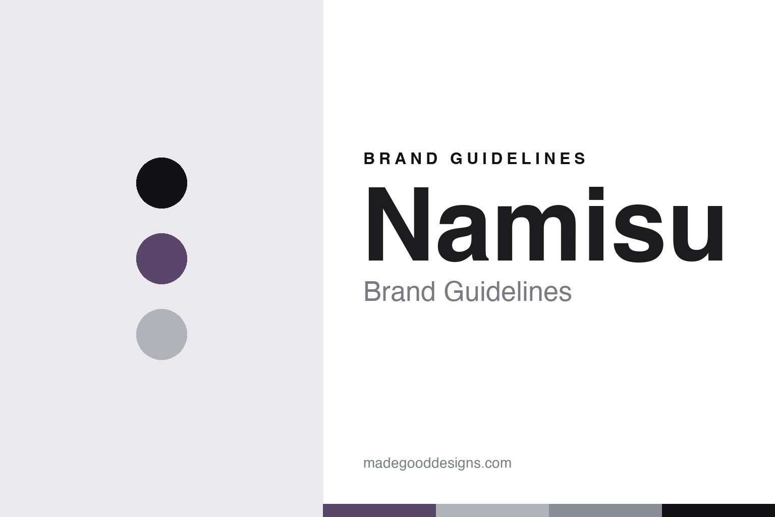
Namisu Brand Guidelines
The design studio.
Aa
Two constants: a titanium-violet palette and a minimal sans register. Abstract homage — not a Namisu pen or wordmark.
The design studio
Namisu is a Scottish design studio making minimalist, geometric machined pens.
Namisu is a lesson in a design studio as the identity. A small Scottish design studio, it makes minimalist, geometric fountain pens in titanium, aluminium and other materials — clean, unbranded, industrial-design forms, often launched on Kickstarter. A pen, reduced to its essentials.
Its identity is the design studio. Namisu’s minimalist, machined pens — the Nova, Orion and their kin — are the work it is known for. A design language, made a signature. A studio that designs the pen down to nothing extra.
(Honest notes, so the story stays precise. Namisu is a Scottish company, incorporated in 2013 and based in Kirkcaldy, in Fife — not Edinburgh or Dunfermline; it is described as a small group of designers, and while its directors are on record we do not name individuals the sources do not clearly identify. On where it is made we are careful: Namisu is unambiguously a design studio in Scotland, but it does not publicly disclose where its titanium and aluminium bodies are machined — a common pattern for Kickstarter-launched pens — so we describe it as designed in Scotland, with machining location undisclosed, rather than claiming it is made in the UK. Its nibs are German Bock units. Its designs are its IP, described but never reproduced, and there is no official brand hex — these tones are an unofficial interpretation. This is design commentary and does not promote any product.)
Colour
Namisu lives in a titanium-violet palette. Click a swatch to copy the hex.
Namisu’s identity is minimal, geometric and modern — a titanium violet, an ink, a silver, a slate, and a chalk. The palette leans titanium violet and silver: the register of a machined, minimalist pen. It signals reduction and design over ornament. The honest caveat: with no published brand hex, these values are an original, unofficial interpretation, not first-party colours.
The lesson is a titanium-violet palette signals a minimal, geometric identity. Namisu’s world is a machined, designed, reduced object. For designers, it is a reminder that a muted violet and a cool silver can carry a brand built on reduction — the violet of an anodised titanium and the silver of a bare machined body. Because these tones can fail as small text, keep type dark and let the colour live in the accents, palette and band. The takeaways: reduce the design; keep it geometric; be honest about making; and treat any single hex as unofficial.
Typography
The register is a minimal sans — clean, geometric, reduced.
Namisu’s identity carries a clean, geometric, reduced spirit — a designed object, not a decorated one. A minimal sans captures the mood: even, spare and modern, the register of a minimalist machined pen. Set in a titanium-violet palette, the minimal sans feels clean and geometric — exactly the personality Namisu carries. It is reduced rather than ornate, mirroring an unbranded, essential form. (Namisu’s real designs and wordmark are things we describe but do not reproduce, and the exact typeface is not ours to use.) Because it is not ours to use, the honest description is “a minimal-sans spirit,” shown here in a stand-in. The type behaves like the maker: clean, geometric and reduced.
Aa
A minimal-sans spirit — clean and geometric. (Specimen set in Manrope, a minimal-sans STAND-IN; NOT the Namisu wordmark or any pen design.)
A design studio as identity
Namisu stands for the design studio.
Namisu is a lesson in making a design studio the identity. A titanium-violet palette, a minimal sans and minimalist machined pens make a design language the whole maker — clean, geometric and modern. The studio is the differentiator. The differentiator is a genuine point of view — reducing the pen to its essential geometry, in fine materials, from a small Scottish design studio.
Put to work, the identity is a design studio as brand. A maker building in this spirit would lead with design and reduction, choose materials with care, and use crowdfunding to launch, so the customer buys into a design object rather than a heritage. It would let restraint be the signature. It would be honest that it is a design studio whose machining it does not disclose, rather than claim a country of manufacture. The lesson Namisu teaches is that a design studio can build a brand: the design gives it a voice, and the honesty about making keeps it credible. The studio is the personality, and the design is the proof.
For designers and brand-builders, Namisu offers a clear takeaway: lead with design, and be honest about making. The lessons: reduce the form; choose materials well; use crowdfunding; and don’t claim a country you can’t confirm. It is also a reminder to stay precise: Namisu is a small Scottish design studio, incorporated in 2013 in Kirkcaldy, making minimalist machined pens designed in Scotland with machining location undisclosed and German Bock nibs — with the palette here an unofficial interpretation. Namisu made the design studio the maker — proof that a design studio can be the difference.
Explore & save
Keep Namisu’s identity on hand — save it to a board in the Made Good inspiration library.
Namisu identity set
Pin the titanium-violet palette and the minimal-sans register to your own board.