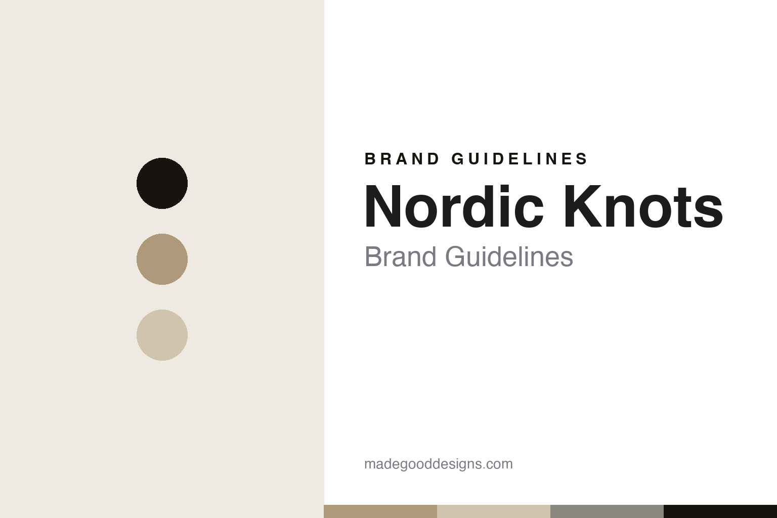
Nordic Knots Brand Guidelines
The minimal rug.
Aa
Two constants: an oat-and-sand palette and a minimal sans register. Abstract homage — not a Nordic Knots rug or wordmark.
The minimal rug
Nordic Knots designs minimalist rugs in Stockholm, hand-woven in India, with honest sourcing.
Nordic Knots is a lesson in restraint and transparency as the identity. A Swedish brand from Stockholm, it makes minimalist, restrained rugs — designed in Sweden and hand-woven by artisan weavers in India — and is unusually open about exactly where and how they are made. A rug, made quietly and honestly.
Its identity is the minimal rug. Nordic Knots’ restrained Scandinavian designs, and its transparent sourcing, are the work it is known for. A restraint, made a signature. A brand that names its weavers’ region.
(Honest notes, so the story stays precise. Nordic Knots was founded in 2016 in Stockholm by three siblings — Liza, Fabian and Felix Berglund. It designs in Stockholm and has its rugs hand-woven by artisans in Bhadohi, in India’s traditional rug region, from New Zealand wool. Its ethics are strong and verifiable: it is GoodWeave-certified, a certified B Corp, and runs regular independent audits — so we say “transparent, certified sourcing,” not vague claims. Its designs are deliberately minimal and sold largely direct. Its rugs and name are its IP, described but never reproduced, and there is no official brand hex — these tones are an unofficial interpretation. This is design commentary and does not promote any product.)
Colour
Nordic Knots lives in an oat-and-sand palette. Click a swatch to copy the hex.
Nordic Knots’ identity is minimal, warm and Scandinavian — an oat, an ink, a sand, a grey, and a chalk. The palette leans oat and sand: the register of a restrained, natural-wool neutral. It signals restraint and calm over show. The honest caveat: with no published brand hex, these values are an original, unofficial interpretation, not first-party colours.
The lesson is an oat-and-sand palette signals a minimal, Scandinavian identity. Nordic Knots’ world is a quiet, neutral, well-sourced object. For designers, it is a reminder that soft, natural neutrals can carry a brand built on restraint — the oat and sand of undyed wool. Because these tones can fail as small text, keep type dark and let the colour live in the accents, palette and band. The takeaways: design minimally; source transparently; certify it; and treat any single hex as unofficial.
Typography
The register is a minimal sans — clean, calm, restrained.
Nordic Knots’ identity carries a clean, calm, restrained spirit — a minimal object, not a busy one. A minimal sans captures the mood: even, spare and quiet, the register of a restrained Scandinavian rug. Set in an oat-and-sand palette, the minimal sans feels clean and calm — exactly the personality Nordic Knots carries. It is restrained rather than loud, mirroring a simple, well-made rug. (Nordic Knots’ real rugs and wordmark are things we describe but do not reproduce, and the exact typeface is not ours to use.) Because it is not ours to use, the honest description is “a minimal-sans spirit,” shown here in a stand-in. The type behaves like the maker: clean, calm and restrained.
Aa
A minimal-sans spirit — clean and calm. (Specimen set in Sora, a minimal-sans STAND-IN; NOT the Nordic Knots wordmark or any rug design.)
Transparency as identity
Nordic Knots stands for the minimal rug.
Nordic Knots is a lesson in making restraint and transparency the identity. An oat-and-sand palette, a minimal sans and minimalist rugs make quiet honesty the whole maker — clean, calm and Scandinavian. The transparency is the differentiator. The differentiator is a genuine openness — designing in Sweden, weaving in a named Indian region, and backing it with GoodWeave and B Corp certification.
Put to work, the identity is transparency as design. A maker building in this spirit would say plainly where its rugs are woven, certify the labour, and let restrained design do the talking, so the customer buys into honesty rather than mystery. It would treat certification as a promise rather than a badge, so that the ethics are real. It would keep the design minimal so that quality and sourcing, not pattern, are the story. The lesson Nordic Knots teaches is that transparency plus restraint can build a brand: the honesty gives it trust, and the certified Indian weaving gives it integrity. The transparency is the personality, and the honesty is the proof.
For designers and brand-builders, Nordic Knots offers a clear takeaway: be transparent and certify it. The lessons: design minimally; name the region; certify the labour; and be accurate about the story. It is also a reminder to stay precise: Nordic Knots is an independent Swedish brand founded in 2016 by the Berglund siblings, designing minimalist rugs hand-woven in Bhadohi, India, under GoodWeave and B Corp certification — with the palette here an unofficial interpretation. Nordic Knots made the minimal rug the maker — proof that transparency can be the difference.
Explore & save
Keep Nordic Knots’s identity on hand — save it to a board in the Made Good inspiration library.
Nordic Knots identity set
Pin the oat-and-sand palette and the minimal-sans register to your own board.