Ortofon Brand Guidelines
The correct sound.
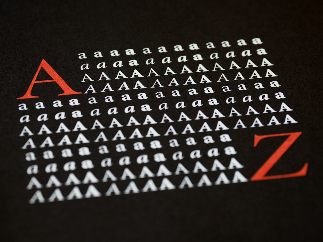
Aa
Two constants: a signal-red-and-steel palette and a modern sans register. Abstract homage — not an Ortofon cartridge or wordmark.
The correct sound
Ortofon hand-winds phono cartridges in Nakskov, Denmark — the name means “correct sound.”
Ortofon is a lesson in a specialism as the identity. A Danish maker in Nakskov, it builds phono cartridges — the tiny transducers at the tip of a tonearm — from its iconic integrated DJ cartridge to hand-wound high-end moving-coil designs. Its name, from the Greek, means “correct sound.” Precision, made very small.
Its identity is the correct sound. Ortofon’s cartridges — above all the instantly recognisable integrated Concorde shape — and its hand-wound coils are the work it is known for. A specialism, made a signature. A maker devoted to one small, exacting thing.
(Honest notes, so the story stays precise. Ortofon traces to 1918 in Copenhagen, when Axel Petersen and Arnold Poulsen began in sound-on-film; the cartridge company Ortofon A/S dates to 1947, and the name means “correct sound.” On ownership: it is a privately owned Danish company, taken over by private investors in 2004 — not employee- or foundation-owned, as is sometimes said. Everything is made in Denmark, in Nakskov, where its coils are hand-wound by specialist artisans and its high-end cartridges are hand-built and individually tested. Its famous integrated Concorde was designed by Jan Trägårdh and won a Danish industrial-design award in 1979, so we credit the designer rather than an unnamed studio. That Concorde silhouette is protected, iconic design, described here but never reproduced; there is no official brand hex, and these tones are an unofficial interpretation. This is design commentary and does not promote any product.)
Colour
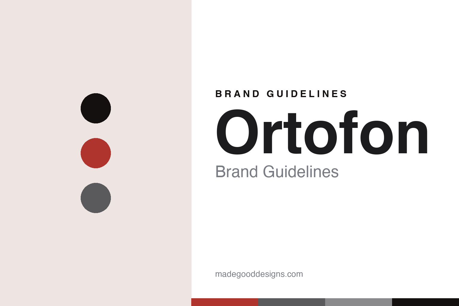
Ortofon lives in a signal-red-and-steel palette. Click a swatch to copy the hex.
Ortofon’s identity is precise, iconic and modern — a signal red, an ink, a steel, a silver, and a chalk. The palette leans signal red and steel: the register of a bold accent against precision metal. It signals precision and design over decoration. The honest caveat: with no published brand hex, these values are an original, unofficial interpretation, not first-party colours.
The lesson is a signal-red-and-steel palette signals a precise, iconic identity. Ortofon’s world is a precise, iconic, modern object. For designers, it is a reminder that a single bold accent against neutral metal can carry a brand built on one exacting specialism — the red of a recognisable object against the steel of precision. Because these tones can fail as small text, keep type dark and let the colour live in the accents, palette and band. The takeaways: master one thing; wind your own coils; own an iconic form; and treat any single hex as unofficial.
Typography
The register is a modern sans — clean, geometric, iconic.
Ortofon’s identity carries a clean, geometric, iconic spirit — a precise object, not a fussy one. A modern sans captures the mood: even, geometric and mid-century, the register of a classic industrial-design object. Set in a signal-red-and-steel palette, the modern sans feels clean and iconic — exactly the personality Ortofon carries. It is precise rather than ornamental, mirroring a small, exacting instrument. (Ortofon’s real cartridges and wordmark are things we describe but do not reproduce, and the exact typeface is not ours to use.) Because it is not ours to use, the honest description is “a modern-sans spirit,” shown here in a stand-in. The type behaves like the maker: clean, geometric and iconic.
Aa
A modern-sans spirit — clean and iconic. (Specimen set in Jost, a modern-sans STAND-IN; NOT the Ortofon wordmark or any cartridge design.)
A specialism as identity
Ortofon stands for the correct sound.
Ortofon is a lesson in making a specialism the identity. A signal-red-and-steel palette, a modern sans and hand-wound cartridges make one exacting craft the whole maker — precise, iconic and modern. The specialism is the differentiator. The differentiator is a genuine, deep focus — a century of making the tiny transducer at the end of a tonearm, with coils hand-wound in Denmark and one instantly recognisable design.
Put to work, the identity is focus as design. A maker building in this spirit would master one small, exacting thing, keep the delicate hand-work at home, and own a single iconic form, so the customer buys into precision and recognition rather than a range. It would let a legendary silhouette do the identifying, so that the object is known before the name is read. The lesson Ortofon teaches is that a deep specialism plus an iconic design can build a brand that lasts: the hand-winding gives it substance, and the form gives it fame. The focus is the personality, and the craft is the proof.
For designers and brand-builders, Ortofon offers a clear takeaway: master one thing and give it an iconic form. The lessons: focus deeply; wind your own coils; own a form; and be honest about the story. It is also a reminder to stay accurate: Ortofon is a privately owned Danish maker in Nakskov, hand-winding cartridge coils in Denmark, with a century of heritage and an integrated Concorde design by Jan Trägårdh from 1979 — with the palette here an unofficial interpretation. Ortofon made the correct sound the maker — proof that a specialism can be the difference.
Explore & save
Keep Ortofon’s identity on hand — save it to a board in the Made Good inspiration library.
Ortofon identity set
Pin the signal-red-and-steel palette and the modern-sans register to your own board.