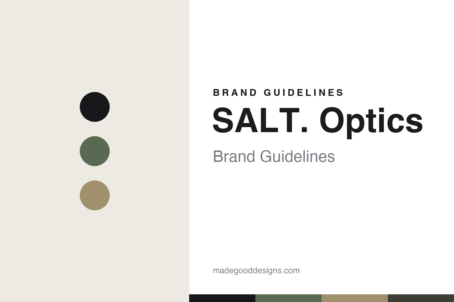
SALT. Optics Brand Guidelines
The understated frame.
Aa
Two constants: a muted-nature palette and a natural sans register. Abstract homage — not the SALT. frame or wordmark.
The understated frame
SALT. keeps its eyewear quiet and natural.
SALT. Optics is a lesson in understated, natural design as the identity. An American eyewear brand founded in 2006 in Costa Mesa, California, it makes quiet, premium frames in natural, muted tones.
Its identity is the understated frame. SALT.’s handcrafted Japanese acetate and titanium frames — in nature-inspired, muted palettes — are the work it is known for. Eyewear that whispers. California calm, Japanese craft.
(Honest notes: SALT. Optics is an American eyewear brand founded in 2006 in Costa Mesa, California, by David Rose and Taylor Whisenand (with partner Ron Smith), all from surf-brand backgrounds; it is celebrating its twentieth year in 2026. Its signature is understated premium eyewear — handcrafted custom Japanese acetate (from a century-old Japanese maker) and Japanese aerospace-grade titanium, with Japanese polarized lenses, in nature-inspired, muted, earthy palettes, across models like the Atomic and Pacific. On production, an important honesty point: it is designed in California and handcrafted in Japan, so we never claim it is US-made. On ownership, we correct a common assumption: it is independent and privately held, and we don’t assert an acquisition by an eyewear group, which we couldn’t verify. The name evokes a sea-air-land nature theme; we don’t assert an exact four-word acronym, which we couldn’t confirm. There’s no official brand hex, and we reproduce no frame or logo — these tones are an unofficial interpretation. This is design commentary and does not promote any product.)
Colour
SALT. Optics lives in a muted-nature palette. Click a swatch to copy the hex.
SALT.’s identity is understated, natural and calm — a sage, an ink, a sand, a slate, and an off-white. The palette leans muted nature — the register of earthy, sun-washed, natural tones. It signals restraint and quality rather than novelty. The honest caveat: with no published brand hex, these tones are an original, unofficial interpretation, not first-party values.
The lesson is a muted-nature palette signals understated design. SALT.’s world is a quiet, natural, premium object. For designers, it is a reminder that restraint — muted colour, natural materials, no loud branding — can be the whole identity, and that a muted-nature palette signals that calm. Because a sage can fail as small text, keep type dark and let the colour live in the accents, palette and band. The takeaways: keep it quiet; use natural materials; stay earthy; and treat any single hex as unofficial.
Typography
The register is a natural sans — clean, warm, understated.
SALT.’s identity carries a clean, warm, understated spirit — a quiet, natural object. A friendly humanist sans captures the mood: it is warm and current, the register of understated premium design. Set in a muted-nature palette, the natural sans feels clean and warm — exactly the personality SALT. carries. It is understated rather than loud, mirroring a quiet frame. (SALT.’s real frame and wordmark are works we describe but do not reproduce, and the exact typeface is not ours to use.) Because it is not ours to use, the honest description is “a natural sans spirit,” shown here in a stand-in. The type behaves like the brand: clean, warm and understated.
Aa
A natural sans spirit — clean and warm. (Specimen set in Figtree, a friendly humanist sans STAND-IN; NOT the SALT. wordmark.)
Understated, natural design as identity
SALT. Optics stands for the understated frame.
SALT. Optics is a lesson in designing quietly. A muted-nature palette, a natural sans and a restrained frame make understated design the whole brand — quiet, natural, premium. The restraint is the differentiator. The differentiator is what it leaves out — loud colour, visible branding — and what it keeps: natural materials and quiet quality.
Put to work, the identity is confidence in restraint. A designer building in this spirit would strip away the loud signals and let material and proportion speak, so the object reads as premium precisely because it is quiet. The lesson SALT. teaches is that understatement can be a position: muted, nature-inspired colour and fine Japanese materials give it a calm, confident identity, and a natural, warm design language keeps that restraint consistent.
For designers and brand-builders, SALT. offers a clear takeaway: let restraint be the statement. The lessons: keep it quiet; use natural materials; stay earthy; and be honest about the story. It is also a reminder that made-where honesty matters: SALT. is designed in California and handcrafted in Japan, so we never call it US-made — the palette here is an unofficial interpretation. And it is a reminder to correct assumptions: it is independent and privately held, not part of a group, so we don’t assert an acquisition. It is a reminder, too, that restraint has to be total to read as restraint: a muted palette only works when the materials, the finishing and the fit are quietly excellent, because there is no loud branding to distract from a flaw — understatement raises the bar on everything underneath it. SALT. Optics made the understated frame the brand — proof that quiet design can be the difference.
Explore & save
Keep SALT. Optics’s identity on hand — save it to a board in the Made Good inspiration library.
SALT. Optics identity set
Pin the muted-nature palette and the natural-sans register to your own board.