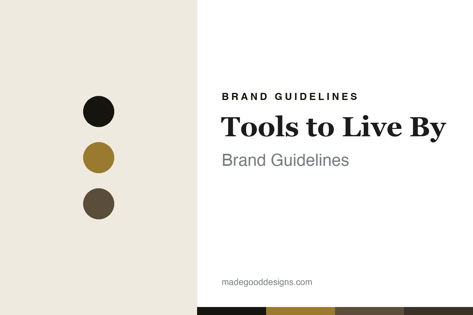
Tools to Live By Brand Guidelines
The scissors.
Aa
Two constants: a gold-and-black palette and a classic serif register. Abstract homage — not the Tools to Live By scissors or wordmark.
The scissors
Tools to Live By makes the desk tool a vintage object.
Tools to Live By is a lesson in vintage-premium desk tools as the identity. A Taiwanese brand founded in 2013 in Taipei, it makes classic desk tools — its gold scissors the signature.
Its identity is the scissors. Tools to Live By’s scissors — in gold and matte black, on Japanese-steel blades — are the object it is known for, alongside a letter opener, a pencil sharpener, rulers, tape dispensers and brass clips. A tool worthy of display. The desk, made timeless.
(Honest notes: Tools to Live By — styled “TOOLS to LIVEBY,” one word “Liveby” — is a Taiwanese premium desk-tools brand founded in 2013 in Taipei (with a Kaohsiung boutique too) by Karen Yang, a former graphic designer, with her husband Marco Tsai; it began as a curated stationery boutique and launched its own line. Its signature is the scissors — in gold and matte black, with Japanese-stainless-steel blades (the black version Teflon-coated), brass and rubber handles — alongside a letter opener, a pencil sharpener, rulers, tape dispensers and brass clips. On materials, note it is Japanese-steel blades with brass accents, not brass-everything. On production, it is made in Taiwan, per the brand. It is independent and founder-led. Because “tools to live by” is a generic phrase, we anchor to Karen Yang’s 2013 Taiwanese brand. There’s no official brand hex — these tones are an unofficial interpretation. This is design commentary and does not promote any product.)
Colour
Tools to Live By lives in a gold-and-black palette. Click a swatch to copy the hex.
Tools to Live By’s identity is vintage, warm and premium — a gold, an ink, a brass, a bronze, and a cream. The palette leans gold and black — the register of gilded metal, matte black and warm brass. It signals timelessness and craft rather than novelty. The honest caveat: with no published brand hex, these tones are an original, unofficial interpretation, not first-party values.
The lesson is a gold-and-black palette signals vintage-premium tools. Tools to Live By’s world is a warm, gilded, classic object. For designers, it is a reminder that an everyday tool — a pair of scissors — can be made worthy of display through finish and material, and that a gold-and-black palette signals that premium intent. Because a gold can fail as small text, keep type dark and let the colour live in the accents, palette and band. The takeaways: elevate the everyday; gild it warmly; keep it classic; and treat any single hex as unofficial.
Typography
The register is a classic serif — elegant, timeless, warm.
Tools to Live By’s identity carries an elegant, timeless, warm spirit — a vintage, gilded object. A classic high-contrast serif captures the mood: it is refined and traditional, the register of vintage-premium goods. Set in a gold-and-black palette, the classic serif feels elegant and timeless — exactly the personality Tools to Live By carries. It is warm rather than modern, mirroring gilded tools. (Tools to Live By’s real scissors and wordmark are works we describe but do not reproduce, and the exact typeface is not ours to use.) Because it is not ours to use, the honest description is “a classic serif spirit,” shown here in a stand-in. The type behaves like the brand: elegant, timeless and warm.
Aa
A classic serif spirit — elegant and timeless. (Specimen set in Playfair Display, a classic high-contrast serif STAND-IN; NOT the Tools to Live By wordmark.)
Vintage-premium desk tools as identity
Tools to Live By stands for the scissors.
Tools to Live By is a lesson in elevating the everyday tool. A gold-and-black palette, a classic serif and a pair of gilded scissors make vintage-premium tools the whole brand — elegant, warm, timeless. The elevation is the differentiator. The differentiator is taking an ordinary desk tool — scissors — and finishing it in gold on Japanese steel until it earns display.
Put to work, the identity is craft applied to the ordinary. A designer building in this spirit would take the most everyday tools and give them premium materials and finishes, so a pair of scissors or a sharpener becomes an object you’d keep out on the desk. The lesson Tools to Live By teaches is that finish and material can transform a category: gilding a simple tool on quality steel gives the brand a distinctive, collectible feel, and a warm, classic design language keeps that premium tone consistent.
For designers and brand-builders, Tools to Live By offers a clear takeaway: make the everyday tool worthy of display. The lessons: elevate the everyday; gild it warmly; keep it classic; and be honest about the story. It is also a reminder to stay accurate — and to be precise about materials: the scissors use Japanese-steel blades with brass accents, not brass throughout — the palette here is an unofficial interpretation. And it is a reminder that made-where claims should be attributed: the brand states its tools are made in Taiwan, so we say so as its claim. It is a reminder, too, that a generic name needs anchoring: “tools to live by” is a common phrase, so we tie it to Karen Yang’s 2013 Taipei brand. Tools to Live By made the scissors the brand — proof that elevating the everyday can be the difference.
Explore & save
Keep Tools to Live By’s identity on hand — save it to a board in the Made Good inspiration library.
Tools to Live By identity set
Pin the gold-and-black palette and the classic-serif register to your own board.