Trade Show Booth Design: Stand Out on the Floor
Trade show booth design has to win a battle for attention measured in seconds — a visitor walking the aisle decides whether to slow down before they consciously read a word. The booths that succeed look clear and inviting from 30 feet away, communicate one message instantly, and only reveal detail as people get closer. This guide covers the graphic and spatial decisions that turn a booth into a traffic magnet.
A booth is environmental design under time pressure; for the underlying legibility and material fundamentals, start with our complete signage design guide, then apply the trade-show-specific tactics below.
The 3-second rule
Assume a passerby gives your booth about three seconds. In that window they should grasp who you are and what you offer. That means one dominant headline — a benefit, not a tagline riddle — set large and high, plus your logo. Everything else is secondary. If your main message requires reading a paragraph, you’ve already lost the aisle.
Design for distance: the three viewing zones
Effective booth graphics work at three distances simultaneously. Plan content for each:
| Zone | Distance | Content |
|---|---|---|
| Attraction | 20–30+ ft | Logo + one big benefit headline, mounted high |
| Engagement | 8–15 ft | Supporting message, key visuals, product imagery |
| Conversation | 0–6 ft | Details, specs, demos, literature, staff |
Mount the attraction-zone headline high — the lower part of your booth wall gets blocked by people and furniture, so the readable real estate is above roughly five feet. Apply the cap-height rule from signage: about an inch of letter height per 25 feet of viewing distance, so a headline read from 30 feet wants letters in the 12-inch range.
Keep the graphics ruthlessly simple
- One headline, big. Resist the urge to list every product.
- High contrast, bold color. Your booth competes with hundreds of others — muddy mid-tones recede.
- Legible type. Use clean, open sans-serifs like DIN or Frutiger that hold up at distance; avoid thin weights and decorative fonts for primary messaging.
- Generous whitespace. Empty space draws the eye to what matters; clutter repels.
- On-brand throughout. Colors, type, and logo must match the rest of your identity — consistency signals credibility.
Layout and flow
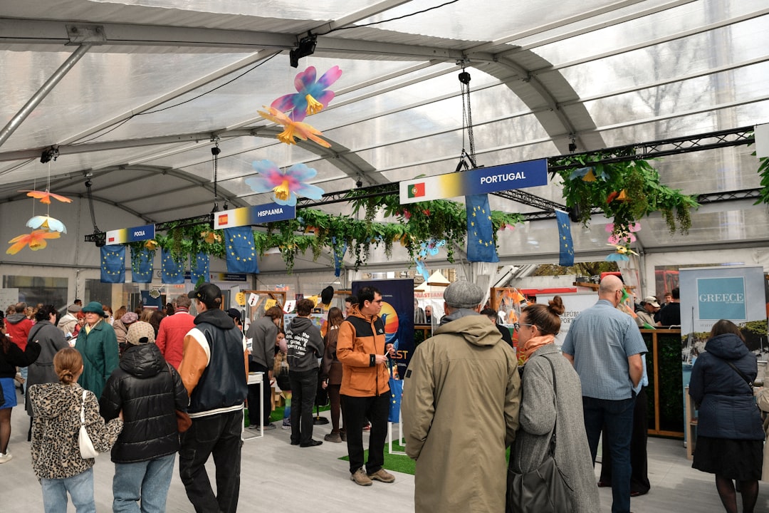
The physical layout is as important as the graphics. Design an open, inviting footprint — a booth walled off like a fortress repels people, while an open corner or angled entry pulls them in. Keep the front edge clear so staff don’t form a barrier, and place demos or interactive elements where they’re visible from the aisle to create natural draw. Account for your booth type early:
- Inline booth (e.g., 10×10) — neighbors on both sides; design the back wall as your hero and use vertical height.
- Corner booth — open on two sides; strong logo and entry on both aisles.
- Island booth — open on all four sides; needs a tall central or hanging element readable from every direction.
Materials and display systems
Booth graphics are large-format prints on a few common systems:
- Fabric tension displays (SEG) — printed fabric stretched over an aluminum frame via a silicone edge; lightweight, wrinkle-resistant, packs small, and the current standard for backwalls.
- Retractable banner stands — affordable, portable verticals for supporting messages and corners.
- Rigid panels — printed PVC or composite for hard surfaces and counters.
- Hanging signs — overhead structures (where the venue allows) that make an island booth visible across the hall.
Set artwork up as vector where possible and supply raster images at adequate resolution for the printed size — large-format files are interpreted by RIP software at the print vendor, so follow their template, bleed, and color-profile specs precisely to avoid surprises on the show floor.
Lighting makes the booth pop
Convention halls are often flatly and dimly lit, so booths that add their own lighting visibly outperform those that don’t. Use:
- Backlit fabric (light boxes) for a glowing, premium backwall.
- Spotlights on the logo and key products.
- Accent lighting along counters and shelves to create depth.
Don’t forget the practicalities
- Pack and weight — fabric systems ship cheaply; heavy custom builds cost more in drayage.
- Reusability — modular systems let you reconfigure for different booth sizes across shows.
- Power and rigging rules — every venue differs; confirm before you design hanging or electrical elements.
- Storage and literature — design discreet space for boxes, coats, and giveaways so the booth stays clean.
The same brand graphics that power your booth should carry across your physical presence. If your team also travels in branded vehicles, see our vehicle wrap design guide, and for permanent retail presence, our storefront sign design tips share the same legibility and brand-consistency logic.
Common booth design mistakes
The booths that get walked past usually share a handful of avoidable errors:
- Too much copy. Walls of text no one reads at a glance. Cut to one headline and let staff handle detail.
- Critical messaging mounted low. The bottom half of the booth is blocked by people and furniture; keep the hero message high.
- A closed-off layout. A counter or staff line across the front reads as a barrier and repels visitors.
- Relying on house lighting. Flat hall light makes even good graphics look dull.
- Off-brand graphics. A booth that doesn’t match your website and collateral undercuts credibility.
Plan for the pre-show file deadline
Exhibition graphics have hard production lead times, and large-format printing plus shipping to a show city is unforgiving of last-minute changes. Build in buffer: lock artwork well ahead of the print vendor’s deadline, request a printed proof or a fabric sample to confirm color and scale, and confirm the venue’s rules for hanging signs, electrical, and material flammability ratings before you finalize the design. A booth that misses its print window is worse than a plain one — it’s an empty space with your name on the floor plan.
Frequently Asked Questions
What makes a trade show booth stand out?
A standout booth communicates who you are and what you offer within about three seconds from 30 feet away. That requires one bold headline mounted high, high-contrast colors, legible sans-serif type, generous whitespace, an open inviting layout, and added lighting. Clutter and small text are the most common reasons booths get walked past.
How big should the text be on a booth backwall?
Use the cap-height rule: roughly one inch of letter height per 25 feet of viewing distance. A headline meant to be read from 30 feet down the aisle should be around 12 inches tall. Mount primary messaging above five feet, since people and furniture block the lower part of the wall.
What is an SEG fabric display?
SEG stands for Silicone Edge Graphics: a printed fabric panel with a thin silicone strip sewn into its edge that pushes into a groove on an aluminum frame, stretching the fabric drum-tight. SEG displays are lightweight, wrinkle-resistant, pack down small, and are the current standard for trade show backwalls.
Do I need lighting on my trade show booth?
Yes, in most cases. Convention halls are typically dim and flatly lit, so booths with their own lighting visibly outperform those without. Backlit fabric light boxes create a premium glow, spotlights highlight your logo and products, and accent lighting adds depth along counters and shelves to draw the eye.