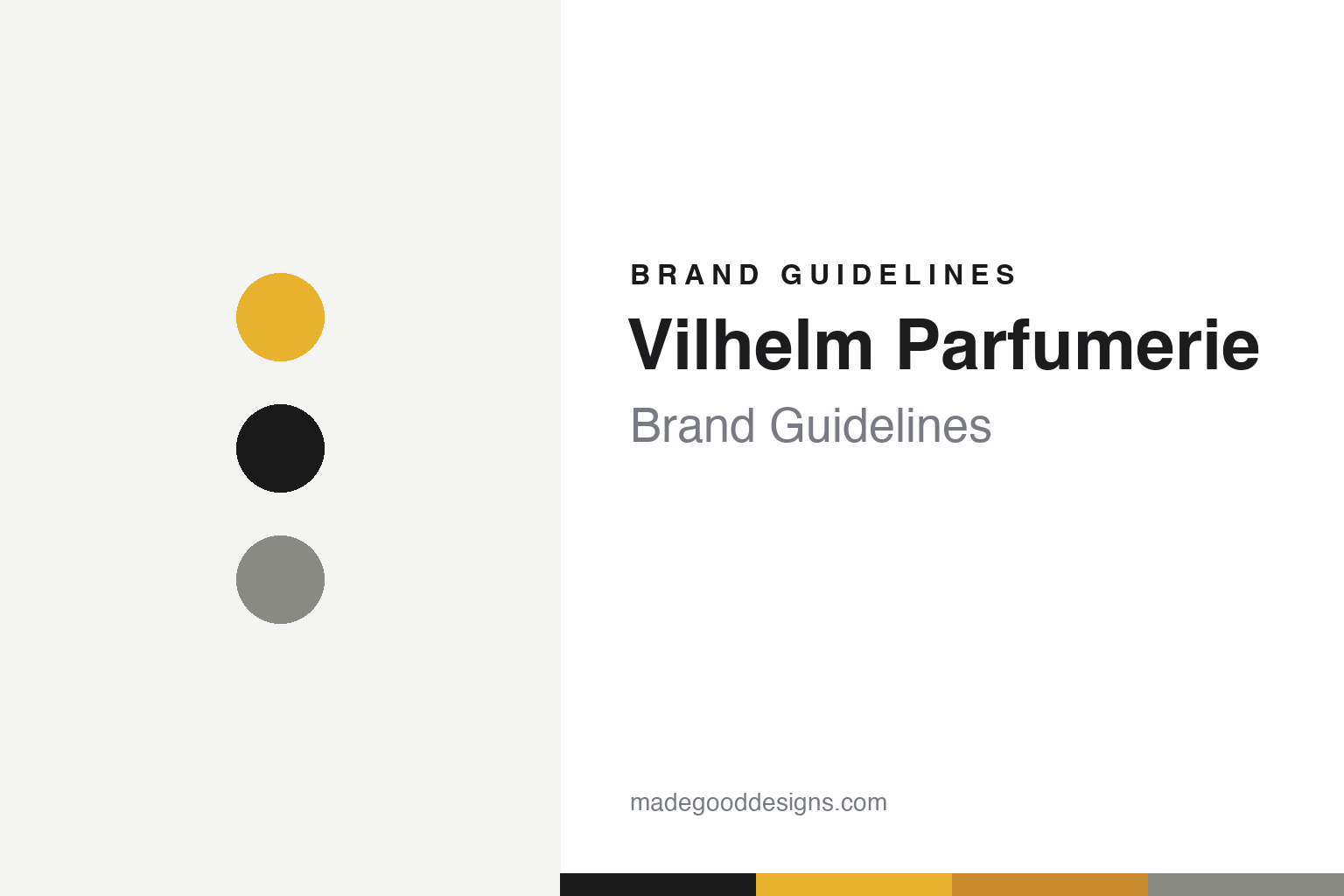
Vilhelm Parfumerie Brand Guidelines
Yellow & black.
Aa
Two constants: a goldenrod-and-black system and a modern grotesque wordmark. Abstract homage — not the Vilhelm wordmark or bottle.
One yellow, many stories
Vilhelm runs a single-colour graphic system.
Vilhelm Parfumerie is a lesson in a one-colour system. Founded in 2015 in New York by Jan (Vilhelm) Ahlgren (the name is his own middle name), with fragrances composed largely by Robertet’s Jérôme Épinette, it turns moments, moods and NYC-life stories into modernist scents. Its breakout, Mango Skin, became a viral signature.
The design is unusual: instead of a different colour per scent, the whole range shares one signature saffron/goldenrod yellow (a nod to a piece of Parisian flea-market Bakelite), a plain white label and bold black graphic patterns. Each scent is distinguished by its black graphic motif and imagery, not its colour — the identity is by Andreas Jacobsson, and the hefty spun-glass bottle is by the legendary designer Pierre Dinand.
(Honest notes: despite its niche image, Vilhelm is not independent — it was acquired by the Swiss group Creative Perfume Company in 2018, with Ahlgren staying on as creative director. The “grandfather Vilhelm” origin story is unverified; the name is the founder’s own middle name. No official brand hex is published — the de-facto signature is a goldenrod yellow.)
Colour
Vilhelm lives in goldenrod and black. Click a swatch to copy the hex.
Vilhelm’s identity is graphic, warm and consistent — a goldenrod, a black, an amber, a warm grey, and a white. The signature is a single goldenrod yellow paired with black across the whole range, with white labels and bold black graphics. It signals a confident, unified graphic system rather than per-scent colour or heritage luxury. The honest caveat: with no published brand hex, these tones are an original, unofficial interpretation, not first-party values.
The lesson is one ownable colour, used everywhere, builds instant recognition. Vilhelm’s world is yellow and black. For designers, it is a reminder that committing to a single signature colour (rather than colour-coding per product) can make a whole range instantly identifiable — the differentiation then lives in graphics and imagery, not colour. The takeaways: pick one ownable colour and use it across everything; differentiate with graphic motifs; and treat any single hex as unofficial — using a deep goldenrod-brown for small text so the yellow stays bright.
Typography
The wordmark spirit is a modern grotesque — graphic and confident.
Vilhelm’s identity carries a graphic, confident, modernist spirit — a bold black wordmark on goldenrod yellow. A modern grotesque sans captures the mood: it is clean and assertive, the register of a graphic-led, NYC-modernist house. Set against goldenrod and black, the grotesque feels graphic and confident — exactly the one-colour-system personality Vilhelm carries. It is graphic rather than ornate, mirroring bold black patterns. (Vilhelm’s real wordmark and Pierre Dinand bottle are trademarks and trade dress we describe but do not reproduce, and the exact typeface is not published, so we don’t assert it.) Because the specific mark is not ours to use, the honest description is “a modern grotesque spirit,” not the Vilhelm logo. The type behaves like the brand: graphic, confident and modernist.
Aa
A modern grotesque spirit — graphic and confident. (Specimen set in Chivo, a modern grotesque; NOT the Vilhelm logo, which is a trademark.)
The single-colour signature
Vilhelm stands for its yellow-and-black system.
Vilhelm Parfumerie is a lesson in owning one colour. While most niche houses colour-code per scent, Vilhelm does the opposite — one goldenrod yellow everywhere, with black graphics carrying the difference. That discipline makes the whole range instantly recognisable on a shelf. The single-colour system is the differentiator. The differentiator is a committed one-colour graphic identity.
For designers and brand-builders, Vilhelm offers a clear takeaway: a single ownable colour can out-brand a rainbow. The lessons: commit to one signature colour across the whole line; let graphics and imagery differentiate products; and invest in the object (a Pierre Dinand bottle). It is also a reminder to stay accurate: Vilhelm is owned by Creative Perfume Company (2018), and its differentiation is graphic, not colour-coded — with the palette here an unofficial interpretation. Vilhelm owned one yellow — proof that a single colour can be the difference.
Explore & save
Keep Vilhelm Parfumerie’s identity on hand — save it to a board in the Made Good inspiration library.
Vilhelm Parfumerie identity set
Pin the goldenrod-and-black palette and the modern-grotesque spirit to your own board.


