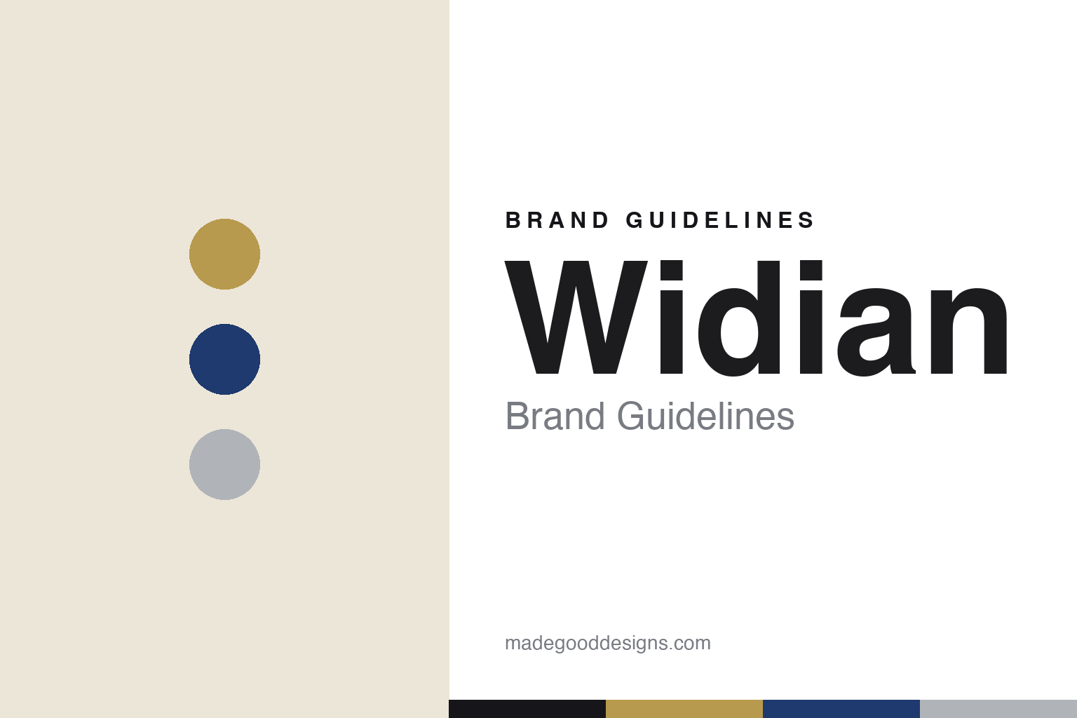
Widian Brand Guidelines
The mosque in a bottle.
Aa
Two constants: a gold-sapphire-silver palette and a geometric sans wordmark. Abstract homage — not the Widian flacon or wordmark.
The mosque in a bottle
Widian built Abu Dhabi into its flacon.
Widian is a lesson in architecture as a bottle. Founded in 2014 in Abu Dhabi — originally as “AJ Arabia,” renamed Widian around 2016–17 — by Ali Al Jaberi (“AJ” for his initials), a chemical engineer turned in-house perfumer working with French perfumer Jean-Claude Astier. “Widian” means “valleys” in Arabic. Its oud-forward Black Collection (numbered Black I, II, III…) is the flagship.
The signature is the flacon: clean, bold, geometric bottles inspired by the arches and domes of the Sheikh Zayed Grand Mosque in Abu Dhabi — the founder’s stated aim was that “opening a bottle should resemble opening a mosque.” The collections are colour-coded — Black (oud), Gold (amber and oud), Sapphire (named for cities) — in weighty, metal-accented, architectural forms.
(Honest notes: Widian is an independent, Emirati, founder-led house — no conglomerate owner. It’s a genuine “bridge between East and West,” pairing Arabian materials (oud, amber, rose) with French technique. No official brand hex is published — the palette follows the collections: black, gold, sapphire blue and silver.)
Colour
Widian lives in gold, sapphire and silver. Click a swatch to copy the hex.
Widian’s identity is architectural, metallic and regal — a gold, a sapphire, a silver, a cream, and a black. The palette is collection-coded: gold, sapphire blue, black and silver, in weighty, metal-accented forms. It signals modern Emirati luxury — architecture and heritage — rather than soft or minimal fragrance. The honest caveat: with no published brand hex, these tones are an original, unofficial interpretation, not first-party values.
The lesson is architecture and metallics read as modern Middle-Eastern luxury. Widian’s world is a mosque rendered in glass and metal. For designers, it is a reminder that a genuine architectural reference (the Grand Mosque’s arches and domes) plus collection-coded metallics can make a fragrance feel monumental and culturally rooted. The takeaways: root the form in real architecture; colour-code by collection; and treat any single hex as unofficial — using a deep sapphire for small text so the gold and silver stay rich.
Typography
The wordmark spirit is a geometric sans — architectural and modern.
Widian’s identity carries an architectural, modern, regal spirit — a clean wordmark on a mosque-inspired geometric flacon. A precise geometric sans captures the mood: it is structured and contemporary, the register of an architectural, metal-accented house. Set against gold, sapphire and silver, the geometric sans feels architectural and modern — exactly the mosque-flacon personality Widian carries. It is structured rather than ornate, mirroring clean arches and domes. (Widian’s real flacon and wordmark are trademarks and trade dress we describe but do not reproduce, and the exact typeface is not published, so we don’t assert it.) Because the specific mark is not ours to use, the honest description is “a geometric sans spirit,” not the Widian logo. The type behaves like the brand: architectural, modern and regal.
Aa
A geometric sans spirit — architectural and modern. (Specimen set in Jost, a geometric sans; NOT the Widian logo, which is a trademark.)
Heritage, in architecture
Widian stands for the architectural flacon.
Widian is a lesson in turning architecture into a signature. Its flacon — modelled on the arches and domes of the Sheikh Zayed Grand Mosque — makes Emirati heritage the whole design, while colour-coded collections and metal accents keep it modern and legible. The building is the bottle. The differentiator is a genuine architectural, culturally-rooted form.
For designers and brand-builders, Widian offers a clear takeaway: a real architectural reference can carry a luxury brand. The lessons: root the form in a meaningful building; colour-code collections for structure; and pair cultural materials (oud) with technical craft (French perfumery). It is also a reminder to stay accurate: Widian is independent and Emirati-owned, and began as AJ Arabia before its 2016–17 rename — with the palette here an unofficial interpretation. Widian bottled a mosque — proof that architecture can be the difference.
Explore & save
Keep Widian’s identity on hand — save it to a board in the Made Good inspiration library.
Widian identity set
Pin the gold-sapphire-silver palette and the geometric-sans spirit to your own board.


