Restaurant Branding: A Complete Guide
Restaurant branding is the system of decisions, visual and otherwise, that makes a place feel like itself the moment a guest walks in, scrolls past it, or unwraps a to-go order. It is not a logo. The logo is one part of a kit that also covers your name, color palette, typography, menu, signage, packaging, uniforms, and the small interior cues that tell people what kind of meal they are about to have. Get the system coherent and a guest can recognize you from a single takeout cup; get it scattered and even a great kitchen reads as forgettable.
This guide walks the whole system in the order you should actually build it: strategy first, then the visual identity, then the physical and digital touchpoints where the brand does its real work. Along the way we link to deeper guides for each cluster piece, because a restaurant brand is the sum of a lot of detailed decisions, not one big reveal.
Start With Strategy, Not the Logo
Every strong hospitality brand answers four questions before anyone opens a design tool. Who is this for? What is the one-line promise (the food, the feeling, the price band)? What does it stand against — who are the three places nearby a guest would otherwise choose? And what is the tone — refined, rowdy, homey, fast, indulgent? Write these down in plain sentences. They become the brief that every later choice is measured against.
The output of this stage is a short brand strategy document: positioning, a personality in three to five adjectives, the target guest, and a name you have actually checked for trademark and domain availability. A trattoria that calls itself “warm, generous, unfussy” will make different color and type calls than a cocktail-forward small-plates room that wants “moody, exact, grown-up.” Decide the adjectives now and the rest of the work gets easier and faster.
Naming and the verbal identity
The name is the most-used asset you will ever make — guests say it, search it, and tag it. Favor names that are easy to spell, easy to say out loud, and not already three other restaurants in the same metro. Lock a short tagline or descriptor too (“wood-fired pizza,” “all-day cafe and bakery”), because it does heavy lifting on signage and map listings where the name alone is ambiguous.
Build the Visual Identity
Once strategy is set, the visual identity is the kit of reusable parts: logo and its variants, color palette, typography, and a few graphic devices (a pattern, an icon set, a photography style). The goal is consistency with enough flexibility to live on a tiny app icon and a thirty-foot wall. For the full framework of how these parts fit together as a system, see our guide to visual identity design.
The logo and its variants
You do not need one logo — you need a small family that covers every size and surface. At minimum: a primary lockup (icon plus wordmark), a standalone wordmark, a standalone mark or monogram for tiny placements (app icon, coffee cup, social avatar), and a one-color version for embroidery, foil, and laser etching. Design it in vector from the start in Illustrator so it scales cleanly from a 16px favicon to a building-side sign without going fuzzy. Our logo design process walkthrough covers the sketch-to-vector workflow in detail, and the food-specific considerations live in our food logo design guide.
Color palette
Pick a palette that survives the real world: one or two brand colors, a neutral base, and an accent. Test every color on the surfaces it will actually appear on — a warm terracotta looks great on a matte menu and muddy on a glossy cup. Specify each color in the formats your vendors need: HEX for screen, RGB for digital, CMYK for offset printing, and a Pantone (PMS) reference for signage and packaging so a printer in another city matches your red exactly.
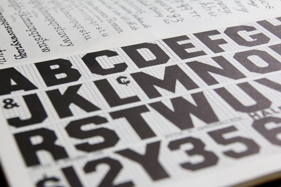
Typography
Choose a pair, not a pile: one display face for the logo and headlines, one workhorse for body text, menus, and the website. The display face carries personality; the body face must stay legible at small sizes and in long lists. Make sure both have a real commercial license for the uses you need (menus, signage, web embedding). For how to combine two faces that actually belong together, read our font pairing guide.
The Menu Is Your Most-Read Asset
More guests read the menu, start to finish, than any other thing you design. It is a sales tool disguised as a list. Treat it as a first-class design surface: clear hierarchy (section, dish name, description, price), comfortable line length, generous spacing so the eye can scan, and pricing that is not lined up in a tidy right-hand column that turns the whole thing into a price-comparison chart. Keep the brand type and color present but quiet — the food descriptions are the star. Our dedicated menu design guide covers layout, pricing psychology, and print specs.
Signage and Storefront
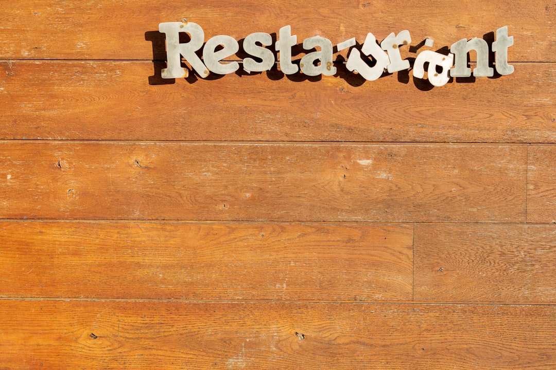
The storefront sign is your single biggest, most permanent brand statement, and it has to work at distances and angles your screen mockups never test. Read it at 50 feet, at a passing 30 mph, at night, and at a sharp side angle from down the block. That means high contrast, generous letter spacing, and a logo variant simplified enough to survive the size. Coordinate the sign with awnings, window vinyl, and the menu board so the whole frontage reads as one brand rather than three contractors.
- Primary sign: the big exterior identifier — usually the wordmark or full lockup, lit if your hours run past dusk.
- Window and door vinyl: hours, the mark, maybe a tagline; keep it sparse so people can still see in.
- Wayfinding and A-frame: sidewalk boards and interior signs that share the brand type and color but carry changeable content.
- Menu boards: for quick-service rooms, the menu board is both signage and menu — design it as both.
Packaging and To-Go
Takeout and delivery turned packaging into a primary brand channel: a branded cup or box travels through a neighborhood and shows up in someone’s kitchen and feed. You do not need to print everything. Pick the highest-visibility, lowest-cost wins — a one-color stamp or sticker on a kraft box, a custom cup sleeve, branded tape, a printed napkin — and let plain, good-quality stock carry the rest. Make sure the one-color logo variant reads cleanly on brown kraft and on a curved cup, because that is where most of your packaging actually lives.
Uniforms, Interior, and the Felt Experience
Branding does not stop at print. Staff aprons or tees in your palette, a consistent music and lighting mood, the texture of the tables, even the typeface on the restroom sign — these are all touchpoints. They should reinforce the same three adjectives you chose at the strategy stage. A “warm, generous, unfussy” room wants soft light, natural materials, and friendly type; a “moody, exact” bar wants low light, hard edges, and tighter typography. Consistency here is what turns a nice meal into a place people describe to friends.
Digital: Website, Maps, and Social
Most guests meet your brand on a phone before they meet it in person, so the digital surfaces have to match the room. Your website needs the menu (in real HTML text, not a buried PDF), hours, location, and reservation or order links above the fold. Your Google Business Profile, map pin, and delivery-app storefront should use the same logo, the same photography style, and the same name and descriptor. Inconsistent profiles across platforms are the most common, most fixable branding leak in hospitality.
Branding by Restaurant Type
The system above is universal, but the dials get set differently depending on what you run. Each of these has its own conventions, and we have a focused guide for each.
| Type | Typical tone | Type & color lean | Deep-dive guide |
|---|---|---|---|
| Cafe / coffee shop | Warm, crafted, daily-ritual | Friendly sans or humanist serif; earthy, warm neutrals | Cafe branding |
| Bakery | Soft, homemade, inviting | Script or rounded type; cream, pastel, soft contrast | Bakery branding |
| Food truck | Bold, mobile, legible-at-distance | Heavy display type; high-contrast, saturated color | Food truck design |
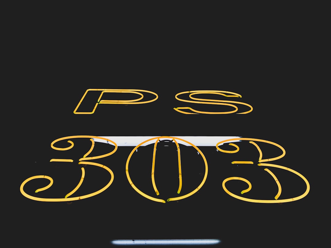
| Bar / pub | Bold, vintage or neon, grown-up | Condensed or vintage display; dark base, bright accent | Bar and pub branding |
For the logo specifically, regardless of type, the rules of food-mark design — appetite appeal, scalability, avoiding clichés — are covered in our food logo design guide.
Tools and Deliverables
You can build a credible restaurant brand with a focused toolkit. Adobe Illustrator is the standard for the logo and any vector artwork that has to scale to signage. Adobe Photoshop handles photography and texture work for menus and social. Canva is genuinely useful for the day-to-day output — daily specials, social posts, simple flyers — once a designer has set up branded templates with your real fonts and colors locked in, so staff can update content without breaking the brand.
The deliverable that ties it together is a one- to two-page brand guideline: logo variants and clear space, color codes (HEX, RGB, CMYK, Pantone), the two fonts and where each is used, and a few do/don’t examples. It is the difference between a brand that stays consistent across a dozen vendors and one that drifts within a year.
Frequently Asked Questions
How much does restaurant branding cost?
It ranges widely. A solo designer building a logo, palette, type system, and menu template can run from the low four figures; a full studio program covering naming, signage, packaging, and interior direction runs much higher. The biggest cost driver is scope — how many physical touchpoints, like signage and custom packaging, you need produced.
What comes first, the logo or the brand strategy?
Strategy first, always. The logo, colors, and type are answers to questions — who you serve, your one-line promise, and your tone. Designing the logo before settling those means you are guessing, and you usually end up redoing the work once the positioning becomes clear.
What are the essential restaurant branding elements?
At minimum: a name and tagline, a scalable logo with variants, a color palette specified for print and screen, two fonts, a menu design, a storefront sign, and basic to-go packaging. Everything else — uniforms, interior cues, social templates — extends those core pieces consistently.
How do I keep my branding consistent across vendors?
Write a short brand guideline with logo files, exact color codes in every format (including Pantone for signage), your fonts, and clear-space rules. Give it to every printer, sign maker, and packaging supplier. Locking branded templates in Canva for daily content also stops staff from drifting off-brand.
Do small restaurants really need branding?
Yes — arguably more than big ones. A single location competing on a crowded street relies on recognition and recommendation, and consistent branding across the sign, menu, packaging, and map listing is what makes you memorable and easy to tell a friend about. It is leverage a small operation can actually afford.