Quaker Oats Brand Guidelines
America’s first registered cereal trademark — later simplified by Saul Bass into a face everyone knows and no one can name.
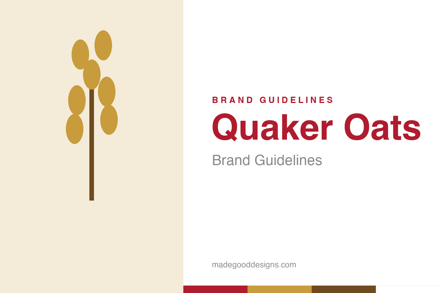
An abstract oat sprig — the grain, not the figure. Deliberately not the Quaker man.
The face of purity
Quaker’s mark is a smiling man in a black hat — a symbol, not a person.
The Quaker Oats figure — a genial, white-haired man in Quaker dress — is one of the most recognised faces in the supermarket, and one of the most misunderstood. The company has long stated that he is not a real person, and specifically not William Penn: he’s a generic symbol chosen to evoke the values popularly associated with Quakers — honesty, integrity and purity — qualities a food brand very much wants borrowed. That’s a subtle, sophisticated bit of brand-building for the 1870s: don’t depict a founder, depict a virtue. Our homage sidesteps the face entirely and celebrates the oats instead.
America’s first cereal trademark
The Quaker mark is a genuine piece of branding history.
The Quaker figure was registered as a trademark in 1877 — widely cited as the first registered trademark for a breakfast cereal in the United States. That makes it a foundational artefact of modern branding: at a moment when packaged food was still winning consumers’ trust, Quaker used a recognisable, reassuring character to stand for consistency and quality on the shelf. The Quaker Oats Company as we know it formed by merger in 1901, consolidating several oat millers, but the man on the box predates the company itself — the symbol came first, and the corporation grew up around it.
Saul Bass cleans him up
The modern Quaker is the work of the master of the reductive logo.
Over the decades the Quaker grew simpler, and its defining modern form is credited to Saul Bass — the designer-filmmaker behind AT&T, Quaker’s peers, and a shelf of classic corporate marks — who reduced the figure to a clean, smiling head and collar around 1969–1972 (sources differ on the exact year). Bass did what Bass always did: he stripped a busy Victorian illustration down to the few essential strokes that still carry all the warmth. The result reads at any size, from a cereal box to a phone screen, and has needed only gentle updates since. It’s a textbook Bass move — maximum recognition, minimum ink.
A symbol that sells trust
The whole identity is engineered to feel wholesome.
Everything about the Quaker identity points one way: trust. The friendly face, the historic connotations of the Quaker name, the warm and simple palette — together they say “honest, wholesome, dependable” before you’ve read a single word of packaging. It’s why the mark has survived nearly 150 years and countless redesigns with its meaning intact: the company has never confused modernising the drawing with changing what it stands for. Saul Bass tidied the lines; the promise underneath — purity and plain goodness — is exactly the one registered back in 1877. That constancy is the brand’s real asset.
There’s a broader branding principle hiding in the Quaker man. A logo built on a value rather than a person or a product feature ages far more gracefully, because values don’t go out of fashion the way haircuts and hemlines do. “Honest and wholesome” was a good pitch in 1877 and it’s a good pitch today; the drawing can be modernised endlessly without the meaning ever needing to move. That’s why Saul Bass could tidy the figure without controversy — he was updating the packaging on an idea, not the idea itself. Few marks have separated those two things so cleanly, or profited from the distinction for so long.
Seen in the round, Quaker Oats’s identity rewards the same discipline every strong brand demands: decide what you stand for, express it in the simplest, most distinctive form you can, and then apply that form with almost stubborn consistency until its meaning compounds. The temptation is always to add, to chase trends, to complicate; the harder and more valuable choice is to protect a clear idea over years. That patience is what turns a mark from mere decoration into a genuine asset — recognised, trusted, and impossible to confuse with anyone else.
Type & the wordmark
Warm, rounded, reassuring — lettering that matches the smile.
The Quaker wordmark is typically warm and rounded, often in a friendly red, tuned to feel approachable and homely rather than corporate. The specimen below stands in with a sturdy, friendly sans.
Good & wholesome
Warm, rounded, approachable — type that feels like breakfast at home. (Specimen set in Archivo, a neutral stand-in.)
Oat & red
Warm neutrals with a friendly red. Click a swatch to copy the hex.
Quaker’s palette leans on warm oat and grain neutrals with a friendly red wordmark. Quaker does not publish an official public hex sheet, so the values below are faithful reconstructions for reference, not a spec — the red in particular is approximate.
Explore & save
Keep the oats-and-trust idea on hand — save the sprig homage and the warm palette to a board.
Quaker identity set
Pin the oat-sprig homage, the warm palette and the friendly wordmark to your own board.