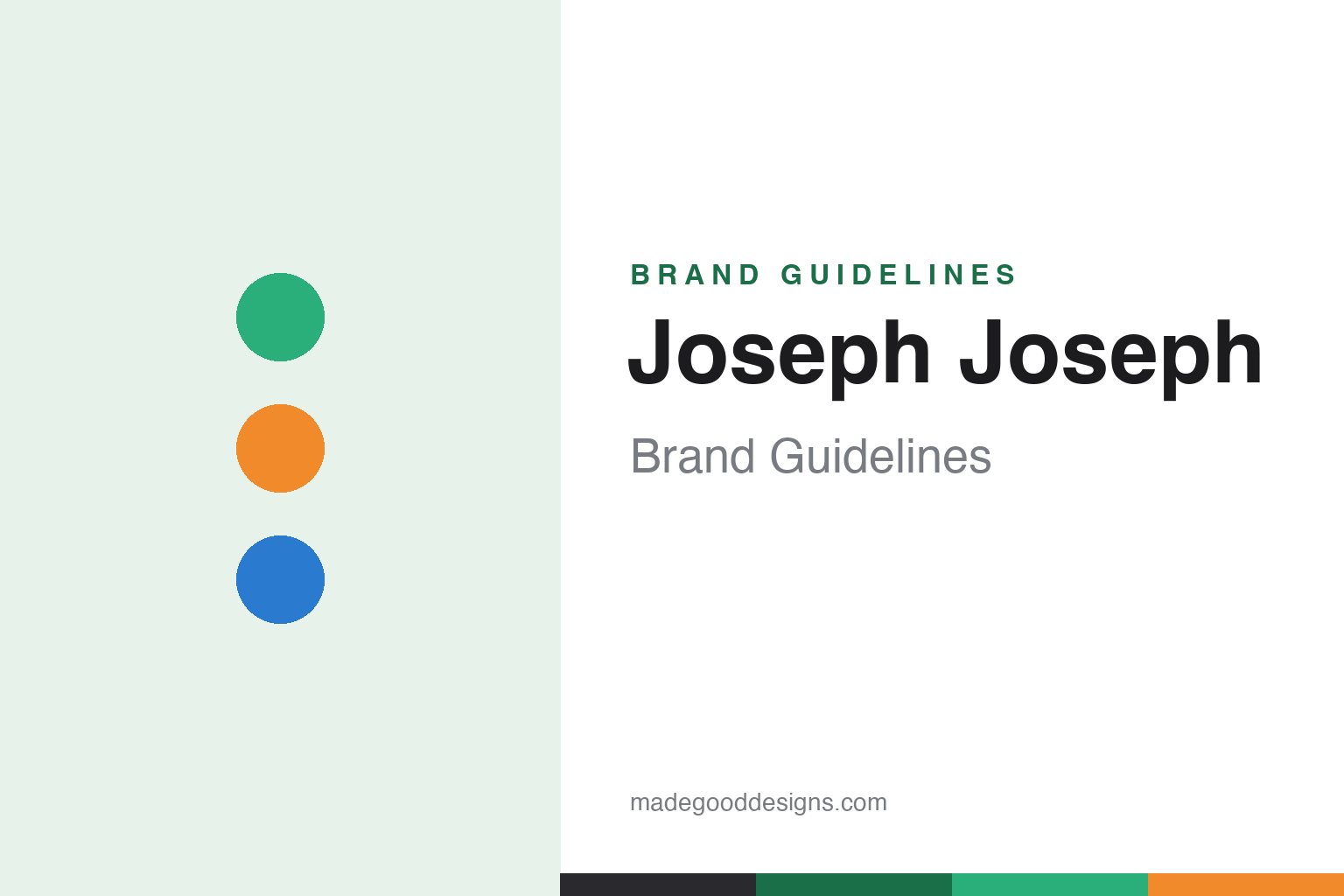
Joseph Joseph Brand Guidelines
Twin brothers, doubled name — colourful, clever housewares that solve everyday kitchen problems by design.
Aa
Two constants: a bold, coordinated multi-colour palette and a clean, modern sans. Abstract homage — not the Joseph Joseph wordmark.
Twin brothers, doubled name
Joseph Joseph is literally two Josephs.
Joseph Joseph is a lesson in design cleverness as a brand. It was founded in 2003 by twin brothers Antony and Richard Joseph in London — and the doubled name is literal: two brothers, both surnamed Joseph, so the brand is quite simply “Joseph, Joseph.” (Antony trained in design at Central Saint Martins; Richard studied industrial design at Loughborough and business at Cambridge — a pairing of aesthetics and engineering that shows in the products.) (Two honest notes: no official brand hex is published — the multi-colour palette is intentional — and the wordmark typeface is undocumented.)
The origin is a nice detail worth getting right: the family ran a toughened-glass manufacturing business (making glass for cooker hobs — not “glassware” like drinking glasses). The brothers launched their own venture using roughly £10,000 of glass stock from the family firm, and their first product was a glass chopping board / worktop saver — which they designed themselves (the father supplied the glass and backing, not the design; they didn’t inherit or take over the company). That glass chopping board is still in the range 20+ years on.
What made Joseph Joseph famous is colourful, clever, design-led housewares that solve everyday problems. The signatures: Index (a colour-coded chopping-board set that files away like books), Nest (space-saving nesting mixing bowls and measuring cups), Chop2Pot (a folding chopping board that squeezes to funnel food into a pan), and Totem (a compartmentalised waste-and-recycling bin). Each turns a mundane kitchen frustration into a considered, functional, brightly-coloured object. It’s privately, family-owned by the founders, and its mission line is “We solve everyday problems through thoughtful design that’s made to last.” Twin brothers, doubled name.
Colour
Joseph Joseph lives in bold, coordinated colour. Click a swatch to copy the hex.
Joseph Joseph’s identity is its bold, coordinated, multi-colour palette — bright greens, oranges, blues and more, arranged in coordinated colour families across a product. Rather than one signature hue, colour is central and intentional: it makes the clever design functional (the colour-coded Index boards) and cheerful, turning practical kitchen tools into bright, desirable objects. The palette reads as fun, modern and design-forward — matching a brand built on solving everyday problems with a smile. The honest caveat: because the identity is deliberately multi-colour, Joseph Joseph publishes no single official brand hex — the green, orange and blue here are an original, unofficial interpretation, not first-party values.
The lesson is coordinated multi-colour can be both functional and joyful. Joseph Joseph uses colour to organise (colour-coding) and to delight. For designers, it’s a reminder that colour can serve function and personality at once. The takeaways: use bold, coordinated colour as a core identity; let colour do functional work where it can (coding, organising); and treat specific hexes as unofficial when the palette is deliberately multi-colour.
Typography
The wordmark is a clean modern sans — smart and design-led.
Joseph Joseph’s identity carries a clean, modern, design-led spirit — a crisp sans-serif wordmark (the doubled “Joseph Joseph” name) whose even, contemporary letterforms read as smart, functional and considered. The clean type matches a brand built on clever, problem-solving design, and the restraint lets the bold, coordinated product colours take the spotlight. Set against a bright multi-colour palette, the type feels modern and intelligent — exactly the thoughtful-design personality Joseph Joseph cultivates. It’s clean and design-led rather than ornate or heritage, mirroring the clever housewares. Because the exact wordmark face isn’t publicly documented, the honest description is “a clean modern sans spirit,” not a named font. The type behaves like the brand: smart, modern and design-led.
Aa
A clean modern sans spirit — smart and design-led. (Specimen set in Familjen Grotesk, a clean modern sans in the spirit of the Joseph Joseph identity; the real face is undocumented.)
Solving problems by design
Joseph Joseph sells clever design.
Joseph Joseph is a lesson in selling clever design in a mundane category. Kitchen tools are about as everyday and commoditised as products get — so Joseph Joseph competed by making them smart: chopping boards that file like books and colour-code by food type, bowls that nest to save space, a board that folds to funnel food, a bin that sorts recycling. Each product identifies a small, real, everyday frustration and solves it with a considered, patentable, brightly-coloured design. That focus on thoughtful problem-solving — not just aesthetics — is the whole brand, and it turns humble housewares into desirable, giftable objects people actively enjoy. The twin-brother pairing of design and engineering shows in how the cleverness is genuine and functional, not gimmicky. The lesson is that even the most ordinary category can support a strong, premium brand if you consistently apply intelligent, problem-solving design and express it through a bright, coherent identity. Solve real problems cleverly, and the housewares become a brand.
For designers and brand-builders, Joseph Joseph offers a clear takeaway: consistent, intelligent problem-solving design can build a premium brand in a mundane category. The lessons: find small, real everyday frustrations and solve them with genuine cleverness (Index, Nest, Chop2Pot, Totem); pair aesthetics with engineering so the cleverness is functional; and express it through a bold, coherent, colourful identity. It’s also a reminder to keep the facts precise — Joseph Joseph was founded in 2003 by twin brothers Antony and Richard Joseph in London, grew from the family’s toughened-glass business with a self-designed glass chopping board, and is privately family-owned. Joseph Joseph sells clever design — proof that thoughtful problem-solving can be a brand.
Explore & save
Keep Joseph Joseph’s identity on hand — save it to a board in the Made Good inspiration library.
Joseph Joseph identity set
Pin the multi-colour palette and the modern-sans spirit to your own board.