Private Reserve Brand Guidelines
Saturated American ink — deep colour, a fast-drying line, and a second life under Yafa.
Aa
Two constants: a sapphire-and-ink palette and a bold sans. Abstract homage — not the Private Reserve wordmark or logo.
Saturated colour, reformulated
Private Reserve is known for deep, vivid ink.
Private Reserve is a lesson in a brand’s reputation surviving a reformulation. It began as a family-owned American ink brand in Indiana in roughly the mid-1990s (we hedge the exact year and don’t name a founder, since reliable sources only say “family-owned”). Its reputation was built on highly saturated, vividly pigmented colours — inks that go down deep and rich, with a catalogue of well-loved names in the fountain-pen community.
The signature line is Fast Dry — quick-drying, neutral-pH inks marketed as good for left-handers and fast writers (less smearing), sold in generous 60ml bottles. That’s a genuinely useful niche: most saturated inks dry slowly, so a saturated ink that also dries fast has a real audience.
The honest part of the story is the reformulation. Private Reserve passed through several owners; after the original owner died, the company was bought and its inks reworked, and it now sits under Yafa Brands — making it a corporate sibling of Monteverde (and Conklin). Earlier formulations had a reputation for problems — slow drying, and in some cases mould or “slime” in the bottle from a formulation error — which is exactly what the reformulation addressed. Today’s inks are reported to behave well; we present the older issues neutrally, as history rather than current fact. (Honest notes: the founding year and founder are hedged; it’s now a Yafa brand, not independent; and no official brand hex is published.)
Colour
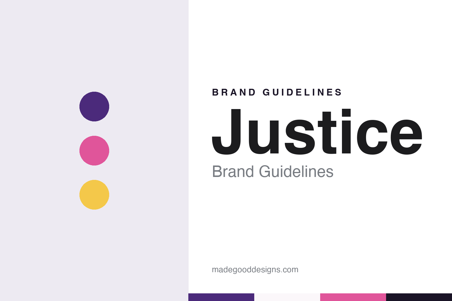
Private Reserve lives in a sapphire-and-ink palette. Click a swatch to copy the hex.
Private Reserve’s identity is deep, saturated and American — a rich sapphire, ink black, and a bright blue. The palette reads as the inks themselves: vivid, heavily pigmented colour that goes down dark and strong. It’s a bold, colour-forward world that signals saturation, value and everyday writing. It’s a sapphire-and-ink palette that signals deep American ink. The honest caveat: Private Reserve makes a broad range and publishes no official brand hex, so the sapphire, ink and blue here are an original, unofficial interpretation, not first-party values.
The lesson is a deep-sapphire palette signals saturated colour. Private Reserve’s world reads as bold and colour-first. For designers, it’s a reminder that a deep, saturated hue reads as richness and value at once. The takeaways: use a deep saturated hue to signal pigment and depth; ground it with ink black; and treat any single hex as unofficial when there’s no published spec.
Typography
The wordmark spirit is a bold sans — strong and saturated.
Private Reserve’s identity carries a bold, saturated, American spirit — a “Private Reserve” wordmark whose strong forms match ink that goes down deep and vivid. A bold sans captures the mood: it’s confident and colour-forward, matching a brand built on saturation. Set against a sapphire palette, the bold sans feels rich and strong — exactly the deep-colour, Fast-Dry personality Private Reserve carries. It’s bold rather than delicate, mirroring a heavily pigmented ink. (Private Reserve’s real wordmark is a trademark we describe but don’t reproduce.) Because the exact mark isn’t ours to use, the honest description is “a bold sans spirit,” not the Private Reserve logo. The type behaves like the brand: bold, saturated and confident.
Aa
A bold sans spirit — strong and saturated. (Specimen set in Archivo, a bold grotesque; NOT the Private Reserve logo, which is a trademark.)
Surviving a reformulation as the difference
Private Reserve kept its colour reputation.
Private Reserve is a lesson in protecting a brand’s core reputation through a rocky handover. Its whole equity was saturated, beautiful colour — but its earlier formulations had real reliability problems, and the company changed hands more than once, including after its original owner died. A lesser story would have ended there. Instead, the ink was reformulated under new ownership (now Yafa) to fix the drying and stability issues while keeping the thing people actually loved: the deep, vivid colours. That’s the hard trick in any brand rescue — fix the defects without losing the identity. The Fast Dry line even turned a former weakness (slow-drying saturated ink) into a selling point. The colours that made the name are still the point; they just behave better now.
For designers and brand-builders, Private Reserve offers a clear takeaway: you can fix a product’s flaws without discarding what made it loved. The lessons: identify the true core equity (here, saturated colour) and protect it through any reformulation; turn a former weakness into a named strength (Fast Dry); and keep the facts precise — Private Reserve is an American ink brand, now a Yafa sibling of Monteverde. It’s also a reminder to keep it honest: the founding year and founder are hedged; the older mould/slow-dry issues are history, reportedly resolved, not current fact; it’s no longer independent; and no official brand hex is published, so the palette here is an interpretation. Private Reserve kept its colour reputation — proof that a careful reformulation can be the difference.
Explore & save
Keep Private Reserve’s identity on hand — save it to a board in the Made Good inspiration library.
Private Reserve identity set
Pin the sapphire-and-ink palette and the bold-sans spirit to your own board.