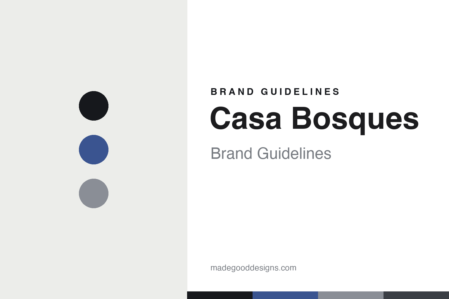
Casa Bosques Brand Guidelines
The bookstore’s chocolate.
Aa
Two constants: a blue-and-paper palette and an editorial sans register. Abstract homage — not the Casa Bosques packaging.
The bookstore’s chocolate
Casa Bosques is a design studio, a bookshop and a chocolate — all at once.
Casa Bosques is a lesson in a design project as identity. Founded around 2012 in Mexico City as an initiative of the acclaimed design studio Savvy Studio, it sits where a design practice, an art-and-design bookstore in Colonia Roma, and a chocolate line all meet under one name.
Its identity is minimalist design: a refined, understated wrapper — blue-and-white on plain paper stock, with generous whitespace — that reads more like a gallery catalogue than a confection. The bookstore and the chocolate are one entity, sold under the same banner, and the bars are named simply by flavour and ingredient — Oscuro Puro, Nibs de Cacao, Sea Salt, Pink Pepper, Cardamom, Black Sesame — alongside art-world collaborations.
(Honest notes: the design authorship belongs to Savvy Studio, which is well documented; the specific founder attributions circulate widely but we treat them cautiously. Its cacao is Mexican, though we don’t assert a specific region, and the bars are flavour-named rather than numbered. There’s no official brand hex, so these tones are an unofficial interpretation.)
Colour
Casa Bosques lives in a blue-and-paper palette. Click a swatch to copy the hex.
Casa Bosques’ identity is minimal, editorial and quiet — an editorial blue, an ink, a stone, a slate, and a paper. The palette pairs an editorial blue with a paper white — the register of a gallery catalogue. It signals design and restraint rather than indulgence. The honest caveat: with no published brand hex, these tones are an original, unofficial interpretation, not first-party values.
The lesson is a blue on paper signals a design-led chocolate. Casa Bosques’ world is a bookshop shelf. For designers, it is a reminder that a restrained, editorial palette reads as considered and gallery-like — right for a studio-run chocolate. The takeaways: keep the palette to a blue and a paper; use whitespace generously; name simply (by flavour); and treat any single hex as unofficial.
Typography
The register is an editorial sans — minimal, considered, gallery-like.
Casa Bosques’ identity carries a minimal, considered, gallery-like spirit — a bookshop and a plain paper wrapper. An editorial sans captures the mood: it is clean and quiet, the register of a design catalogue. Set in a blue-and-paper palette, the editorial sans feels minimal and considered — exactly the personality Casa Bosques carries. It is gallery-like rather than loud, mirroring a plain wrapper. (Casa Bosques’ real packaging is work we describe but do not reproduce, and the exact typeface is not ours to use.) Because it is not ours to use, the honest description is “an editorial sans spirit,” shown here in a stand-in. The type behaves like the brand: minimal, considered and gallery-like.
Aa
An editorial sans spirit — minimal and considered. (Specimen set in Manrope, a clean editorial sans STAND-IN; NOT the Casa Bosques packaging.)
A design project as identity
Casa Bosques stands for chocolate as a design object.
Casa Bosques is a lesson in making a design project the identity. A blue-and-paper palette, an editorial sans and a plain wrapper make design the whole brand — minimal, considered, gallery-like. The design is the differentiator. The differentiator is a studio-and-bookstore, design-object identity.
For designers and brand-builders, Casa Bosques offers a clear takeaway: let a design practice make the product. The lessons: keep the wrapper minimal (blue on paper); name simply; connect the product to a world (a bookstore); and collaborate with artists. It is also a reminder to stay accurate: it’s a 2012 Savvy Studio initiative, its cacao region is unstated, and the palette here is an unofficial interpretation. Casa Bosques made a design project the brand — proof that design itself can be the difference.
Explore & save
Keep Casa Bosques’s identity on hand — save it to a board in the Made Good inspiration library.
Casa Bosques identity set
Pin the blue-and-paper palette and the editorial-sans register to your own board.


