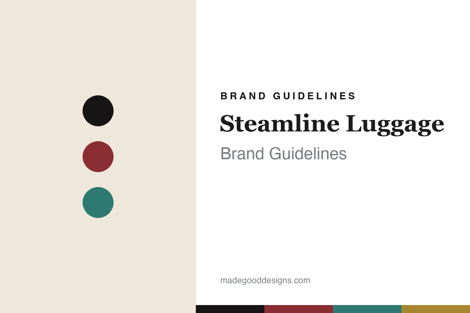
Steamline Luggage Brand Guidelines
The vintage trunk.
Aa
Two constants: an oxblood-and-teal palette and a vintage serif register. Abstract homage — not the Steamline Luggage products or packaging.
The vintage trunk
Steamline sells the romance of old travel.
Steamline Luggage is a lesson in romance as the product. Founded, the brand says, in 2008 by Sara Banks and headquartered in Ireland, it sells the feeling of the golden age of travel as much as the cases themselves.
Its identity is vintage-travel romance. Steamline’s hardside cases — trolleys, carry-ons, vanity cases and hatboxes — take their cues from early-20th-century steamer trunks, in bold saturated colours with contrasting leather trim and gleaming metal hardware. Its persona-named ranges (The Diplomat, The Editor, The Explorer, The Navigator) evoke a cosmopolitan cast of characters, and its motto — “S.L.O.W.,” for Travel Slowly, Lovingly, Openly and with Wonder — sums up the mood. Old-world glamour, made to roll.
(Honest notes: the founding story is single-source — the brand’s own account — so we attribute the 2008 date, Sara Banks and the Ireland HQ to the company (and note only “Ireland,” not a specific city). The gold/brass fittings are the aesthetic, but the material is nickel-plated alloy, so we say “brass-look,” not solid brass. The manufacturing country isn’t clearly stated, so we don’t assert one. There’s no official brand hex, so these tones are an unofficial interpretation. This is design commentary and does not promote any product.)
Colour
Steamline lives in an oxblood-and-teal palette. Click a swatch to copy the hex.
Steamline’s identity is vintage, bold and romantic — an oxblood, an ink, a vintage teal, a brass, and a cream. The palette pairs an oxblood with a teal — the register of golden-age travel colour. It signals romance and nostalgia rather than novelty. The honest caveat: with no published brand hex, these tones are an original, unofficial interpretation, not first-party values.
The lesson is an oxblood with a teal signals a vintage-travel brand. Steamline’s world is a steamer trunk for the modern traveller. For designers, it is a reminder that selling a feeling — old-world glamour — can be as much the product as the object. Because a deep oxblood can fail as small text, keep type dark and let the colour live in the accents, palette and band. The takeaways: sell the feeling; use bold colour with warm trim; name for characters; and treat any single hex as unofficial.
Typography
The register is a vintage serif — romantic, bold, old-world.
Steamline’s identity carries a romantic, bold, old-world spirit — a golden-age travel case. An elegant vintage serif captures the mood: it is glamorous and nostalgic, the register of the grand tour. Set in an oxblood-and-teal palette, the vintage serif feels romantic and old-world — exactly the personality Steamline carries. It is theatrical rather than plain, mirroring a colourful trunk. (Steamline’s real products and wordmark are works we describe but do not reproduce, and the exact typeface is not ours to use.) Because it is not ours to use, the honest description is “a vintage serif spirit,” shown here in a stand-in. The type behaves like the brand: romantic, bold and old-world.
Aa
A vintage serif spirit — romantic and old-world. (Specimen set in Prata, an elegant Didone serif STAND-IN; NOT the Steamline Luggage packaging.)
Romance as the product
Steamline stands for vintage-travel romance.
Steamline Luggage is a lesson in making a feeling the product. An oxblood-and-teal palette, a vintage serif and a colourful trunk make golden-age romance the whole brand — vintage, bold, romantic. The romance is the differentiator. The differentiator is the feeling of old-world travel.
For designers and brand-builders, Steamline offers a clear takeaway: sell the feeling, not just the object. The lessons: sell the feeling; use bold colour with warm trim; name for characters; and be honest about the story. It is also a reminder to stay accurate: the founding details are the brand’s own account (2008, Sara Banks, Ireland — not a specific city), the fittings are brass-look nickel alloy, and the palette here is an unofficial interpretation. Steamline made a feeling the brand — proof that romance can be the difference.
Explore & save
Keep Steamline Luggage’s identity on hand — save it to a board in the Made Good inspiration library.
Steamline Luggage identity set
Pin the oxblood-and-teal palette and the vintage-serif register to your own board.