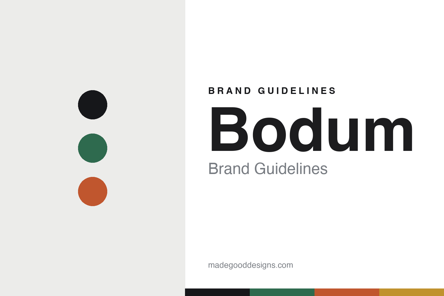
Bodum Brand Guidelines
The democratic French press.
Aa
Two constants: a democratic-bright palette and a democratic sans register. Abstract homage — not the Bodum Chambord, glassware or wordmark.
The democratic French press
Bodum makes good design cheap enough for everyone.
Bodum is a lesson in democratic design as the identity. Founded in 1944 in Copenhagen by Peter Bodum, it built a brand on the belief that good design should be functional and affordable — and made the French press its emblem of that idea.
Its identity is the French press. Bodum makes the flagship Chambord coffee press, plus electric kettles, coffee makers, blenders, frothers and colourful double-wall borosilicate glassware — but the press is the object it is known for. Good design, democratised. A design classic at a supermarket price.
(Honest notes: Bodum was founded in 1944 in Copenhagen, Denmark, by Peter Bodum, who moved from importing glassware into making the MOCCA and SANTOS coffee makers. In 1978 his son Jørgen Bodum moved the company to Switzerland; it remains 100% family-owned, run by Jørgen (with his sister Pia) from Triengen. Its signature is the Chambord French press, and its philosophy — good design should be functional and affordable — is a paraphrase, not a verified verbatim quote. On production, it is mixed: the glass French presses are largely made in Portugal, while appliances and metal parts are made in China and elsewhere — not a single-country origin, so we don’t claim one. There’s no official brand hex, and we reproduce no press, glassware or logo — these tones are an unofficial interpretation. This is design commentary and does not promote any product.)
Colour
Bodum lives in a democratic-bright palette. Click a swatch to copy the hex.
Bodum’s identity is bright, functional and democratic — a green, an ink, a coral, an amber, and a chalk. The palette leans democratic bright — the register of colourful, affordable, everyday design. It signals accessibility and cheer rather than novelty. The honest caveat: with no published brand hex, these tones are an original, unofficial interpretation, not first-party values.
The lesson is a democratic-bright palette signals affordable good design. Bodum’s world is a colourful, everyday object. For designers, it is a reminder that “good design need not be expensive” can be a whole positioning — that colour and function, priced for everyone, is a real strategy — and that an iconic object like the Chambord can anchor a broad range. Because a bright green can fail as small text, keep type dark and let the colour live in the accents, palette and band. The takeaways: price it for everyone; use colour generously; anchor on an icon; and treat any single hex as unofficial.
Typography
The register is a democratic sans — clean, warm, functional.
Bodum’s identity carries a clean, warm, functional spirit — a colourful, everyday object. A friendly grotesque captures the mood: it is approachable and modern, the register of accessible Scandinavian-rooted design. Set in a democratic-bright palette, the democratic sans feels clean and warm — exactly the personality Bodum carries. It is functional rather than fussy, mirroring an everyday classic. (Bodum’s real Chambord, glassware and wordmark are works we describe but do not reproduce, and the exact typeface is not ours to use.) Because it is not ours to use, the honest description is “a democratic sans spirit,” shown here in a stand-in. The type behaves like the brand: clean, warm and functional.
Aa
A democratic sans spirit — clean and warm. (Specimen set in Work Sans, a friendly grotesque STAND-IN; NOT the Bodum wordmark.)
Democratic design as identity
Bodum stands for the democratic French press.
Bodum is a lesson in making democratic design the identity. A democratic-bright palette, a democratic sans and an iconic press make affordable good design the whole brand — bright, functional, accessible. The price is the differentiator. The differentiator is a genuine design classic sold at a price almost anyone can pay.
Put to work, the identity is a principle made physical. A designer building in this spirit would refuse the premium markup and instead let colour, function and a strong signature object carry the brand, so that good design reaches a supermarket shelf rather than a boutique. The lesson Bodum teaches is that accessibility is a position you can own: committing to functional-and-affordable, and anchoring it on one recognisable object like the Chambord, lets a family-owned brand stay coherent across kettles, glassware and blenders for decades.
For designers and brand-builders, Bodum offers a clear takeaway: make good design affordable and mean it. The lessons: price it for everyone; use colour generously; anchor on an icon; and be honest about the story. It is also a reminder to stay accurate: it was founded in 1944 in Copenhagen by Peter Bodum, moved to Switzerland in 1978 under his son Jørgen, and remains family-owned — the palette here is an unofficial interpretation. And it is a reminder that made-where honesty matters even for a design-democratic brand: being clear that the glass presses are largely made in Portugal while appliances are made in China, rather than implying a single origin, keeps the affordable-design story trustworthy. It is a reminder, too, that a founding country and a headquarters can differ: Bodum is Danish by birth and Swiss by base, and saying so plainly is more honest than flattening the two. Bodum made the French press the brand — proof that democratic design can be the difference.
Explore & save
Keep Bodum’s identity on hand — save it to a board in the Made Good inspiration library.
Bodum identity set
Pin the democratic-bright palette and the democratic-sans register to your own board.


