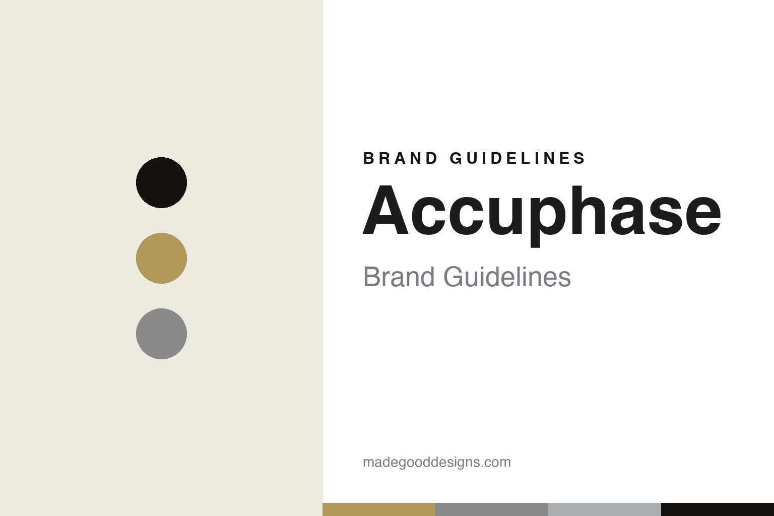
Accuphase Brand Guidelines
The golden face.
Aa
Two constants: a champagne-and-aluminium palette and a heritage sans register. Abstract homage — not an Accuphase amplifier or wordmark.
The golden face
Accuphase builds champagne-gold amplifiers, meant to last for decades, in Yokohama.
Accuphase is a lesson in a look and a promise as the identity. A Japanese maker in Yokohama, it builds high-end amplifiers and players with champagne-gold brushed-aluminium fascias and large analogue meters — and a philosophy that its products should never become obsolete. Electronics, made an heirloom.
Its identity is the golden face. Accuphase’s champagne-gold fronts and its long-life philosophy are the work it is known for. A face, made a signature. A maker that expects its amplifiers to outlive trends.
(Honest notes, so the story stays precise. Accuphase began in 1972 as Kensonic Laboratory — a name it changed to Accuphase in 1982 — founded by Jiro Kasuga, a former Kenwood engineer, with his brother. It is privately held, independent and family-founded, and we use those words rather than “employee-owned,” which we could not verify; its current president is Masaomi Suzuki, not a Kasuga, so we do not say the founder still runs it. Everything is made in Japan, in-house in Yokohama, at low volume. Two things define it: the champagne-gold face, and a genuine “never obsolete” philosophy of long production runs, long-term parts and service, and upgradeable designs — early units are reportedly still serviceable. It is distinct from Luxman and from the American McIntosh, which also use meters. Its designs and name are its IP, described but never reproduced, and there is no official brand hex — these tones are an unofficial interpretation. This is design commentary and does not promote any product.)
Colour
Accuphase lives in a champagne-and-aluminium palette. Click a swatch to copy the hex.
Accuphase’s identity is warm, precise and timeless — a champagne, an ink, an aluminium, a graphite, and a chalk. The palette leans champagne and aluminium: the register of a gold face against brushed metal. It signals longevity and warmth over fashion. The honest caveat: with no published brand hex, these values are an original, unofficial interpretation, not first-party colours.
The lesson is a champagne-and-aluminium palette signals a timeless, heritage identity. Accuphase’s world is a warm, precise, long-lived object. For designers, it is a reminder that a warm metallic palette can carry a brand built on permanence — the champagne of a gold face against the grey of aluminium. Because these tones can fail as small text, keep type dark and let the colour live in the accents, palette and band. The takeaways: hold a look; build to last; support it forever; and treat any single hex as unofficial.
Typography
The register is a heritage sans — warm, precise, timeless.
Accuphase’s identity carries a warm, precise, timeless spirit — a heirloom object, not a throwaway one. A heritage sans captures the mood: clean, considered and classic, the register of a gold-faced amplifier. Set in a champagne-and-aluminium palette, the heritage sans feels warm and timeless — exactly the personality Accuphase carries. It is enduring rather than trendy, mirroring an amplifier meant to last for decades. (Accuphase’s real amplifiers and wordmark are things we describe but do not reproduce, and the exact typeface is not ours to use.) Because it is not ours to use, the honest description is “a heritage-sans spirit,” shown here in a stand-in. The type behaves like the maker: warm, precise and timeless.
Aa
A heritage-sans spirit — warm and timeless. (Specimen set in Jost, a heritage-sans STAND-IN; NOT the Accuphase wordmark or any amplifier design.)
A look and a promise as identity
Accuphase stands for the golden face.
Accuphase is a lesson in making a look and a promise the identity. A champagne-and-aluminium palette, a heritage sans and gold-faced amplifiers make permanence the whole maker — warm, precise and timeless. The longevity is the differentiator. The differentiator is a genuine promise — a consistent gold face and a philosophy that a product should never become obsolete, backed by long production, long support and upgrades.
Put to work, the identity is permanence as design. A maker building in this spirit would hold a recognisable look for decades, design for long life and serviceability, and keep the making at home, so the customer buys into an heirloom rather than a purchase. It would treat “never obsolete” as a real commitment rather than a slogan, so that the promise becomes part of the brand. The lesson Accuphase teaches is that a consistent look plus a real longevity promise can build a brand: the gold face gives it recognition, and the support gives it trust. The look is the personality, and the promise is the proof.
For designers and brand-builders, Accuphase offers a clear takeaway: hold a look and promise longevity. The lessons: keep a face; build to last; support it; and be honest about the story. It is also a reminder to stay accurate: Accuphase began in 1972 as Kensonic, is a privately held, independent Japanese maker, and builds champagne-gold amplifiers in Yokohama under a genuine never-obsolete philosophy — with the palette here an unofficial interpretation. Accuphase made the golden face the maker — proof that a look and a promise can be the difference.
Explore & save
Keep Accuphase’s identity on hand — save it to a board in the Made Good inspiration library.
Accuphase identity set
Pin the champagne-and-aluminium palette and the heritage-sans register to your own board.