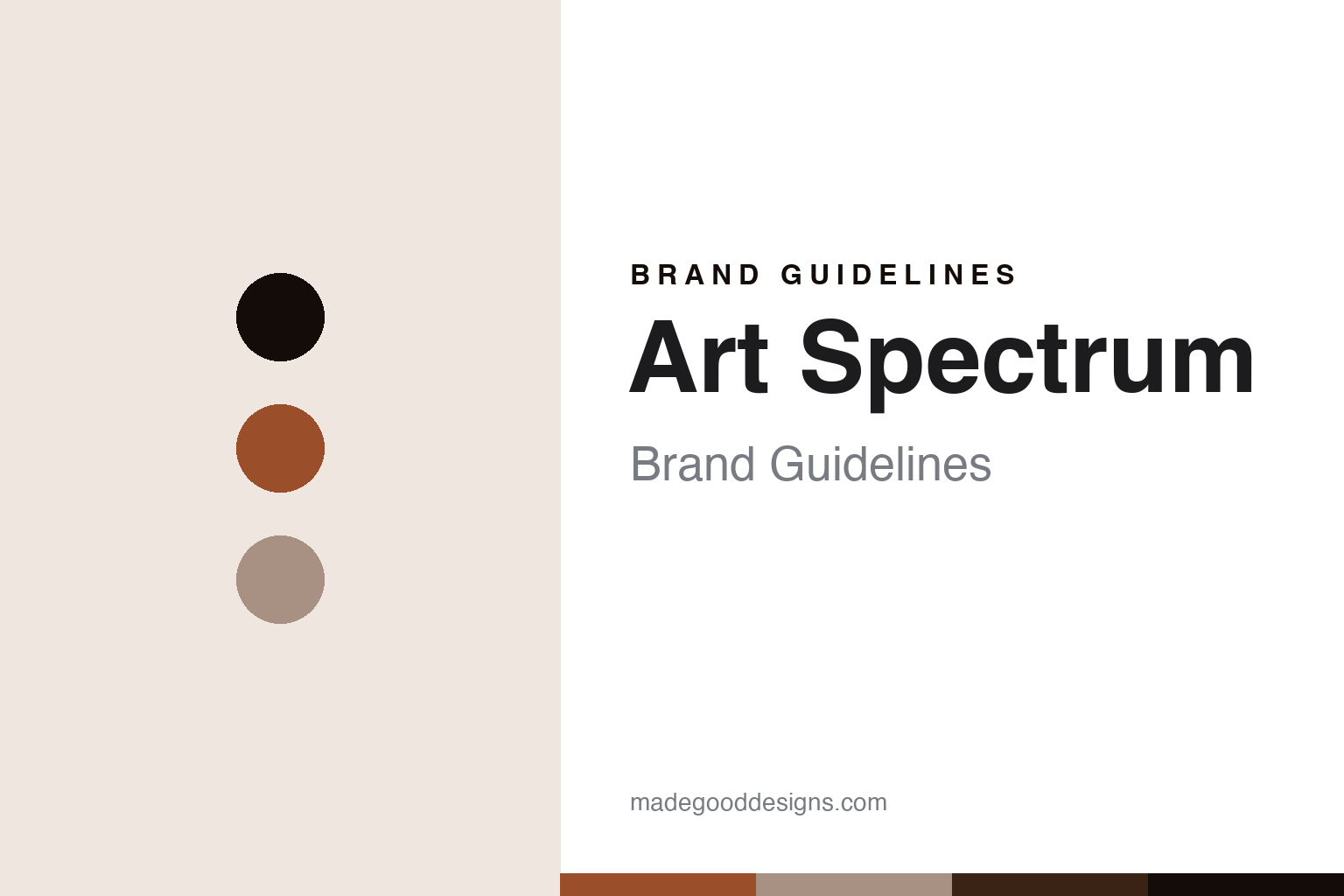
Art Spectrum Brand Guidelines
The colour of Australia.
Aa
Two constants: a burnt-sienna palette and a landscape-sans register. Abstract homage — not an Art Spectrum colour, label or wordmark.
The colour of Australia
Art Spectrum is the independent, family-owned Australian colour maker in Melbourne, 100% Australian-made, known for its oils, pastels and Colourfix ground.
Art Spectrum is a lesson in how a colour is made to match a place. From Melbourne, this family-owned Australian maker produces professional oils, soft pastels and its Colourfix pastel ground — and it develops colours meant to match the specific hues of Australian skies, earth and vegetation. Its answer to how a colour is made is local and considered: use traditional European manufacturing methods, but build a palette that speaks to where its painters actually stand. A colour made for the light of a particular country.
Its identity is the Australian colour maker. Art Spectrum’s oils, its soft pastels and its Colourfix ground are the work it is known for. A colour, tuned to a landscape. A house that stayed small, independent and Australian-made.
(Honest notes, so the story stays precise. Art Spectrum is genuinely 100% Australian-made, in Melbourne — real domestic manufacture, not designed-here and made offshore. It was founded in the early 1960s by Gay and David Keys Snr — David Snr an artist and a fine-art lecturer at RMIT — and it remains family-owned and independent, now run by their son David with his partner Tamara, which sets it apart from the corporately owned houses elsewhere in this round. Its flagships are its professional oils, its soft pastels and Colourfix, which the company markets as “the world’s first pastel surface paper,” sold as both a primer and pre-coated papers — a claim we attribute to the company. It positions itself on “unique Australian colours” for local skies, earth and vegetation, paired with traditional European methods; we describe that concept but do not assert specific colour names we could not confirm. Cultural care matters here: any homage to the Australian landscape stays abstract natural colour and light — we use no Indigenous Australian art motifs or imagery, which carry cultural ownership and are unconnected to the brand. Its name, labels and Colourfix are its IP, described but never reproduced, and there is no official brand hex — these tones are an unofficial interpretation. This is design commentary and does not promote any product.)
Colour
Art Spectrum lives in a burnt-sienna palette. Click a swatch to copy the hex.
Art Spectrum’s identity is earthy, warm and Australian — a burnt sienna, an ink, a linen, an umber, and a paper. The palette leans burnt sienna and linen: the register of sun-warmed earth and a colour tuned to a landscape. It signals place and warmth over gloss. The honest caveat: with no published brand hex, these values are an original, unofficial interpretation, not first-party colours — an abstract nod to a landscape, not a sampled paint or any specific named colour.
The lesson is a burnt-sienna palette signals a place-rooted, made-in-Melbourne identity. Art Spectrum’s world is a local, landscape-tuned, Australian-made object. For designers, it is a reminder that a warm sienna and a soft linen can carry a brand built on a particular light — the colour of dry earth and the linen of a canvas. Because these tones can fail as small text, keep type dark and let the colour live in the accents, palette and band. The takeaways: tune the palette to a place; make it locally; stay independent; and treat any single hex as unofficial.
Typography
The register is a landscape sans — warm, plain, grounded.
Art Spectrum’s identity carries a warm, plain, grounded spirit — a local maker, not a global marque. A landscape sans captures the mood: friendly, even and rooted, the register of a colour tuned to a country. Set in a burnt-sienna palette, the landscape sans feels warm and grounded — exactly the personality Art Spectrum carries. It is plain rather than polished, mirroring an earthy, place-rooted colour. (Art Spectrum’s real labels and marks are things we describe but do not reproduce, and the exact typeface is not ours to use.) Because it is not ours to use, the honest description is “a landscape-sans spirit,” shown here in a stand-in. The type behaves like the house: warm, plain and grounded.
Aa
A landscape-sans spirit — warm and grounded. (Specimen set in Figtree, a landscape-sans STAND-IN; NOT the Art Spectrum wordmark or any label.)
The house behind the colour
Art Spectrum stands for the colour tuned to a place.
Art Spectrum is a lesson in how a colour is made to belong to a landscape. A burnt-sienna palette, a landscape sans and a locally made oil make one thing — a colour tuned to Australian light — the whole house: earthy, warm and Australian. The place-matched palette is the differentiator, and the independent local making is the meaning. The point is a colour house that builds its range around the specific hues of its own country, and keeps the making at home rather than sending it abroad.
Put to work, the identity is place as design. A colour house in this spirit would tune its palette to where its painters actually stand, keep manufacture local and independent, and be honest and careful about the culture of that place — celebrating the landscape’s colour and light without appropriating the art of its First Peoples. A brand learning from it would see that a place-rooted identity is durable — that colours named for local skies and earth give an Australian maker something no global house can copy — and that being precise, 100% Australian-made, family-owned since the early 1960s, keeps the claim honest against bigger, corporately owned rivals. A brand learning from it would also treat cultural care as part of the brand: an homage to a landscape must stay abstract natural colour, never borrow Indigenous design language, because respect for a place includes respect for its people. The lesson Art Spectrum teaches is that place can hold an identity: the local palette gives it distinctiveness, and the independent making gives it integrity. The landscape is the personality, and the place-tuned colour is the proof.
For designers and brand-builders, Art Spectrum closes this round about the house behind the colour, from Australia: tune the colour to a place, make it locally, and honour that place with care. The lessons: match the palette to a landscape; keep manufacture at home; stay independent; treat local culture respectfully; and never reproduce a protected label or appropriate Indigenous imagery. It is also a reminder to stay precise: Art Spectrum is an independent, family-owned Australian colour maker in Melbourne, 100% Australian-made, known for its oils, pastels and Colourfix ground — with the palette here an unofficial interpretation. Art Spectrum made place the identity — proof that a colour tuned to a landscape can be the difference.
Explore & save
Keep Art Spectrum’s identity on hand — save it to a board in the Made Good inspiration library.
Art Spectrum identity set
Pin the burnt-sienna palette and the landscape-sans register to your own board.