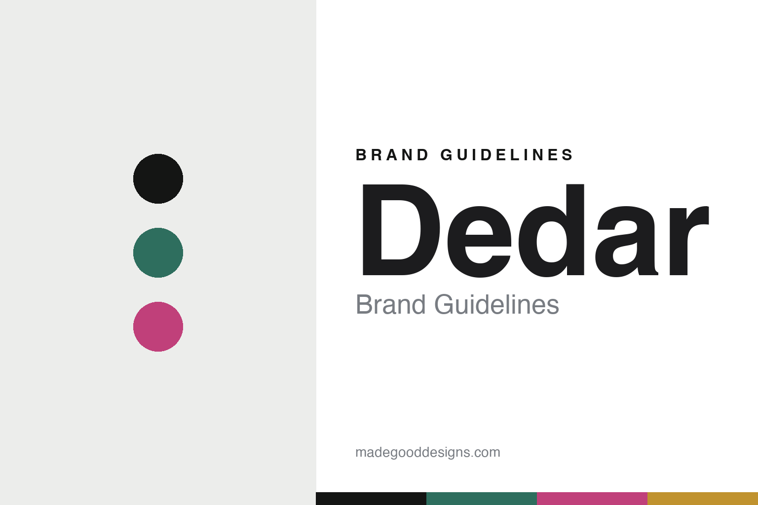
Dedar Brand Guidelines
The colour & fibre.
Aa
Two constants: an emerald-and-magenta palette and a colour sans register. Abstract homage — not the Dedar fabrics, weave or packaging.
The colour & fibre
Dedar builds fabrics on colour and fibre.
Dedar is a lesson in colour and fibre as identity. An Italian family-run house of furnishing fabrics and wallcoverings, it pairs precious yarns with fibre-technology research — a materials-led editor of cloth for curtains, sheers, upholstery and walls.
Its identity is bold colour, engineered fibre. Dedar is known for saturated, confident colour and for the quality and texture of its yarns, presented as a design-led editor’s collections rather than a single mill’s output. Its cultural side runs to a “Weaving Anni Albers” project (with the Albers foundation) and support for textile students at Milan’s Brera Academy. Colour and fibre, treated as the whole point.
(Honest notes: Dedar describes itself as an Italian family-run house of fabrics and wallcoverings — that much is verified from its own site, along with the Anni Albers collaboration. Its founding is reported as 1976 near Como, by Nicola and Elda Fabrizio, with a second generation now running it, and it’s headquartered in the Como textile district — but these details we treat as reported and hedge, as we do “woven in Italy.” It is a separate, independent house — not part of Hermès, and there’s no confirmed production relationship — so we don’t mention one. There’s no official brand hex, and we reproduce no actual fabric — these tones are an unofficial interpretation. This is design commentary and does not promote any product.)
Colour
Dedar lives in an emerald-and-magenta palette. Click a swatch to copy the hex.
Dedar’s identity is saturated, contemporary and Italian — an emerald, an ink, a magenta, a gold, and a chalk. The palette pairs an emerald with a magenta — the register of bold, colour-forward fabrics. It signals colour and fibre rather than novelty. The honest caveat: with no published brand hex, these tones are an original, unofficial interpretation, not first-party values.
The lesson is an emerald with a magenta signals a colour-led fabric house. Dedar’s world is a saturated, textural cloth. For designers, it is a reminder that confident colour and fibre research — not pattern alone — can be the whole identity. Because a mid emerald can fail as small text, keep type dark and let the colour live in the accents, palette and band. The takeaways: lead with colour; research the fibre; edit rather than imitate; and treat any single hex as unofficial.
Typography
The register is a colour sans — saturated, contemporary, Italian.
Dedar’s identity carries a saturated, contemporary, Italian spirit — a colour-forward, textural fabric. A clean contemporary sans captures the mood: it is confident and modern, the register of a design-led editor. Set in an emerald-and-magenta palette, the colour sans feels saturated and contemporary — exactly the personality Dedar carries. It is bold rather than quiet, mirroring colour-forward cloth. (Dedar’s real fabrics, weaves and wordmark are works we describe but do not reproduce, and the exact typeface is not ours to use.) Because it is not ours to use, the honest description is “a colour sans spirit,” shown here in a stand-in. The type behaves like the brand: saturated, contemporary and Italian.
Aa
A colour sans spirit — saturated and contemporary. (Specimen set in Sora, a clean contemporary sans STAND-IN; NOT the Dedar packaging.)
Colour and fibre as identity
Dedar stands for bold colour and engineered fibre.
Dedar is a lesson in making colour and fibre the identity. An emerald-and-magenta palette, a colour sans and a saturated cloth make bold colour the whole brand — saturated, contemporary, Italian. The colour is the differentiator. The differentiator is confident colour plus fibre research, edited into collections.
For designers and brand-builders, Dedar offers a clear takeaway: own colour and material. The lessons: lead with colour; research the fibre; edit rather than imitate; and be honest about the story. It is also a reminder to stay accurate: it’s an Italian family-run house (reportedly founded 1976 near Como), it collaborates with the Anni Albers foundation, and it isn’t part of Hermès — the palette here is an unofficial interpretation. Dedar made colour and fibre the brand — proof that colour can be the difference.
Explore & save
Keep Dedar’s identity on hand — save it to a board in the Made Good inspiration library.
Dedar identity set
Pin the emerald-and-magenta palette and the colour-sans register to your own board.


