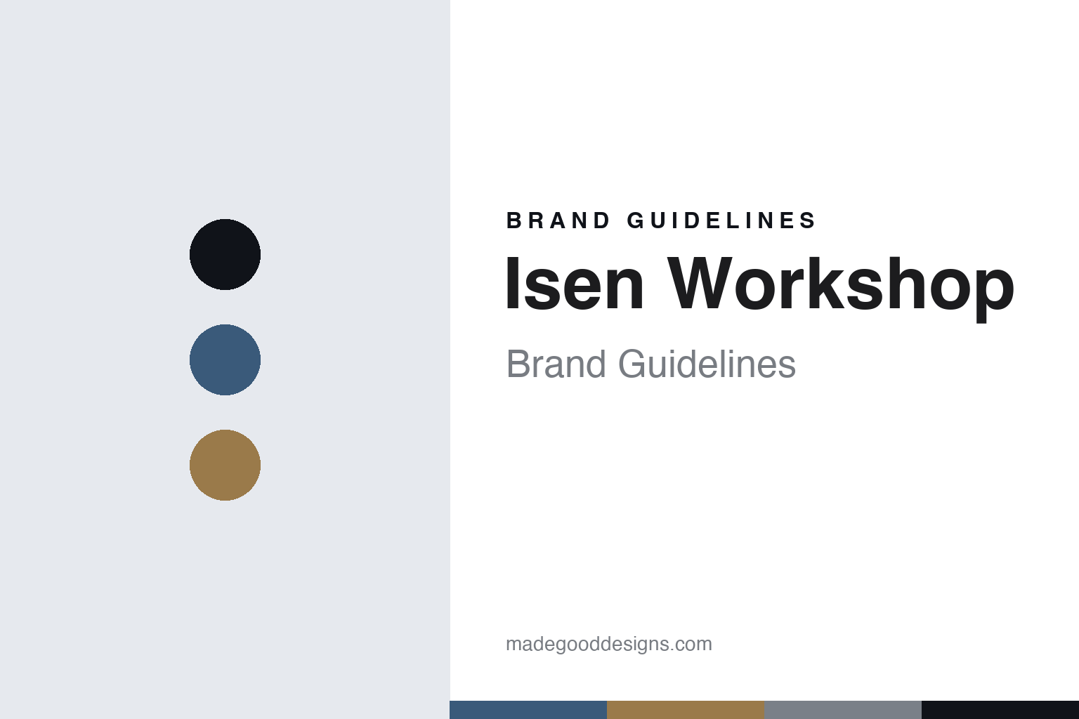
Isen Workshop Brand Guidelines
The clean line.
Aa
Two constants: a slate-blue-and-ochre palette and a studio sans register. Abstract homage — not an Isen frame or wordmark.
The clean line
Isen Workshop builds and hand-paints clean, TIG-welded production steel frames in London.
Isen Workshop is a lesson in clean, accessible making as the identity. A British studio in London, it builds TIG-welded steel bicycle frames — made to order in stock sizes, then hand-painted in-house with candy-fade finishes and brass head badges. Steel, made clean and attainable.
Its identity is the clean line. Isen’s neat, sleek, hand-painted production frames are the work it is known for. A silhouette, made a signature. A studio that makes hand-built steel more attainable.
(Honest notes, so the story stays precise. Isen Workshop is a collaboration between two London framebuilders — Caren Hartley of Hartley Cycles and Matt McDonough of Talbot Frameworks — and we credit them, not any unrelated builder; it launched around 2017. It is deliberately a stand-alone brand for off-the-peg, made-to-order production frames in stock sizes, kept separate from its founders’ bespoke businesses, so we describe it as production rather than fully custom. Everything is designed, hand-built and hand-painted in London, in its Mitcham workshop. On method: its production frames are TIG-welded — not fillet-brazed, which is the signature of the founders’ bespoke shops — with silver-brazed head badges and braze-ons, from a mix of Reynolds, Columbus and Dedacciai tubing. Its frames and name are its IP, described but never reproduced, and there is no official brand hex — these tones are an unofficial interpretation. This is design commentary and does not promote any product.)
Colour
Isen lives in a slate-blue-and-ochre palette. Click a swatch to copy the hex.
Isen’s identity is clean, modern and understated — a slate blue, an ink, an ochre, a stone, and a chalk. The palette leans slate blue and ochre: the register of a sleek, considered production frame. It signals clarity and restraint over noise. The honest caveat: with no published brand hex, these values are an original, unofficial interpretation, not first-party colours.
The lesson is a slate-blue-and-ochre palette signals a clean, modern identity. Isen’s world is a sleek, considered, attainable object. For designers, it is a reminder that a calm, modern palette can carry a brand built on clarity — cool grounds and a single warm accent. Because these tones can fail as small text, keep type dark and let the colour live in the accents, palette and band. The takeaways: keep it clean; weld it neatly; paint it in-house; and treat any single hex as unofficial.
Typography
The register is a studio sans — clean, modern, considered.
Isen’s identity carries a clean, modern, considered spirit — a sleek object, not a fussy one. A studio sans captures the mood: neat, even and quietly contemporary, the register of a well-made production frame. Set in a slate-blue-and-ochre palette, the studio sans feels clean and modern — exactly the personality Isen carries. It is considered rather than ornate, mirroring a sleek, TIG-welded line. (Isen’s real frames and wordmark are things we describe but do not reproduce, and the exact typeface is not ours to use.) Because it is not ours to use, the honest description is “a studio-sans spirit,” shown here in a stand-in. The type behaves like the studio: clean, modern and considered.
Aa
A studio-sans spirit — clean and modern. (Specimen set in Schibsted Grotesk, a studio-sans STAND-IN; NOT the Isen wordmark or any frame design.)
Clean making as identity
Isen Workshop stands for the clean line.
Isen Workshop is a lesson in making clean, attainable craft the identity. A slate-blue-and-ochre palette, a studio sans and sleek, hand-painted production frames make clarity the whole studio — clean, modern and considered. The clean line is the differentiator. The differentiator is a genuine idea — taking the skills of two bespoke framebuilders and channelling them into neat, well-made frames that more people can own.
Put to work, the identity is clarity as design. A studio building in this spirit would define a clear, repeatable product, keep the making and painting in-house, and be honest about what is production and what is bespoke, so the customer buys into clean design and real craft at a reachable price. It would also treat production not as a lesser path but as a discipline of its own, spending its craft on consistency and fit across a whole range rather than on one-off showpieces, so that even an off-the-peg frame still reads as considered. The lesson Isen teaches is that clarity plus real craft can build a brand: the clean line gives it a look, and the making gives it substance. The clarity is the personality, and the craft is the proof.
For designers and brand-builders, Isen offers a clear takeaway: make clean, attainable craft the brand. The lessons: keep it clean; weld it neatly; paint in-house; and be honest about the story. It is also a reminder to stay accurate: Isen Workshop is a London collaboration between Caren Hartley and Matt McDonough, TIG-welding and hand-painting production steel frames in Mitcham — a stand-alone production brand distinct from their bespoke shops — with the palette here an unofficial interpretation. Isen made the clean line the studio — proof that clarity can be the difference.
Explore & save
Keep Isen Workshop’s identity on hand — save it to a board in the Made Good inspiration library.
Isen Workshop identity set
Pin the slate-blue-and-ochre palette and the studio-sans register to your own board.