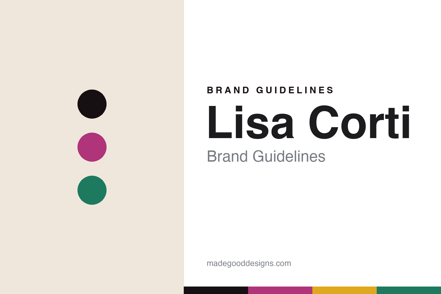
Lisa Corti Brand Guidelines
The block print.
Aa
Two constants: a vivid multicolour palette and a vivid sans register. Abstract homage — not the Lisa Corti prints or packaging.
The block print
Lisa Corti prints colour into cotton.
Lisa Corti is a lesson in the block print as identity. Founded in 1986 in Milan by the artist Lisa Corti — born in Asmara and raised in the Horn of Africa — the house turns cotton into bold, saturated, hand-block-printed colour.
Its identity is the block print. Lisa Corti is known for vivid multicolour cottons across home textiles — quilts, tablecloths, cushions and its signature square “mezzeri” cloths — and clothing, in patterns drawn from Indian and African craft traditions. Colour, printed by hand, everywhere. A print that is impossible to mistake.
(Honest notes: Lisa Corti was founded in 1986 in Milan by the Asmara-born artist Lisa Corti; it is independent and family-run, now led by her daughter Ida Corti as CEO and creative director. Crucially on the make-where: the patterns are designed in Milan but hand-block-printed in India — so we don’t call it “Made in Italy,” we call it designed in Milan, printed in India. Its influences are India and Africa (any “Mediterranean” read is ours, not the brand’s wording). It is an Italian house drawing on Indian and African craft and Indian artisan labour; we state that neutrally — the company foregrounds the craft and its artisans, and we found no documented controversy, so we don’t imply one. There’s no official brand hex, and we reproduce no actual print — these tones are an unofficial interpretation. This is design commentary and does not promote any product.)
Colour
Lisa Corti lives in a vivid multicolour palette. Click a swatch to copy the hex.
Lisa Corti’s identity is vivid, saturated and joyful — a magenta, an ink, an emerald, a marigold, and a cream. The palette pairs a magenta with an emerald — the register of a bold block print. It signals colour and craft rather than novelty. The honest caveat: with no published brand hex, these tones are an original, unofficial interpretation, not first-party values.
The lesson is a magenta with an emerald signals a block-print house. Lisa Corti’s world is a saturated, printed cloth. For designers, it is a reminder that unapologetic colour, printed by hand, can be the whole identity. Because a mid magenta can fail as small text, keep type dark and let the colour live in the accents, palette and band. The takeaways: go bold with colour; print by hand; honour the craft; and treat any single hex as unofficial.
Typography
The register is a vivid sans — bold, saturated, joyful.
Lisa Corti’s identity carries a bold, saturated, joyful spirit — a printed, colour-forward cloth. A confident geometric sans captures the mood: it is warm and modern, the register of a colour-led house. Set in a vivid multicolour palette, the vivid sans feels bold and saturated — exactly the personality Lisa Corti carries. It is joyful rather than restrained, mirroring a saturated print. (Lisa Corti’s real prints, mezzeri and wordmark are works we describe but do not reproduce, and the exact typeface is not ours to use.) Because it is not ours to use, the honest description is “a vivid sans spirit,” shown here in a stand-in. The type behaves like the brand: bold, saturated and joyful.
Aa
A vivid sans spirit — bold and saturated. (Specimen set in Poppins, a confident geometric sans STAND-IN; NOT the Lisa Corti packaging.)
The block print as identity
Lisa Corti stands for the block print.
Lisa Corti is a lesson in making colour the identity. A vivid multicolour palette, a vivid sans and a saturated cloth make the block print the whole brand — bold, saturated, joyful. The print is the differentiator. The differentiator is colour laid into cotton by hand, in traditional Indian block-printing.
For designers and brand-builders, Lisa Corti offers a clear takeaway: own colour and craft. The lessons: go bold with colour; print by hand; honour the craft; and be honest about the story. It is also a reminder to stay accurate: it was founded in 1986 by the Asmara-born Lisa Corti, it is family-run under Ida Corti, and it is designed in Milan and hand-block-printed in India — the palette here is an unofficial interpretation. Lisa Corti made the block print the brand — proof that colour can be the difference.
Put to work, colour carries everything. The vivid multicolour palette can hold a page by itself, so the ink grounds the text, the vivid sans stays bold but readable, and the block-print idea lives in saturation and repetition rather than in a copied pattern. A designer building in this spirit would let one saturated field dominate, then answer it with a second, near-clashing hue, keeping the type dark so the colour never has to work as small text. The lesson Lisa Corti teaches is that hand-printed colour reads warmer than printed-on colour — a good homage honours the hand, not just the hue. As you borrow it, keep the record straight: Lisa Corti was founded in 1986 in Milan by the Asmara-born artist of the same name, it is family-run under her daughter Ida Corti, and its cottons are designed in Milan and hand-block-printed in India — so it is not made in Italy but designed in one country and printed in another, and the tones here are an unofficial interpretation rather than first-party values.
Explore & save
Keep Lisa Corti’s identity on hand — save it to a board in the Made Good inspiration library.
Lisa Corti identity set
Pin the vivid-multicolour palette and the vivid-sans register to your own board.


