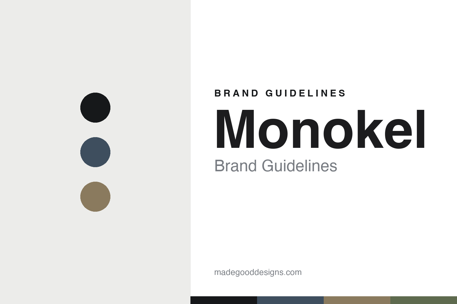
Monokel Brand Guidelines
The minimalist sunglass.
Aa
Two constants: a Nordic-slate palette and a minimalist sans register. Abstract homage — not the Monokel frames or wordmark.
The minimalist sunglass
Monokel strips the sunglass back.
Monokel is a lesson in Nordic minimalism as the identity. Founded in Stockholm in the early 2010s by Fredrik Sävenberg and Robert Sandgren — with roots in snowboard and film culture — it makes pared-back, functional sunglasses.
Its identity is the minimalist sunglass. Monokel makes clean, unisex sunglasses (with optical options through retailers) in a mid-century-influenced Scandinavian register — simple silhouettes, restrained detail, bio-based and recycled acetate with Carl Zeiss lenses. Less frame, more form. A sunglass reduced to essentials.
(Honest notes: Monokel was founded in Stockholm by Fredrik Sävenberg and Robert Sandgren; its founding year is genuinely contested across sources (2011, 2013 and 2015 all appear), so we say “the early 2010s.” Its materials are well documented — bio-based and recycled acetate, with Carl Zeiss lenses — but its manufacturing country is not publicly disclosed, so we don’t assert one. It presents as an independent Swedish brand, though its corporate structure isn’t verified. Note it is distinct from Monocle magazine’s eyewear (a retailer sometimes mislabels it): this is Swedish MONOKEL. There’s no official brand hex, and we reproduce no frame or logo — these tones are an unofficial interpretation. This is design commentary and does not promote any product.)
Colour
Monokel lives in a Nordic-slate palette. Click a swatch to copy the hex.
Monokel’s identity is minimal, Nordic and restrained — a slate, an ink, a sand, a sage, and a chalk. The palette leans Nordic slate — the register of clean, mid-century-influenced Scandinavian design. It signals restraint and function rather than novelty. The honest caveat: with no published brand hex, these tones are an original, unofficial interpretation, not first-party values.
The lesson is a Nordic-slate palette signals a minimalist eyewear brand. Monokel’s world is a spare, essential object. For designers, it is a reminder that reduction — clean silhouettes, muted tones, no ornament — can itself be the identity in a category prone to logos and flash. Because a mid slate can fail as small text, keep type dark and let the colour live in the accents, palette and band. The takeaways: reduce the form; keep tones muted; let material speak; and treat any single hex as unofficial.
Typography
The register is a minimalist sans — clean, functional, Nordic.
Monokel’s identity carries a clean, functional, Nordic spirit — a pared-back, essential object. A grotesque sans captures the mood: it is quiet and modern, the register of a Scandinavian studio. Set in a Nordic-slate palette, the minimalist sans feels clean and functional — exactly the personality Monokel carries. It is restrained rather than loud, mirroring a reduced silhouette. (Monokel’s real frames and wordmark are works we describe but do not reproduce, and the exact typeface is not ours to use.) Because it is not ours to use, the honest description is “a minimalist sans spirit,” shown here in a stand-in. The type behaves like the brand: clean, functional and Nordic.
Aa
A minimalist sans spirit — clean and functional. (Specimen set in Archivo, a grotesque sans STAND-IN; NOT the Monokel wordmark.)
Nordic minimalism as identity
Monokel stands for the minimalist sunglass.
Monokel is a lesson in making Nordic minimalism the identity. A Nordic-slate palette, a minimalist sans and a pared-back frame make reduction the whole brand — minimal, Nordic, restrained. The restraint is the differentiator. The differentiator is a sunglass stripped to its essentials, in honest materials.
Put to work, the identity is subtraction as a stance. A designer building in this spirit would strip a frame to clean silhouettes and muted tones, let good materials (bio-based acetate, quality lenses) carry the quality message, and avoid the logos and flash the category defaults to. The lesson Monokel teaches is that in eyewear — where many brands shout — quiet can be the loudest position: a reduced, well-made frame signals confidence and taste, and lets the wearer, not the branding, be the focus. Being candid about an uncertain founding year and undisclosed manufacturing keeps that restraint honest rather than mysterious.
For designers and brand-builders, Monokel offers a clear takeaway: let restraint be the position. The lessons: reduce the form; keep tones muted; let material speak; and be honest about the story. It is also a reminder to stay accurate: it was founded in Stockholm by Fredrik Sävenberg and Robert Sandgren in the early 2010s, it uses bio-based and recycled acetate with Zeiss lenses, and its manufacturing location is undisclosed — the palette here is an unofficial interpretation. And it is a reminder that reduction is harder than it looks: a plain frame has nowhere to hide a bad proportion, so minimalism forces the design to be right rather than merely decorated, and that discipline is exactly what a discerning buyer is paying for. It is also a reminder that honesty about what is not disclosed — a contested founding year, an unnamed factory — reads as confidence rather than weakness when the product itself is this assured. Monokel made the minimalist sunglass the brand — proof that restraint can be the difference.
Explore & save
Keep Monokel’s identity on hand — save it to a board in the Made Good inspiration library.
Monokel identity set
Pin the Nordic-slate palette and the minimalist-sans register to your own board.