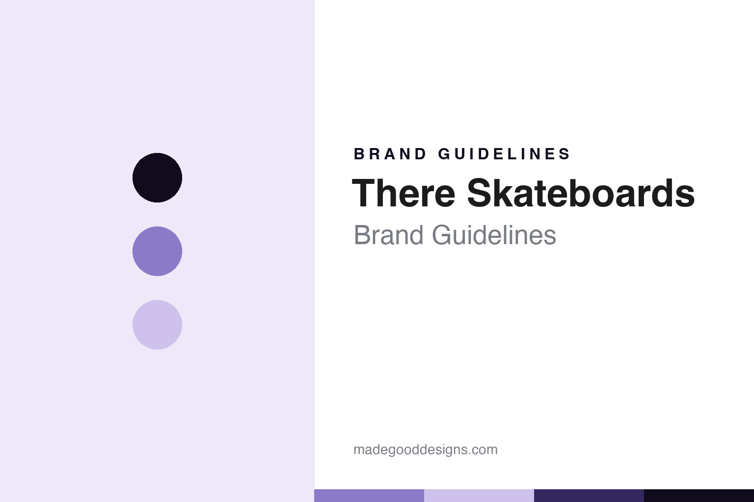
There Skateboards Brand Guidelines
The queer- and trans-centered deck brand.
Aa
Two constants: a There-lavender palette and a community-sans register. Abstract homage — not a There product or mark; no deck, graphic, logo or pride-flag motif is reproduced.
The queer- and trans-centered deck brand
There Skateboards is the queer- and trans-centered skateboard brand that emerged around 2019–2020, built around community.
There Skateboards closes this indie round as its community-centered brand — a skateboard brand created for and by trans and queer skaters, which emerged around 2019 and 2020 and foregrounds community above all. There makes and sells the decks, and its answer to a round about independence is a brand whose mission, more than any owner, defines it. A brand, community.
Its identity is the queer- and trans-centered deck brand. The community mission, the emergence around 2019–2020 and the stated focus on unity are the story here — reported with care, and with what is documented kept separate from what is not. A brand, community. The queer- and trans-centered deck brand.
(Honest notes, framed with respect. There Skateboards sells skateboard decks as its heroes, and we report its performance language as the brand’s own. What is documented: it is genuinely a queer- and trans-centered brand — a reputable LGBTQ-plus skate outlet profiled it in 2020, which places its emergence around 2019 to 2020 and confirms the community framing — and its own storefront foregrounds community and unity. We center that community and mission — a brand created for and by trans and queer skaters — rather than reducing it to a label or a novelty, and we avoid tokenizing language. What we could not verify: its exact founders, its legal ownership, and the precise nature of a sometimes-cited link to a related brand — so we do not assert founder names or ownership, and we describe the brand’s stated mission rather than labeling individuals. Where a person is named in a brand’s own press, they should be referred to only with the names and identity language they use themselves — so we hold those specifics open until they can be verified. We disambiguate it as There Skateboards, because “there” is a common word. Its designs are IP we describe but do not reproduce; we use no pride-flag or rainbow motif as decoration; there is no official brand hex; these tones are an unofficial interpretation.)
Colour
There lives in a There lavender. Click a swatch to copy the hex.
There’s identity is community-centered, welcoming and modern — a There lavender, an ink, a pale lilac, a deep violet, and a paper. The palette leans There lavender and pale lilac: a calm, dignified register held as a single considered colour, deliberately not a rainbow or pride-flag motif, so the brand is honoured rather than tokenized. It signals a queer- and trans-centered deck brand. The honest caveat: with no published brand hex, these values are an original, unofficial interpretation, not first-party colours.
The lesson is a There lavender signals a community-centered identity, held with care. There’s world is a community of trans and queer skaters. For designers, it is a reminder that a dignified single colour can carry a community brand far better than a borrowed symbol — a calm tone held as colour, never as a flag. Because these tones can fail as small text, keep type dark and let the colour live in the accents, palette and band. The takeaways: center the community and mission; avoid tokenizing language; hold founders and ownership open; and treat any single hex as unofficial.
Typography
The register is a community sans — community-centered, plain, welcoming.
There’s identity carries a community-centered, plain, welcoming spirit — a mission-led brand, not a graphics label. A community sans captures the mood: clean, warm and confident, the register of a brand defined by who it is for. Set in a There-lavender palette, the community sans feels community-centered and welcoming — exactly the personality There carries, held with care. It is a made deck rather than a logo, mirroring maple veneer. (There’s real decks, graphics and logo are things we describe but do not reproduce, and the exact typeface is not ours to use.) Because it is not ours to use, the honest description is “a community-sans brand,” shown here in a stand-in. The type behaves like the brand: community-centered, plain and welcoming.
Aa
A community-sans brand — community-centered and welcoming. (Specimen set in Manrope, a community-sans STAND-IN; NOT the There logo, and no pride-flag motif.)
The indie
There Skateboards stands for the queer- and trans-centered deck brand.
There Skateboards closes the indie round as its community-centered brand. A There-lavender palette, a community sans and a community mission make one thing — the queer- and trans-centered deck brand — the whole identity: community-centered, welcoming and modern. The community mission is the pitch, and the emergence around 2019–2020 is what is documented. The point is a brand whose mission defines it, closing a round about independence.
Put to work, the identity is the brand told with care — the community centered, and the documented kept separate from the unverified. A maker in this spirit would center the community and mission, avoid tokenizing language, and hold founders and ownership open. A reader in this spirit would keep the facts right and respectful: There Skateboards sells skateboard decks as its heroes; it is genuinely a queer- and trans-centered brand, profiled in 2020 by a reputable LGBTQ-plus skate outlet, which places its emergence around 2019 to 2020, and its own storefront foregrounds community and unity; its exact founders, legal ownership and a sometimes-cited related-brand link could not be verified, so none are asserted, and its stated mission is described rather than individuals labeled; any named person should be referred to only with the names and identity language they use themselves, held open until verified; and no pride-flag or rainbow motif is used as decoration. There closes the round, its community-centered brand, after DGK. The honest editorial moves are to center the community and mission, to keep documented and unverified separate, to hold founders open, and to avoid tokenizing symbols.
For designers and brand-builders, There closes the indie: center the community and mission — and keep documented separate from unverified. The lessons: let a mission define a brand more than its owner; center a community rather than tokenize it; state plainly what is documented and what is not; refer to people only with the language they use themselves, and hold it open until verified; hold a dignified single colour rather than a borrowed symbol; and never reproduce a mark. It is also a reminder to stay precise: There Skateboards is the queer- and trans-centered skateboard brand that emerged around 2019–2020, built around community — with the palette here an unofficial interpretation. Read that way, There is less a deck than a community: welcoming, mission-led, modern. The lesson for a brand is that a centered community and honest limits reinforce each other, and keeping the documented separate from the unverified keeps the story earned and respectful. There made the-queer-and-trans-centered-deck-brand the identity — proof that a mission can close a round.
Explore & save
Keep There Skateboards’s identity on hand — save it to a board in the Made Good inspiration library.
There Skateboards identity set
Pin the There-lavender palette and the community-sans register to your own board.