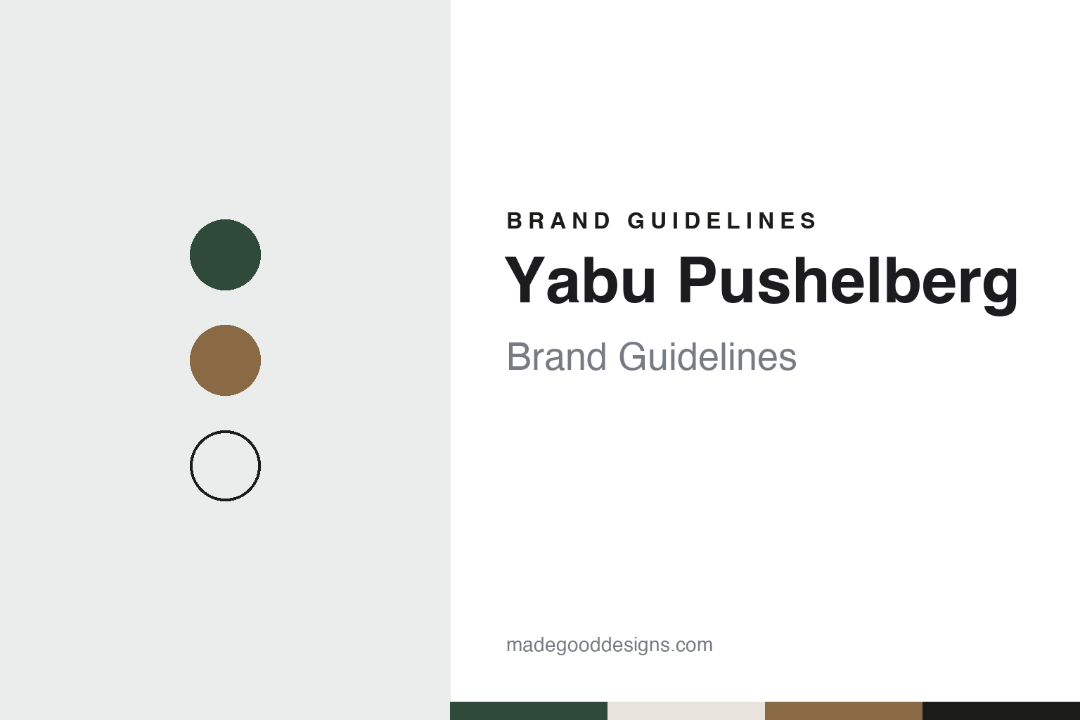
Yabu Pushelberg Brand Guidelines
The Toronto and New York studio behind hotels, stores and furniture.
Aa
Two constants: a green, bronze and stone palette and a geometric sans register. Abstract homage — not a Yabu Pushelberg project or mark; no interior, product or logo is reproduced.
Toronto, 1980
Two designers, two studios.
Yabu Pushelberg is an interior-design practice with studios in Toronto and New York. It was founded in Toronto in 1980 by the Canadian designers George Yabu and Glenn Pushelberg, the date given by Dezeen in 2019 and by English Wikipedia. The practice trades under the two founders’ surnames, and it uses that double name for everything it signs, from hotel lobbies and department-store floors to tables, chairs and lighting.
The New York office grew out of a retail commission. Dezeen reported in March 2019 that the studio set up a second office in New York in the 1990s to build on its interior for the Bergdorf Goodman store in the city. In 2019 the firm moved into a building in Manhattan’s TriBeCa neighbourhood where, the magazine said, it had bought all three floors. Glenn Pushelberg told Dezeen the building was “really double the space we need,” and that the lower level would host installations, talks and dinners with visiting chefs alongside the design work.
The studio’s own team page, read in November 2026, names Waqas Ahmed as chief executive, working from the Toronto studio, and English Wikipedia dates his appointment to 2025. The same page says the studio’s product practice has been led since 2012 by Bahar Ghaemi, its Creative Director of Product, with a team of ten that designs bespoke furniture, lighting, accessories, textiles and fixtures for the studio’s own projects. It describes the practice as working “around the world, in two studios,” and opens with a short section headed “yabu who?” on how the two founders work together.
The studio’s client work runs across hotel groups, department stores and furniture makers, according to Dezeen. This guide looks at three of its projects in detail: two hotels, one in New York and one in London, and a Paris department store.
Colour
Hotels as a series of rooms.
Hotels make up much of the studio’s published work. For The Times Square Edition in New York, completed for the hotelier Ian Schrager in 2019, Dezeen described a 452-room building of 42 storeys rising behind a 17,000-square-metre LED billboard. “We didn’t want it to feel like a big hotel,” George Yabu told the magazine; the idea was to break it into a series of smaller, more residential spaces. The interiors leaned on botanicals and a neutral palette, with terraces treated as outdoor rooms. The firm had planned black-and-white guest rooms, Dezeen reported, and then chose neutral rooms with white oak floors, linen armchairs and lampshades and parchment-coloured curtains, set against the colour of the streets outside. The restaurant 701West had electric-blue and chartreuse velvet banquettes, mahogany panelling and white marble mosaic floors. The hotel had a short life: Dezeen reported in May 2020 that it was due to close permanently on 13 August that year.
In London the studio took a theatrical theme. The Londoner, a five-star hotel on Leicester Square that Dezeen covered in August 2022, spreads over 16 floors, and each of its public rooms is themed on a member of a theatre or film production, from the cinematographer at reception to the sound mixer in a basement bar called The Green Room, where undulating walls and curved velvet furniture suggest sound waves. Glenn Pushelberg called the hotel “an homage to performance.” The 350 bedroom suites were kept brighter and more minimal, the magazine reported, and the styling ran to custom gramophones in the club and oversized slices of fruit carved from coloured stone in the spa.
The studio’s retail work includes a historic building in Paris. At La Samaritaine in Paris, the LVMH-owned department store that reopened in 2021 after a long closure, Yabu Pushelberg redesigned the art nouveau part of the building, now called the Pont Neuf side, while SANAA, Hubert de Malherbe and Ciguë worked on other parts, Wallpaper* reported in June 2021. The designers told the magazine they wanted the store to speak to Parisians as well as to visitors. They softened an original yolk-yellow, settled on bronze metals, blond woods and the ironwork’s original grey-blue, and divided the floors with custom rugs and furniture in place of walls. The 6,000 square metres of terrazzo, hand-laid with marble insets, came from a New York-based terrazzo maker; the designers had to argue for it, Wallpaper* said, because terrazzo is not a French material. “It’s important that you have this quiet personality that is respectful and responsive to the old building,” Glenn Pushelberg said.
Typography
How interior practices present themselves.
Interior-design practices rarely build their identity the way product brands do. Most trade under the names of their founders, either as a pair of surnames, as Yabu Pushelberg does, or as a single word that joins the studio and its founder, as Studioilse does. The name appears on the website, in press credits and on furniture collections, and it is usually set plainly, with the work itself left to carry the character.
Project photography does much of that work. The practices in this guide present hotels, restaurants, shops and homes through photographs credited to named photographers, with short project titles, a city and a year. Trade magazines such as Dezeen and Wallpaper* usually report a project when it opens, quoting the designers on materials, colours and the building they started from, and those dated reports are the main record of who designed what.
Many practices also design furniture, lighting and objects, often with established manufacturers, and show them at furniture fairs, in exhibitions or in their own studios. Some publish books on their work or write about design more widely. Founders and partners are presented in their professional roles: as designers, creative directors or teachers, and as the people quoted when a project is published.
Offices are described plainly, often as a city and a building, and some practices treat their own studio as a project in its own right. Pages on history and clients tend to be short. This guide sets out what dated sources say about each practice: when and where it was founded, who leads it, and which projects and collections are credited to it, leaving out award lists and private clients.
Aa
A geometric sans for a two-name studio. (Specimen set in Jost, a sans STAND-IN; NOT the Yabu Pushelberg logo.)
Furniture and the studio
Interiors that turn into products.
Furniture has become a second line of work. In March 2019 Dezeen reported that Yabu Pushelberg had shown two collections made with the Italian furniture brand Henge in its new TriBeCa space: the Puddle side tables, in polished silver, bronze and burnished brass, each cast in a wooden mould that is thrown away after use so that every top differs; and the Noce dining and lounge chairs, set on three hand-made solid-wood legs. The installation turned the floor into a forest, with grassy mounds, a film of woodland by the artist Jason Bruges and mirrors shaped like pools of water. The same report mentioned an earlier Mushroom table series with Henge and lighting for Lasvit. English Wikipedia says several of the studio’s collections have been introduced at the Salone del Mobile in Milan and at 3 Days of Design in Copenhagen.
The studio presents its buildings as part of the work. Its team page speaks of “two studios that embody the environments we design for,” and the TriBeCa space was bought, Pushelberg told Dezeen, partly so that the firm could “keep changing this space to show our work.” The studio’s website, read in November 2026, leads with project and collection names and photographs rather than long statements, and the reports cited here all present the practice through its two founders, quoted side by side.
For a design guide, Yabu Pushelberg shows how a two-name practice can carry one identity across hotels, department stores and furniture over more than four decades. Compare EDITION Hotels, the Schrager and Marriott hotel brand behind The Times Square Edition, and Hirsch Bedner Associates, another hospitality interiors practice. For this guide we use a deep botanical green, bronze and a warm stone with a geometric sans, an unofficial interpretation; no product or logo is reproduced.
Explore & save
Keep Yabu Pushelberg’s identity on hand — save it to a board in the Made Good inspiration library.
Yabu Pushelberg identity set
Pin the Yabu Pushelberg green, bronze and stone palette and the geometric sans register to your own board.
Source & notes
Frequently Asked Questions
What font can I use to match the Yabu Pushelberg look?
This guide describes Yabu Pushelberg’s type as “A geometric sans for a two-name studio”. Its type specimen is set in Jost from Google Fonts as a stand-in; Jost is not Yabu Pushelberg’s own lettering.
What colours are in the Yabu Pushelberg palette?
This guide’s Yabu Pushelberg palette is Botanical green #2F4A3A, Bronze #8A6A45, Toronto stone #E9E4DB, Ink #1C1C1A and Paper #F7F5F0. The tones are the guide’s own unofficial interpretation, not official Yabu Pushelberg hex codes.
When was Yabu Pushelberg founded?
Yabu Pushelberg was founded in 1980, in Toronto, Canada. Yabu Pushelberg is known for Hotel, retail and furniture design.
Who founded Yabu Pushelberg?
Yabu Pushelberg was founded by George Yabu and Glenn Pushelberg in 1980.