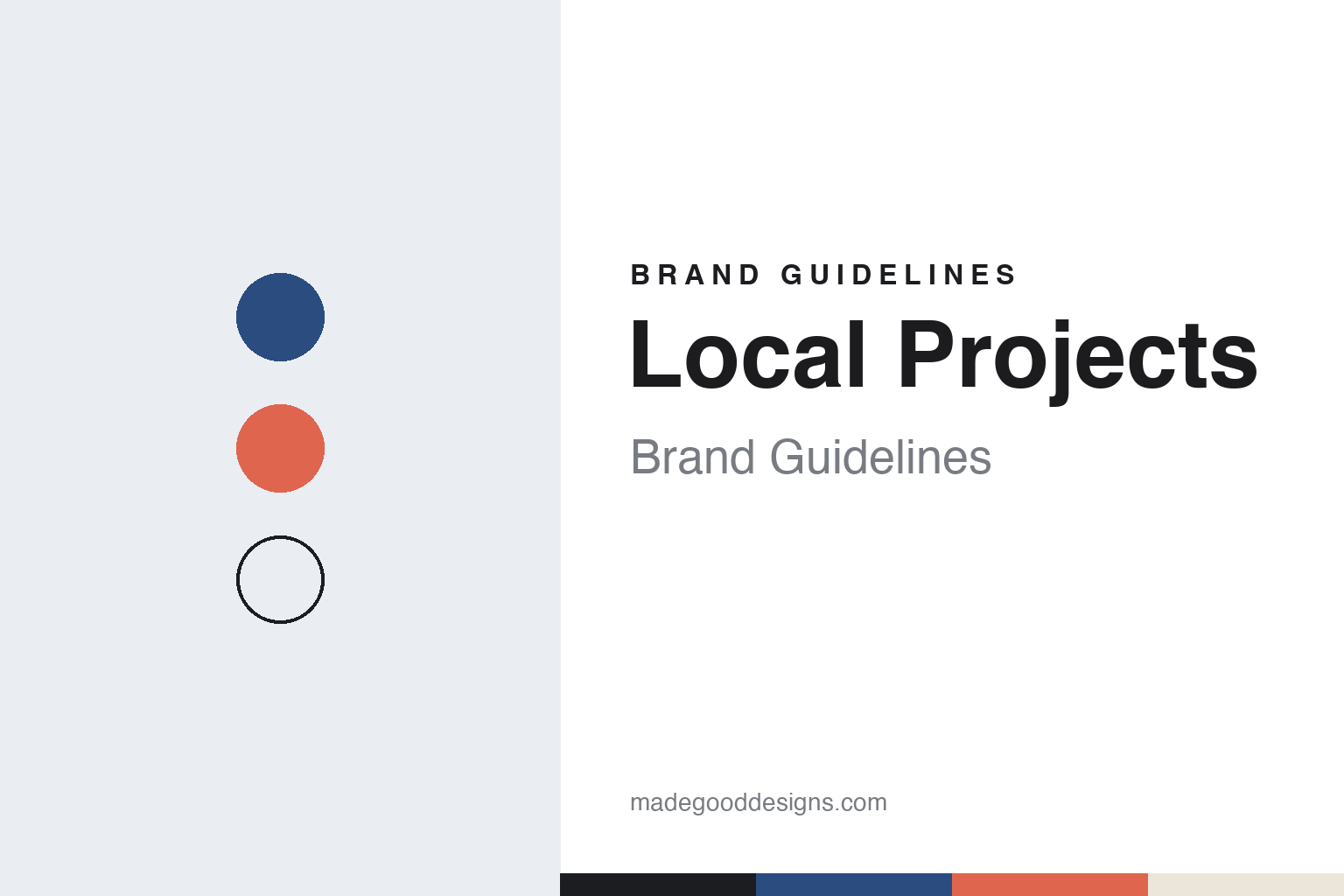
Local Projects Brand Guidelines
The New York studio that turns museum stories into things visitors do.
Aa
Two constants: an archive blue, signal coral and vellum palette and a grotesque sans register. Abstract homage — not a Local Projects asset or mark; no logo, installation or screen is reproduced.
Memory Maps
A graduate student, a festival and pins on vellum.
Local Projects is an experience design studio in New York, founded in 2002 by the designer Jake Barton. The design site Core77, writing in March 2014, and English Wikipedia both give 2002 as the founding year. Before he started the studio, Barton worked in exhibition design. English Wikipedia says he did set design for Broadway productions after university, then joined the museum design firm Ralph Appelbaum Associates as an intern and stayed for seven years. In 2001 he left to study at New York University’s Interactive Telecommunications Program, known as ITP, part of the Tisch School of the Arts, and launched Local Projects alongside his studies.
The studio’s early work was small and hands-on. Speaking to the architecture and design magazine STIR in May 2020, Barton described Memory Maps, made for the Smithsonian Folklife Festival in 2001, as one of the studio’s early projects: giant maps of each New York borough, on which visitors wrote favourite places or memories on pieces of vellum paper and pinned them to a location. He told the magazine that paper and simple interaction design could matter as much to the studio as sensors or touch screens, and that it chooses carefully where digital technology goes, so that it does not overwhelm a subject. Core77 reported in 2014 that Barton had taught at ITP since graduating in 2003.
In 2014 the studio billed itself as a “media design firm for museums and public spaces,” Core77 noted, with a team of designers, technologists, filmmakers and developers. Its own pages now call it an experience design studio, and sort its case studies under headings that include civil rights and memorials, corporate experience, higher education, interactive installations, public art, retail, and web and mobile work. Its about page lays out the work in four phases: discovery and strategy, concept design, prototyping and development, and production and launch, running from interpretive planning and workshops through 3D modelling, interaction design and user testing to software, hardware, installation and maintenance.
Colour
Prototypes, an Immersion Room and a museum of words.
Core77’s report on Barton’s talk at the 2014 Design Indaba conference described a process heavy on prototypes. Borrowing the Agile methods of software teams, Local Projects would build as many as a dozen concepts in full, so that designers and clients could try them in time and space before choosing one, an approach Barton himself called a luxury, the report said. It contrasted this with the step-by-step “Waterfall” approach. The same report described the touch displays the studio made for Gallery One at the Cleveland Museum of Art, where visitors could swipe and handle the collection on screen.
At the Cooper Hewitt, Smithsonian Design Museum in New York, which reopened on 12 December 2014 after renovation, English Wikipedia records an “Immersion Room,” an interactive space that gives visitors digital access to the museum’s collection of wallpaper. STIR credited the Immersion Room, and a Gesture Match installation at the same museum, to Local Projects. The museum’s new name, wordmark and graphic identity, launched in June 2014, were designed by Eddie Opara of Pentagram, Wikipedia says, and the building reopened with a custom open-source typeface.
Planet Word, a museum of language in the historic Franklin School building in Washington, DC, opened on 22 October 2020, according to English Wikipedia, which says it was created by Ann B. Friedman, a former reading teacher. Local Projects says it designed the museum and used voice-activation technology so that the experience feels more like a conversation than a lesson. Its case study describes a Magical Library, where books project their characters and settings into the room, and Word Worlds, where visitors “paint” a landscape with adjectives. The studio lists partners including Solomon Group and BBB Architects. Wikipedia also records a motion-sensing tree sculpture at the entrance, Speaking Willow, by the artist Rafael Lozano-Hemmer, which whispers to visitors in hundreds of languages.
Typography
Studios, stories and the screens between.
Exhibition, museum and experience-design studios rarely sell a product with their name on it. What they publish instead is a body of work: galleries, visitor centres, pavilions and installations, each credited to the studio by the museum, the client or the trade press. A guide to their identity therefore starts with how they present that work, and with the names and wordmarks on their own websites.
Several of these practices are named after their founders or partners, and some shorten a longer name to initials: Ralph Appelbaum Associates calls itself RAA on its own site. Their websites show a wordmark, a project list and a few pages on the practice. Founders and partners appear in a professional role, as creative directors or principals, and team pages can list designers, content developers and model-makers alongside them, as Casson Mann’s does.
The project case study is the core format. A typical page names the client and the opening date, then shows the gallery graphics, wayfinding, display furniture, projections and interactive installations that make up the scheme; Casson Mann’s pages call this mix its scenography. Independent coverage, in titles such as Museums Journal, Blooloop and national newspapers, is the surest way to date and credit a project, because a single building can involve more than one design firm: English Wikipedia credits the conversion of the IKEA Museum in Älmhult to both WilkinsonEyre and Ralph Appelbaum Associates.
Corporate pages fill in the rest: office locations, practice history, renamings and, where it has happened, a change of ownership. This guide sets out what dated sources say about each studio, keeps company statements attributed, and leaves out awards and any claims about what an exhibition does for its visitors.
Aa
A sturdy grotesque sans for a studio that writes its name in plain words. (Specimen set in Archivo, a sans STAND-IN; NOT the Local Projects logo.)
An MTM company
A sale in 2019, a new chief executive in 2022.
In March 2019 Local Projects was sold to MTM, English Wikipedia says. A company announcement dated 18 April 2022 describes Alexei Orlov as founder and chief executive of MTM, the “parent owner” of Local Projects, and names Whitney Rutter, who had joined five years earlier and served as managing director and head of new business, as the studio’s chief executive. Barton became founder and chief creative officer. The footer of the studio’s website names it as an MTM company, and its about page gives a single office in New York.
The studio’s name is written in two plain words, and its site leans on sentences rather than slogans. The home page rotates one line, “We are an experience design studio and we …,” finished differently for each featured project; for Planet Word it ends “bring language to life.” The about page repeats a second line, “Local Projects connects people to stories through innovative design,” each time with a new ending drawn from a project. Case studies follow a set order: an overview, a list of partner firms, a few paragraphs on each gallery, and a short press list naming the newspapers and magazines that covered the work. One recent case study lists experience design, interpretative planning and branding and identity among its services, and says the studio designed the institution’s brand identity alongside its exhibition.
For a design guide, Local Projects shows how an exhibit studio can present itself through what visitors do, from pinning a memory on a paper map to speaking to a wall, rather than through a logo. Compare Ralph Appelbaum Associates, the museum design firm where Barton spent seven years, and Thinc, another New York exhibition studio. For this guide we use ink, an archive blue, a signal coral and a vellum cream with a sans, an unofficial interpretation; no product or logo is reproduced.
Explore & save
Keep Local Projects’s identity on hand — save it to a board in the Made Good inspiration library.
Local Projects identity set
Pin the archive blue, signal coral and vellum palette and the grotesque sans register to your own board.
Source & notes
Frequently Asked Questions
What font can I use to match the Local Projects look?
This guide describes Local Projects’ type as “A sturdy grotesque sans for a studio that writes its name in plain words”. Its type specimen is set in Archivo from Google Fonts as a stand-in; Archivo is not Local Projects’ own lettering.
What colours are in the Local Projects palette?
This guide’s Local Projects palette is Ink #1C1D21, Archive blue #2B4C7E, Signal coral #E0654F, Vellum #ECE6DA and Paper #F7F5F0. The tones are the guide’s own unofficial interpretation, not official Local Projects hex codes.
When was Local Projects founded?
Local Projects was founded in 2002, in New York, United States.
Who founded Local Projects?
Local Projects was founded by Jake Barton in 2002. Local Projects is known for Gallery One, Immersion Room, Planet Word.
Who owns Local Projects?
Local Projects has been part of MTM (since March 2019), New York.