Logitech Brand Guidelines
A 34-year-old peripherals company that shed its beige past for colour — and a shorter name for a new era.
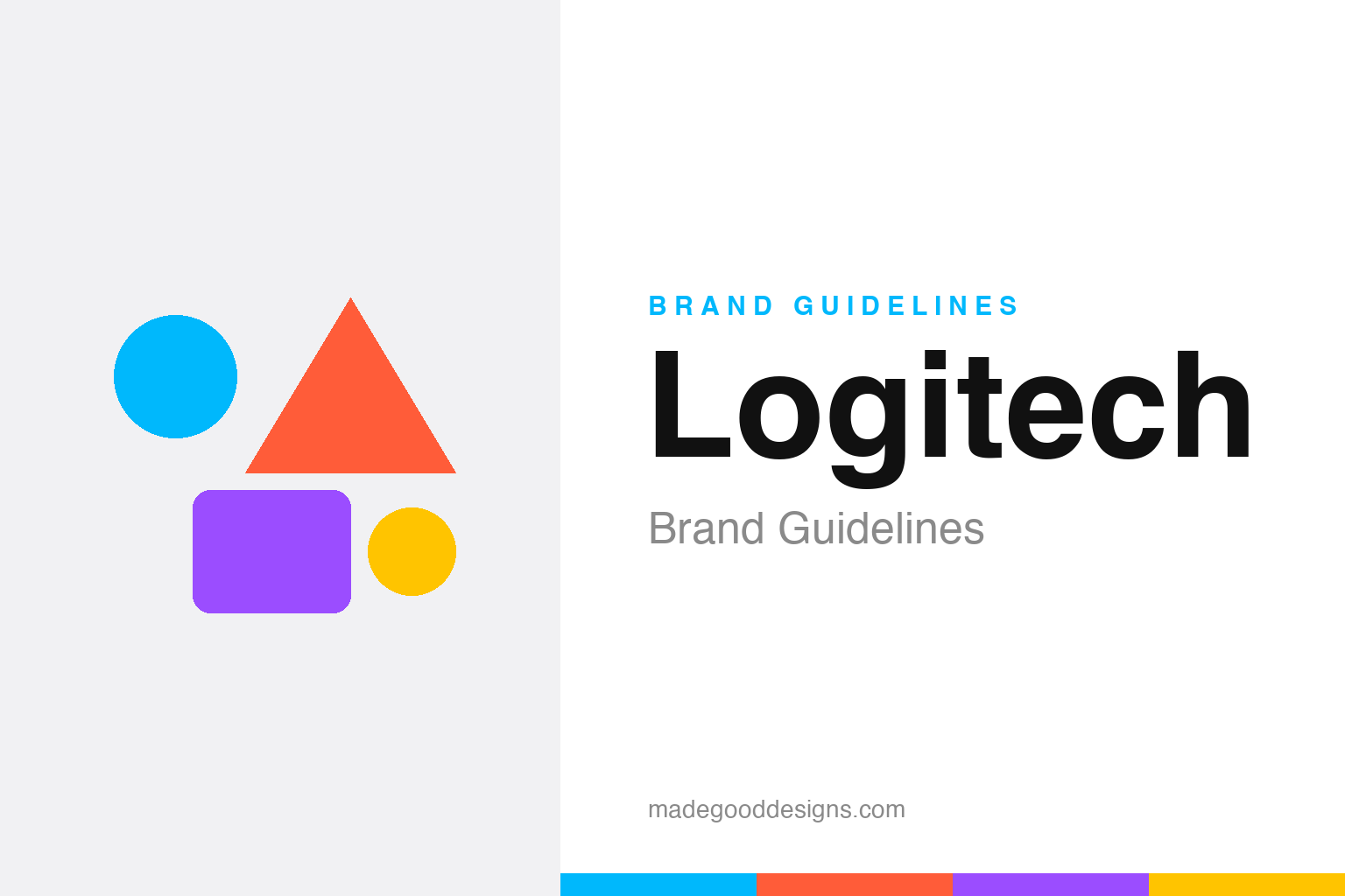
An abstract colourful geometric burst — the vibrant idea, not the wordmark. Deliberately not the Logitech logo.
From beige boxes to bright colour
Logitech’s 2015 rebrand was a deliberate personality transplant.
For decades Logitech was a maker of practical computer peripherals — mice, keyboards, webcams — the sort of dependable, slightly anonymous hardware that lived in a beige box in the corner of every office. In 2015, the company undertook a major rebrand (its first new logo since 1997) with the agency DesignStudio, and the goal was a personality transplant: to reposition Logitech from a utilitarian tech-accessory maker into a modern, colourful, design-and-music-and-creativity brand. Out went the staid old look; in came a fresh wordmark and a vibrant, multi-colour palette meant to feel human, creative and contemporary. Our homage nods to that new colourful energy with an abstract geometric burst.
A logo full of hidden warmth
The 2015 wordmark carries a small, human detail.
The refreshed “Logitech” wordmark — a clean, geometric, Futura-flavoured lettering — hides a nice touch that designers love to point out: a subtle “hidden smile” worked into the letterforms, a small signal of the friendlier, warmer personality the company was reaching for. (It’s a wordmark-led identity, incidentally — the separate prism-like “G” symbol belongs to the distinct Logitech G gaming sub-brand, not the 2015 corporate mark.) The vibrant colour palette does the heavy lifting on personality: bright, varied, energetic hues that could flex across the company’s growing range of products and audiences — from productivity tools to creative gear to music accessories. The whole system was engineered to say “we’re not just beige hardware anymore.”
‘Logi’ for a new generation
Logitech even shortened its own name.
Part of the 2015 strategy was introducing “Logi” — a shorter, punchier version of the name — for newer product lines and a younger, more design-conscious audience. The full “Logitech” carried decades of “computer accessories” baggage; the snappier “Logi” signalled something more modern, lifestyle-oriented and future-facing. It’s a common move for maturing tech brands trying to shed a dated association without abandoning their equity: keep the established name where it still works, but deploy a fresh, trimmed-down variant to reach new markets. Whether or not “Logi” fully caught on, the intent was clear — a company reaching past its origins as a purveyor of practical peripherals toward a broader identity around creativity, work and play.
Repositioning through design
Logitech shows how a rebrand can widen a company’s world.
The Logitech rebrand is a solid case study in using identity to reposition a mature company. Its old brand said “reliable but boring accessories”; the new one aimed to say “modern, creative, colourful, human.” That shift wasn’t cosmetic — it supported a genuine business strategy of expanding beyond basic peripherals into gaming, video collaboration, music and creative tools, each of which needs a more emotive, design-forward brand than a plain mouse ever did.
The lesson is that a rebrand is most effective when it reflects a real change in the business, not just a fresh coat of paint. Logitech didn’t simply want a prettier logo; it wanted to be perceived differently because it was becoming a different, broader company. The vibrant palette and warmer wordmark gave that transformation a face, making the new positioning legible to customers, partners and employees alike. It’s the opposite of the cautionary rebrands elsewhere in this series (Gap, Tropicana): those changed the look without a strategic reason and were punished for it; Logitech changed the look because the strategy had changed, and the identity followed the substance. When brand and business move together, even a beige-box company can convincingly become a colourful one.
Seen in the round, Logitech’s identity rewards the same discipline every strong brand demands: decide what you stand for, express it in the simplest, most distinctive form you can, and then apply that form with almost stubborn consistency until its meaning compounds. The temptation is always to add, to chase trends, to complicate; the harder and more valuable choice is to protect a clear idea over years. That patience is what turns a mark from mere decoration into a genuine asset — recognised, trusted, and impossible to confuse with anyone else.
Type & the wordmark
A geometric sans with a hidden smile.
The 2015 Logitech wordmark is a clean, geometric, Futura-flavoured sans — with that subtle hidden smile in the letterforms. The specimen below stands in with a neutral geometric sans.
Defy logic
Even, geometric, modern — type with a small, deliberate smile built in. (Specimen set in Archivo, a neutral stand-in.)
A vibrant palette
Bright, varied, energetic. Click a swatch to copy the hex.
The 2015 identity leans on a vibrant, multi-colour palette (Logitech doesn’t publish a single fixed brand hex; the wordmark is typically black). The swatches below are representative brights — treat them as illustrative. A cyan around #00B8FC is a common accent.
Explore & save
Keep the colourful-rebrand idea on hand — save the burst homage and the palette to a board.
Logitech identity set
Pin the colour-burst homage, the vibrant palette and the reposition-through-design lesson to your own board.