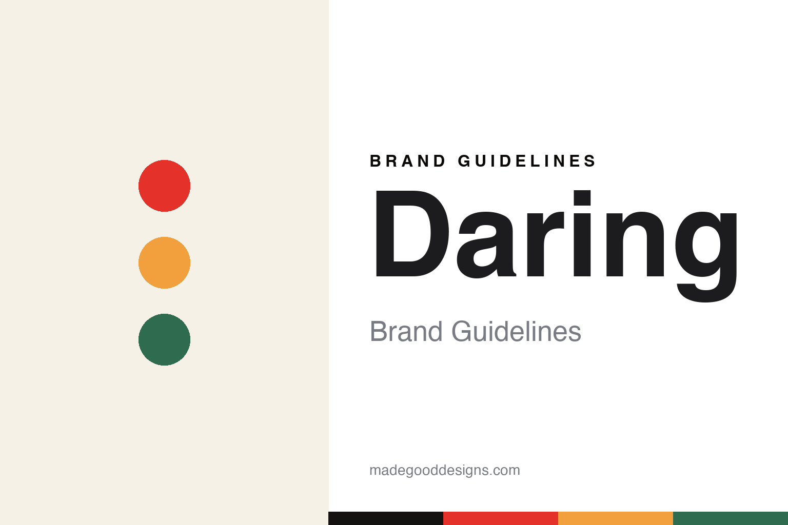
Daring Brand Guidelines
Plant-based chicken — and only chicken.
Aa
Two constants: a bold high-contrast palette and a bold sans. Abstract homage — not the Daring wordmark or logo.
Chicken, and only chicken
Daring focuses purely on plant chicken.
Daring is a lesson in the power of focus. Founded around 2018 by Scottish entrepreneur Ross Mackay (with co-founder Eliott Kessas) and later based in Los Angeles, it makes plant-based chicken — and only chicken. While rivals chase burgers and beef, Daring stakes everything on chicken pieces, with a mission to “rethink and replace chicken” and the line “Chicken Better. Chicken On.”
Its pitch is a short, simple, soy-based, non-GMO ingredient list — pieces in Original, Breaded, Cajun and Buffalo, plus diced and shredded formats — sold direct, in retail and to restaurants. It drew a marquee backer in rapper Drake (an investor from 2021) and raised a substantial Series C, standing out in the plant-based set with unusually bold design.
(Honest notes: Daring is a plant-based chicken specialist — not a general beef/burger brand — which is its whole differentiator; its ingredient list is simple, soy-based and non-GMO; its founder Ross Mackay is Scottish, with the brand’s roots in the UK before Los Angeles; Drake is a genuine investor; and it is private and founder-led. No official brand hex is published.)
Colour
Daring lives in a bold high-contrast palette. Click a swatch to copy the hex.
Daring’s identity is bold, high-contrast and confident — a signal red, a chicken gold, an ink black, an off-white, and an herb green. The palette reads like its packaging: punchy red and gold against black and clean off-white, striking and premium. It signals confidence and modern design rather than earthy, crunchy plant-food cues. The honest caveat: with no published brand hex, these tones are an original, unofficial interpretation, not first-party values.
The lesson is a bold high-contrast palette signals confident, design-forward plant food. Daring’s world reads as striking and modern. For designers, it is a reminder that a punchy red with black and gold stands out in a category full of earth tones, matching a brand that competes on design as much as product. The takeaways: use bold, high-contrast colour to break category conventions; keep it premium and confident; and treat any single hex as unofficial — using the ink black for small text so the red stays in the palette.
Typography
The wordmark spirit is a bold sans — confident and modern.
Daring’s identity carries a confident, modern, striking spirit — a “DARING” wordmark whose bold forms match a design-forward plant-chicken brand. A bold sans captures the mood: it is strong and contemporary, the register of a premium modern food brand rather than an earthy natural label. Set against a bold high-contrast palette, the bold sans feels confident and modern — exactly the focused, design-led personality Daring carries. It is assertive rather than crunchy, mirroring a brand that competes on design. (Daring’s real wordmark is a trademark we describe but do not reproduce, and the exact typeface is not something we assert.) Because the specific mark is not ours to use, the honest description is “a bold sans spirit,” not the Daring logo. The type behaves like the brand: confident, modern and striking.
Aa
A bold sans spirit — confident and modern. (Specimen set in Sora, a modern sans; NOT the Daring logo, which is a trademark.)
Focus as the difference
Daring stands for doing one thing well.
Daring is a lesson in winning through focus. In a plant-based-meat market crowded with brands trying to make everything, Daring chose to make only chicken — and to make it with a short, simple ingredient list and unusually bold, premium design. That focus, plus a confident identity and a headline-grabbing investor, gave a young brand a clear, ownable position. The differentiator is discipline: one category, done with real design confidence.
For designers and brand-builders, Daring offers a clear takeaway: focus and design confidence can carve out space against bigger rivals. The lessons: pick one thing and own it (plant chicken); keep the product story simple (short, soy-based, non-GMO); and use bold design to stand out in a look-alike category. It is also a reminder to stay accurate: Daring is a chicken specialist with a simple soy-based recipe, founded by Scotland’s Ross Mackay, with Drake as a genuine investor, and it is private and founder-led — with the palette here an unofficial interpretation. Daring focused — proof that doing one thing well can be the difference.
Explore & save
Keep Daring’s identity on hand — save it to a board in the Made Good inspiration library.
Daring identity set
Pin the bold high-contrast palette and the bold-sans spirit to your own board.