Ferrarelle Brand Guidelines
Liscia, gassata o… Ferrarelle?
Aa
Two constants: a green-glass identity and an elegant Italian serif wordmark. Abstract homage — not the Ferrarelle bottle, label or the Mona-Lisa creative.
The third kind of water
Ferrarelle invented its own category.
Ferrarelle is a lesson in naming a category and owning it. Bottled since 1893 from a source at Riardo, in Campania, on the slopes of the extinct Roccamonfina volcano, it is one of Italy’s best-known mineral waters. Its defining quality is natural: the water is naturally effervescent — “effervescente naturale,” the “bollicine naturali” — its fine bubbles formed by volcanic carbon dioxide absorbed underground, not added at the plant.
That truth became one of Italy’s most famous slogans. The 1980 campaign “Liscia, gassata o… Ferrarelle?” — “Still, sparkling, or… Ferrarelle?”, illustrated by a Mona Lisa with three hairstyles — argued that Ferrarelle was a third category: not flat, not artificially fizzed, but naturally sparkling. It is sold in an iconic green-glass bottle, and the company runs a bottle-to-bottle PET recycling plant.
(Honest notes: 1893 is the commercial-bottling marker, while the spring itself has been known since Roman antiquity — keep the two apart; the brand is owned by the Pontecorvo family via LGR Holding, which bought it from Danone in 2005; it became an Italian Società Benefit (benefit corporation) in 2021, which is a legal status and not the same as a certified B Corp; and no official brand hex is published.)
Colour
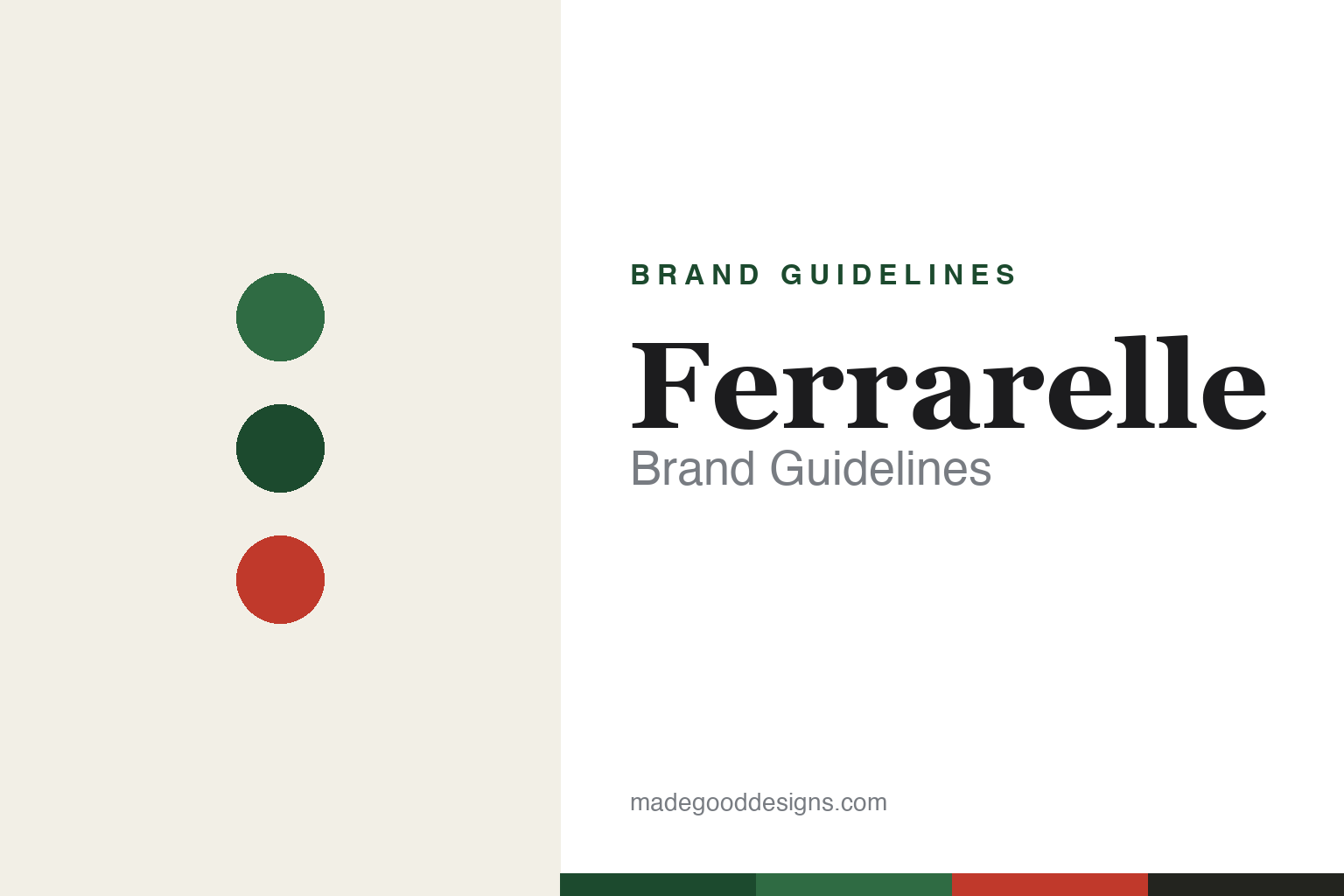
Ferrarelle lives in green glass with a red accent. Click a swatch to copy the hex.
Ferrarelle’s identity is Italian, green and natural — a Ferrarelle green, a deep bottle green, a label red, a cream, and an ink. The confirmed visual icon is the green-glass bottle; a warm red appears on the label and wordmark as an accent. It signals a classic, naturally sparkling Italian water with real heritage rather than a modern flavoured product. The honest caveat: with no published brand hex, these tones are an original, unofficial interpretation, not first-party values.
The lesson is a signature material can be the palette. Ferrarelle’s world is green glass, lit by a little red. For designers, it is a reminder that a distinctive bottle colour, held for generations, can be the brand’s primary identity — with a single accent to carry the wordmark. The takeaways: let a real material (the green glass) lead the palette; add one warm accent for the mark; and treat any single hex as unofficial — using the deep bottle green for small text so the green stays the field.
Typography
The wordmark spirit is an elegant Italian serif — refined and classic.
Ferrarelle’s identity carries an elegant, classic, Italian spirit — a refined “Ferrarelle” wordmark on a green-glass bottle, backed by one of the most famous slogans in Italian advertising. A high-contrast Italian serif captures the mood: it is graceful and confident, the register of a heritage water that turned “still, sparkling, or Ferrarelle?” into a national catchphrase. Set against green and a red accent, the elegant serif feels premium and timeless — exactly the classic, naturally-sparkling personality Ferrarelle carries. It is refined rather than loud, mirroring a bottle that belongs on an Italian table. (Ferrarelle’s real wordmark, bottle and the Mona-Lisa “liscia, gassata o Ferrarelle?” creative are trademarks and proprietary artwork we describe but do not reproduce, and the exact typeface is not published, so we don’t assert it.) Because the specific mark is not ours to use, the honest description is “an elegant Italian serif spirit,” not the Ferrarelle logo. The type behaves like the brand: refined, classic and self-assured.
Aa
An elegant Italian serif spirit — refined and classic. (Specimen set in Bodoni Moda, a high-contrast serif; NOT the Ferrarelle logo, which is a trademark.)
Winning by defining the middle
Ferrarelle stands for the third way.
Ferrarelle is a lesson in creating a category through language. The market saw two options — still and sparkling — and Ferrarelle used a single slogan to invent a third: “still, sparkling, or… Ferrarelle?” By naming its naturally effervescent water as its own kind of thing, it turned a real product fact (volcanic, source-formed bubbles) into a memorable position no rival could claim. The differentiator is a category the brand defined and named.
For designers and brand-builders, Ferrarelle offers a clear takeaway: positioning can be a design act. The lessons: find the genuine difference in your product (here, natural effervescence) and give it a name; wrap it in a distinctive, consistent material (the green glass); and let a great line do heavy lifting for decades. It is also a reminder to stay accurate: 1893 is the bottling marker (the spring is ancient), the brand is owned by the Pontecorvo family via LGR Holding (bought from Danone in 2005), and its Società Benefit status is a legal form rather than a B-Corp certification — with the palette here an unofficial interpretation. Ferrarelle named the middle — proof that a category can be a design idea.
Explore & save
Keep Ferrarelle’s identity on hand — save it to a board in the Made Good inspiration library.
Ferrarelle identity set
Pin the green-glass palette and the elegant Italian-serif spirit to your own board.