Apollinaris Brand Guidelines
The Queen of Table Waters.
Aa
Two constants: a bold red identity (a triangle) and a bold grotesque wordmark. Abstract homage — not the Apollinaris red triangle or wordmark.
The queen of table waters
Apollinaris built a global brand on a red triangle.
Apollinaris is a lesson in a mark that travels. Its spring was discovered by chance in 1852 by a winemaker, Georg Kreuzberg, in Bad Neuenahr in Germany’s Ahr valley; the name honours Saint Apollinaris, via a local chapel. Naturally carbonated, it became a huge export brand — millions of bottles a year, most shipped abroad — and earned an English nickname that stuck: “The Queen of Table Waters.”
Its identity is one of the most economical in the category: a red equilateral triangle, adopted in the 1890s and still the centrepiece today. A later rebrand kept the triangle and added heritage cues — the founding year 1852, Kreuzberg’s signature, and an old jug seal. The whole brand rides on one shape and one colour.
(Honest notes: 1852 is the spring’s discovery, while the red triangle and the slogan date to the 1890s; the “huge export” story is historical — today Apollinaris is repositioned as a premium gastronomy water in Germany, not a mass-market fixture; and it is owned by The Coca-Cola Company, acquired in 2006 from Cadbury Schweppes. No official brand hex is published; the red triangle is also distinct from Bass Ale’s unrelated red triangle.)
Colour
Apollinaris lives in red. Click a swatch to copy the hex.
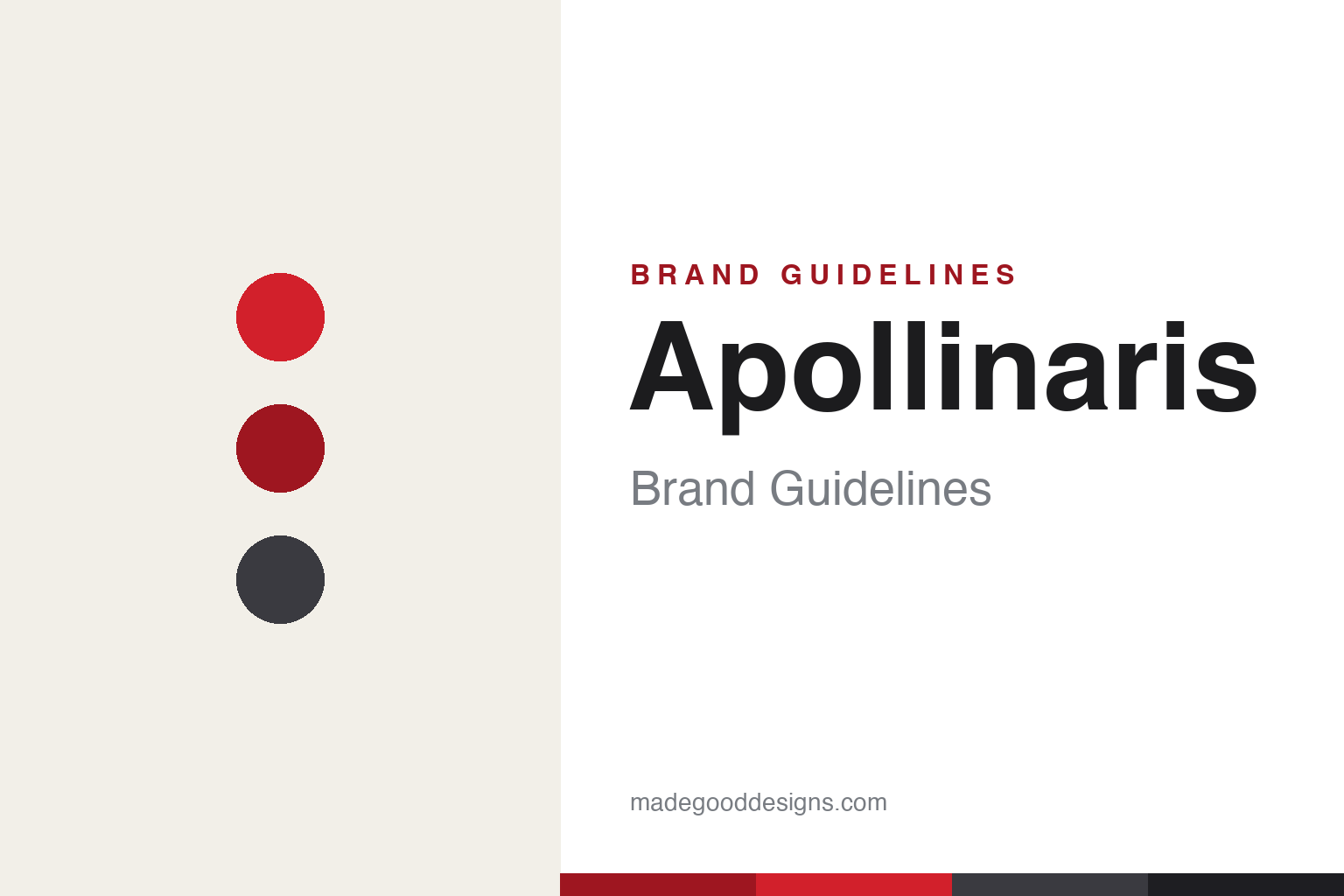
Apollinaris’s identity is bold, red and heritage — an Apollinaris red, a deep red, a slate, a cream, and an ink. The palette is essentially one colour: the red of the triangle, grounded by neutrals. It signals a classic, trusted, historically premium table water rather than a modern flavoured product. The honest caveat: with no published brand hex, these tones are an original, unofficial interpretation, not first-party values.
The lesson is one shape plus one colour can be a global brand. Apollinaris’s world is a red triangle. For designers, it is a reminder that a simple geometric mark in a single strong colour is memorable, reproducible and durable — it survived a century and a rebrand. The takeaways: reduce the mark to its simplest strong form; own one colour; and treat any single hex as unofficial — using the deep red for small text so the bright red stays the field.
Typography
The wordmark spirit is a bold grotesque — solid and classic.
Apollinaris’s identity carries a bold, classic, trusted spirit — an “Apollinaris” wordmark beside the red triangle, built to read at a glance. A strong grotesque sans captures the mood: it is confident and legible, the register of a heritage water that once travelled the world and now sits on fine-dining tables. Set against red and neutrals, the bold type feels dependable and premium — exactly the classic, queen-of-tables personality Apollinaris carries. It is solid rather than delicate, mirroring a serious table water. (Apollinaris’s real wordmark and the red triangle are trademarks and trade dress we describe but do not reproduce, and the exact typeface is not published, so we don’t assert it.) Because the specific mark is not ours to use, the honest description is “a bold grotesque spirit,” not the Apollinaris logo. The type behaves like the brand: solid, classic and assured.
Aa
A bold grotesque spirit — solid and classic. (Specimen set in Archivo, a grotesque sans; NOT the Apollinaris logo, which is a trademark.)
A century on a single mark
Apollinaris stands for the red triangle.
Apollinaris is a lesson in the durability of a simple mark. A red triangle, chosen in the 1890s, carried the brand across the world and remains its centrepiece more than a century later — surviving changes of owner and a modern rebrand that only reinforced it. A commodity water became instantly recognisable because its symbol was reducible to a shape and a colour. The differentiator is graphic simplicity that lasts.
For designers and brand-builders, Apollinaris offers a clear takeaway: the simplest mark ages best. The lessons: reduce your identity to a memorable geometric symbol; commit to a single strong colour; and let heritage cues (a founding year, a signature) support the mark without cluttering it. It is also a reminder to stay accurate: 1852 is the spring (the triangle and slogan are 1890s), the export glory is historical, and it is now a Coca-Cola–owned premium water — with the palette here an unofficial interpretation. Apollinaris kept its triangle — proof that a simple mark can be the difference.
Explore & save
Keep Apollinaris’s identity on hand — save it to a board in the Made Good inspiration library.
Apollinaris identity set
Pin the red palette and the bold-grotesque spirit to your own board.