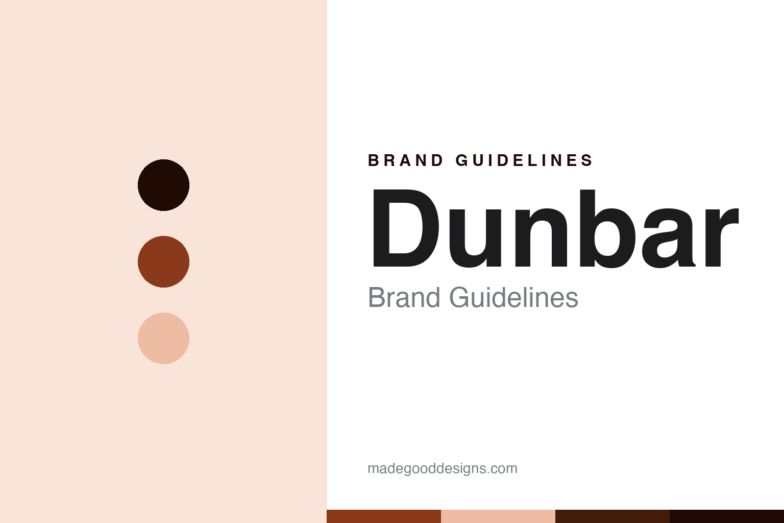
Dunbar Brand Guidelines
The decoration is the only difference.
Aa
Two constants: a Dunbar-russet palette and a workshop-sans register. Abstract homage — not a Dunbar product or mark; no pipe, script monogram or logo is reproduced.
The decoration is the only difference
Dunbar publishes two things most makers leave unsaid: exactly which parts it manufactures, and that its entire model ladder differs only in the outside decoration.
Dunbar closes the round as its candour node, and it earns the place twice over. First, it draws its own manufacturing boundary in public: its pricing covers the sticks, stocks, blowpipe and chanter, because those are the items it makes in its own shop, while bags, reeds and accessories are things it purchases and offers as upgrades. Second, and more startling for a company selling a seven-rung model range, it states that all of its blackwood instruments are built to the same specifications and will sound exactly the same, and that the only difference between the models is the outside decoration. Its answer to a round about who makes and who brands the instrument is a maker that answers the question itself, unprompted: the decoration is the only difference.
Its identity is the decoration is the only difference. The 1967 founding, the Ontario workshop and a published made-versus-bought line are the story here. The workshop. The decoration is the only difference.
(Honest notes, so the founding, the ownership, the making and one long-running claim are framed accurately. On founding: the company dates its work to 1967, which is when its founder — a Glasgow-born turner who had worked at a famous Scottish pipe works — his own company dates that to 1934, though the trade obituary that independently confirms the connection calls him simply a turner there and gives no date — then served five years in the war, helped run a post-war Scottish pipe business, and emigrated to Canada in 1951 to work at a car plant — began repairing pipes in his basement at a retailer’s invitation. He went full-time in 1985, which is also when the present company was incorporated, so 1967 is the craft and 1985 is the company, and neither should be written as the other. One thing the current site has lost: its own older pages described the founders in the plural, naming the founder and his late wife. She has since been written out, and we credit both. On ownership: a daughter, a son-in-law and a son were brought into the business in 1997; the son-in-law and daughter are reported to run it today. A share reorganisation followed the founder’s death in 2002 and its terms were never published. There was also an earlier partnership with a named pipe-major, under a joint name, which produced a pipe-band chanter — and the date it ended is given differently by the same publication on two occasions, so we do not pick one. No register publishes shareholders here, so the family running is reported rather than documented. On the making: unusually clear, quoted above, and the site is built around it, with a category for its own made items containing exactly four products and every bought-in bag, reed and engraver named. On one claim to handle with care: its founding innovation is a synthetic instrument, and its current copy dates a first to 1968 — but its own earlier pages say the 1968 experiments used impregnated maple and that the plastic came later and undated. Its marks are IP we describe but do not reproduce; there is no official brand hex.)
Colour
Dunbar lives in a Dunbar russet. Click a swatch to copy the hex.
Dunbar’s identity is Canadian, family-run and candid — a Dunbar russet, an ink, a pale maple, a deep rust, and a paper. The palette leans Dunbar russet and deep rust: a workshop register that stands in for an Ontario turning shop rather than a loud logo colour. It signals that the decoration is the only difference — Canadian, family-run and candid. The honest caveat: with no official brand hex these values are an unofficial interpretation. The company’s real mark runs on two colours, a wine and a black, and we describe that rather than restating it as ours.
The lesson is a mark can decline to make a claim, and that is a claim too. Set this company’s logo beside the Paisley maker earlier in this round and you have the round’s sharpest visual pair. That one is a monogram with pipes drawn into it and a strapline ending in the country of manufacture, so the origin is asserted every time the mark appears. This one is a flourished script initial and the surname in letterspaced capitals: no slogan, no instrument, no country. Two makers, two defensible positions — one puts the promise in the logo, the other keeps the logo out of the argument entirely and puts the disclosure in the product copy instead. And the naming follows the same instinct. The model ladders are plain codes, because the company has already told you the rungs differ only in decoration. The names it does make expressive are reserved for its historical reproductions, each a definite article and a Scottish proper noun. Those come with a genuine legal disclaimer stating that it is not affiliated with the original workshops and that the names belong to their rights holders, used descriptively — which is precisely the discipline this series applies to itself. Because a strong hue can fail as small text, keep type dark and let the colour live in the accents, palette and band. The takeaways: separate 1967 from 1985; credit both founders; treat the family running as reported; and never write patented.
Typography
The register is a workshop sans — Canadian, plain, candid.
Dunbar’s identity carries a Canadian, workshop spirit — a small shop that turns wood, restores old instruments and says what it buys. A workshop sans captures the mood: plain, unembellished and practical, the register of a price list that tells you what is in the box. Set in a Dunbar-russet palette, the workshop sans feels turned rather than styled — exactly the personality the record supports. It behaves like a lathe ring rather than a loud logo, mirroring a turned bead and a reed taper. (Dunbar’s real products, its script initial, its collection names and the name itself are things we describe but do not reproduce; its actual mark pairs a calligraphic script with letterspaced capitals and our stand-in deliberately does not, so nothing here should be mistaken for its type.) Because it is not ours to use, the honest description is “a workshop-sans brand,” shown here in a stand-in. The type behaves like the brand: Canadian, plain and candid.
Aa
A workshop-sans brand — plain and practical. (Specimen set in Manrope, a workshop-sans STAND-IN; NOT the Dunbar logo, script initial or products.)
The candour node
Dunbar stands for the decoration being the only difference.
Dunbar closes the round as its candour node. A Dunbar-russet palette, a workshop sans and a 1967 founding make one thing — the decoration is the only difference — the whole identity: Canadian, family-run and candid. The founding is the frame, the Ontario workshop is the substance, and two published admissions are the signature. The point is a maker that tells buyers where its own work stops and what its model range actually buys them, which is the rarest thing in this trade and the most useful.
Put to work, the identity is the disclosure taken at face value. A brand in this spirit would date the craft to 1967 and the company to 1985 without merging them, credit both founders rather than the one its current pages name, describe the present ownership as reported family running while noting that no register publishes shareholders and that a post-2002 share reorganisation was never explained, quote its made-versus-bought boundary rather than paraphrasing it, name the third-party bags, reeds and engravers as the company itself names them, and hedge the date of its synthetic first because its own older copy contradicts its newer copy. A reader in this spirit would keep the facts right: Dunbar turns sticks, stocks, blowpipes and chanters in Ontario, buys in bags and reeds and says so, restores historic instruments, and offers a synthetic range alongside the blackwood one. Dunbar closes the round, after Wallace. The honest editorial moves are to split the dates, to restore a founder, to mark the ownership reported, and to hedge the first.
For designers and brand-builders, Dunbar closes the candour node: telling buyers what your model range does not change is a stronger position than implying it changes everything. The lessons: a category can be closed by the firm that publishes its own manufacturing boundary, naming the four components it turns and conceding that bags, reeds and accessories are purchased — a line most of this trade leaves the customer to guess at, and one the Paisley maker earlier in this round does not draw at all; a range is described honestly, because a seven-rung ladder whose rungs are acknowledged to sound identical is a decoration ladder, and saying so converts a potential criticism into a reason to trust the cheapest rung; a founding is split between the craft and the company, 1967 and 1985, with a founder’s wife restored to a story her own company’s newer pages had dropped — the second time in two rounds that this series has had to put a co-founding spouse back into a history; an ownership is marked reported rather than documented, since the province publishes no shareholders and the only public word on the post-2002 reorganisation is a contemporary quote promising it would stay family-run; and a synthetic material is treated as a genuine product position rather than a compromise, because here the plastic range carries a lifetime warranty while the blackwood carries five years, which is the clearest possible statement of what the company thinks each material can promise. Three cautions close it. Its strongest historical claims need softening to what the record bears: a trade publication supports it being the first pipe maker to set up full-time in North America and among the first to see the potential of synthetics, which is not the same as inventing the first synthetic pipe, and its own earlier copy says the 1968 work used impregnated maple. A magazine honour it cites is real but narrower than its phrasing suggests, and the same article is lukewarm about its chanters — and verifying that required crawling every page of a sixteen-page feature, because the first page did not mention the company at all, which is exactly why a single fetch is never enough to prove an absence. And one live marketing line should go: a band’s recent championship placing is the band’s achievement and not the maker’s, the piper is a family member, and the result could not be verified. The hook is that plainness: Dunbar is the decoration is the only difference. Read that way, Dunbar is less a model range than a workshop with an honest price list: Canadian, plain, candid. The lesson for a brand is that disclosure is a feature, and the customer can tell. Dunbar made the-published-boundary the identity — proof that candour can close a round.
Explore & save
Keep Dunbar’s identity on hand — save it to a board in the Made Good inspiration library.
Dunbar identity set
Pin the Dunbar-russet palette and the workshop-sans register to your own board.