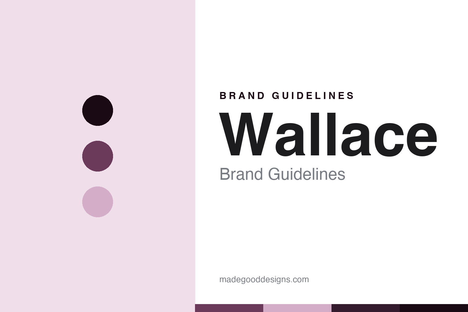
Wallace Brand Guidelines
The origin claim is in the logo.
Aa
Two constants: a Wallace-heather palette and a lockup-sans register. Abstract homage — not a Wallace product or mark; no pipe, monogram, tartan or logo is reproduced.
The origin claim is in the logo
Most makers put “made in Scotland” in the copy. Wallace put it in the wordmark — and its own earliest site says the parts were moulded by another firm.
Wallace is the round’s claim-in-the-mark node, and it is the most design-forward brand here because its origin statement is not marketing copy at all — it is a component of the logo lockup. The monogram, the name, the word bagpipes in red capitals, and then a ruled line carrying four words in black caps that end with the country. Every application of the mark therefore asserts where the instrument was made, which is a real decision with real consequences. Its answer to a round about who makes and who brands the instrument is a company that wrote the answer into its own identity: the origin claim is in the logo.
Its identity is the origin claim is in the logo. The Paisley workshop, the blackwood-only range and a two-colour mark are the story here. The lockup. The origin claim is in the logo.
(Honest notes, so the place, the founding, the ownership and the history are framed accurately. On place, a correction worth making because the error is everywhere including on the company’s own site: this is a Paisley firm, not a Glasgow one. Its contact page gives a Paisley address and places itself minutes from Glasgow airport, and the register agrees — but another of its own pages says its factory is in Glasgow, so the two do not match and we say Paisley, near Glasgow. A second caution about its own published details: the company registration number printed in its website footer is not the number on the register, and has been wrong there for years, so we use the register and do not reproduce the footer. On founding, the finding is an absence: this company publishes no founding date and names no founder anywhere. We checked its main pages, its entire downloadable brochure, every product description and its archived homepages going back to 2003, and there is nothing. What the record supports is a business origin around 2002 to 2003, because the site called itself Scotland’s newest bagpipe company in April 2003 and the company was renamed that May. The present company number dates from 1994, but to an unrelated business under another name entirely, so nobody should write founded 1994. The brand takes its name from the founding director, not from the medieval patriot the name inevitably summons. On ownership: the register records the current sole director as having significant influence or control, which is not the same as a shareholding, and the only shareholding it ever recorded ceased in 2025. So ownership is not disclosed, and we do not promote a director to a proprietor. On history, the interesting part: its earliest archived site says plainly that its parts were designed by a named craftsman and would be manufactured by a plastics engineering firm. Its marks are IP we describe but do not reproduce; there is no official brand hex.)
Colour
Wallace lives in a Wallace heather. Click a swatch to copy the hex.
Wallace’s identity is Scottish, mark-led and blackwood-only — a Wallace heather, an ink, a pale heather, a deep bramble, and a paper. The palette leans Wallace heather and deep bramble: a workshop register that stands in for a Paisley turning shop rather than a loud logo colour. It signals that the origin claim is in the logo — Scottish, mark-led and blackwood-only. The honest caveat: with no official brand hex these values are an unofficial interpretation. The company’s real mark runs on two colours only, a black and a red, and we describe that rather than restating it as ours.
The lesson is putting a promise inside a logo commits you to it permanently. A claim in body copy can be softened, moved or quietly deleted — this series has watched three companies do exactly that, one deleting a verb, one deleting an ownership line, one shifting a fact to a different page. A claim set in the wordmark cannot be edited without redrawing the brand, so it becomes a standing obligation rather than a sentence. That is a genuine strength here, and the company’s current production statement backs it: it describes its methods as almost entirely hand-worked traditional turning with a small proportion of machine work for consistency, which is an unusually specific thing to publish. But the same permanence is why the brand’s early history matters rather than embarrasses. In 2003 this was a design house whose parts were moulded by a separate engineering company — and that company was Scottish, registered on the same day, at the consecutive company number, so the country claim was never untrue. What would have been untrue is a claim to do the making itself, and the mark carefully does not say that. It names a country, not a workshop. Because a strong hue can fail as small text, keep type dark and let the colour live in the accents, palette and band. The takeaways: say Paisley; publish no founding date the company does not publish; call the ownership undisclosed; and never write that it is certified to a quality standard, because its own wording says its systems are like that standard, which is a different claim.
Typography
The register is a lockup sans — Scottish, mark-led, plain.
Wallace’s identity carries a Scottish, mark-led spirit — a small firm whose logo does more work than its prose. A lockup sans captures the mood: plain, assembled and legible at badge size, the register of a stamped plate rather than a paragraph. Set in a Wallace-heather palette, the lockup sans feels fixed rather than styled — exactly the personality the record supports. It behaves like a turned ring rather than a loud logo, mirroring a drone line and a woven grain. (Wallace’s real products, its monogram, its engraving-pattern names and the name itself are things we describe but do not reproduce; its actual wordmark is a high-contrast serif and our stand-in deliberately is not, so nothing here should be mistaken for its type.) Because it is not ours to use, the honest description is “a lockup-sans brand,” shown here in a stand-in. The type behaves like the brand: Scottish, mark-led and plain.
Aa
A lockup-sans brand — plain and assembled. (Specimen set in Manrope, a lockup-sans STAND-IN; NOT the Wallace logo, wordmark or products.)
The claim-in-the-mark node
Wallace stands for the origin claim being in the logo.
Wallace holds the round’s claim-in-the-mark node. A Wallace-heather palette, a lockup sans and a Paisley workshop make one thing — the origin claim is in the logo — the whole identity: Scottish, mark-led and blackwood-only. The place is the frame, the blackwood range is the substance, and a four-word strapline inside the lockup is the signature. The point is a brand that chose to make its origin statement structural rather than editorial, and therefore cannot quietly retire it.
Put to work, the identity is the claim honoured and the gaps left open. A brand in this spirit would say Paisley rather than Glasgow while noting its own pages disagree, decline to invent a founding date because the company publishes none, credit the name to the founding director rather than the patriot, describe its ownership as undisclosed because the register records influence rather than a shareholding, keep its quality-systems wording exactly as written instead of upgrading it to a certification, and tell the 2003 outsourcing story as history rather than hiding it. A reader in this spirit would keep the facts right: Wallace makes African blackwood drone sets and chanters at Paisley, sells nine sets across two model ladders, and distributes through a stockist network with country exclusivity. Wallace follows Naill, before Dunbar. The honest editorial moves are to fix the town, to leave the founding blank, to call ownership undisclosed, and to quote the standard rather than claim it.
For designers and brand-builders, Wallace holds the claim-in-the-mark node: anything you put in the logo, you have promised forever. The lessons: a category can include a firm whose strongest brand decision is typographic, since the words naming the country of manufacture sit inside the lockup and travel with every application of it; a place is corrected against the company’s own copy, because the register and the contact page say Paisley while another page says Glasgow, and the published company number in the site footer does not match the register at all — which is a reminder that a brand’s own small print is a source to check rather than to trust; a founding is left blank rather than filled, because no date and no founder appear in any of its own materials across two decades of archived pages, and the temptation to reach for the 1994 incorporation of an unrelated predecessor company must be refused; an ownership is described precisely from what the register actually records, influence or control rather than a shareholding, with the last recorded shareholder having ceased in 2025; and a history is told rather than buried, since the earliest version of this site describes a named craftsman designing parts that a plastics engineering firm would manufacture — and that firm turns out to have been registered on the same day at the adjacent company number, and to have been dissolved in 2025. Three cautions close it. Its quality-systems language says its procedures are like a named international standard, which is emphatically not a certification, and writing it as one would be a real error. Its site is visibly unmaintained even though the business is demonstrably trading — a dated pandemic notice, a 2021 brochure, a dead link to a collaborator’s domain and a stockist in liquidation — and the fair way to put that is that the company is active and the website is not. And unlike the Canadian maker that closes this round, it names no supplier for the bag, reeds, cords or cover it ships with an assembled set, so what is bought in is simply not stated. The hook is that permanence: Wallace is the origin claim is in the logo. Read that way, Wallace is less a range than a promise set in type: Scottish, mark-led, plain. The lesson for a brand is that the safest place to put a claim is also the hardest place to take it back from. Wallace made the-claim-in-the-mark the identity — proof that a logo can carry an argument.
Explore & save
Keep Wallace’s identity on hand — save it to a board in the Made Good inspiration library.
Wallace identity set
Pin the Wallace-heather palette and the lockup-sans register to your own board.