NutriBullet Brand Guidelines
The personal blender.
Aa
Two constants: a vital-bright palette and a vital sans register. Abstract homage — not the NutriBullet blender or wordmark.
The personal blender
NutriBullet turned the blender into a personal habit.
NutriBullet is a lesson in a single-serve object as the identity. Launched in 2012 by Capital Brands in Los Angeles, it built its name on the compact personal blender — a bullet-shaped base and a twist-on cup that made “nutrient extraction” a daily habit.
Its identity is the personal blender. NutriBullet makes the single-serve, extract-and-go blender, joined by full-size and portable blenders, but the compact bullet is the object it is known for. A blender you drink straight from. A wellness ritual, not a countertop chore.
(Honest notes: NutriBullet launched in 2012, made by Capital Brands, a Los Angeles company; its founder was Colin Sapire (CEO, with Lenny Sands) — the infomercial figures often associated with it were spokespeople and marketers, not founders. The NutriBullet followed the earlier Magic Bullet (a compact “bullet” blender under the same umbrella). Its signature is the personal, single-serve “nutrient extraction” blender. On production, it is largely made in China (with some Asian suppliers), and no single official “made in” statement is published, so we hedge. On ownership, the key fact: Capital Brands (NutriBullet and Magic Bullet) was acquired by the De’Longhi Group in December 2020 (a roughly US$420 million deal). There’s no official brand hex, and we reproduce no blender or logo — these tones are an unofficial interpretation. This is design commentary and does not promote any product.)
Colour
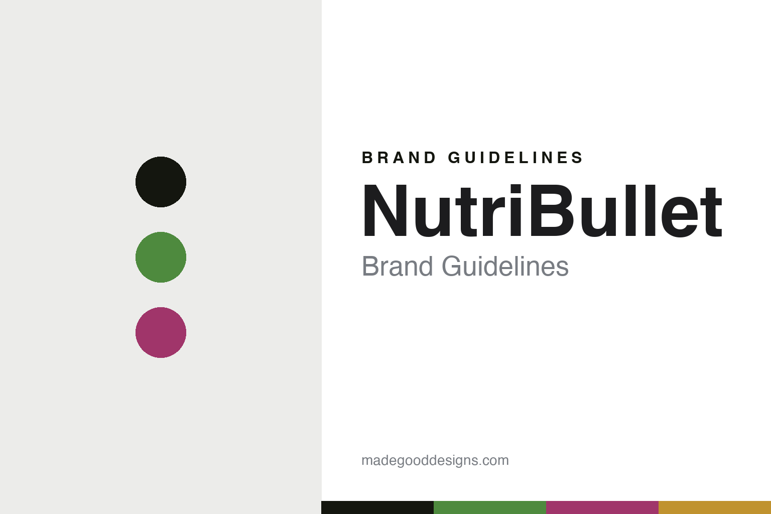
NutriBullet lives in a vital-bright palette. Click a swatch to copy the hex.
NutriBullet’s identity is energetic, healthy and modern — a green, an ink, a magenta, a citrus, and a chalk. The palette leans vital bright — the register of fresh juice, wellness and everyday energy. It signals health and habit rather than novelty. The honest caveat: with no published brand hex, these tones are an original, unofficial interpretation, not first-party values.
The lesson is a vital-bright palette signals a wellness habit. NutriBullet’s world is an energetic, healthy object. For designers, it is a reminder that reframing a category — from “blending” to “extraction,” from appliance to ritual — can be the whole identity, and that a bright, fresh palette carries a wellness promise. Because a bright green can fail as small text, keep type dark and let the colour live in the accents, palette and band. The takeaways: reframe the category; make it a habit; keep it bright; and treat any single hex as unofficial.
Typography
The register is a vital sans — clean, energetic, modern.
NutriBullet’s identity carries a clean, energetic, modern spirit — a healthy, everyday object. A friendly geometric sans captures the mood: it is bright and contemporary, the register of a wellness brand. Set in a vital-bright palette, the vital sans feels clean and energetic — exactly the personality NutriBullet carries. It is modern rather than fussy, mirroring a quick, single-serve machine. (NutriBullet’s real blender and wordmark are works we describe but do not reproduce, and the exact typeface is not ours to use.) Because it is not ours to use, the honest description is “a vital sans spirit,” shown here in a stand-in. The type behaves like the brand: clean, energetic and modern.
Aa
A vital sans spirit — clean and energetic. (Specimen set in Plus Jakarta Sans, a friendly geometric sans STAND-IN; NOT the NutriBullet wordmark.)
A single-serve object as identity
NutriBullet stands for the personal blender.
NutriBullet is a lesson in making a single-serve object the identity. A vital-bright palette, a vital sans and a compact bullet make the personal blender the whole brand — energetic, healthy, modern. The reframing is the differentiator. The differentiator is turning a countertop appliance into a personal, extract-and-go wellness habit.
Put to work, the identity is a category renamed. A designer building in this spirit would reframe a familiar product around a benefit and a ritual — here “nutrient extraction,” not blending — so the object feels new even though the mechanism is not. The lesson NutriBullet teaches is that language and format can create a category: shrinking the blender to a single serving and renaming what it does turned an ordinary appliance into a lifestyle habit millions adopted.
For designers and brand-builders, NutriBullet offers a clear takeaway: reframe the category, not just the product. The lessons: reframe the category; make it a habit; keep it bright; and be honest about the story. It is also a reminder to stay accurate: it launched in 2012 from Capital Brands in Los Angeles, its founder was Colin Sapire rather than the infomercial spokespeople, and — importantly — it has been owned by the De’Longhi Group since 2020 — the palette here is an unofficial interpretation. And it is a reminder that made-where honesty matters even for a wellness brand: describing production as largely Chinese, and hedging where no official statement exists, keeps the story trustworthy. It is a reminder, too, that a lineage should be acknowledged: the NutriBullet built on the earlier Magic Bullet, so the “new” habit arrived on the back of a proven format. NutriBullet made the personal blender the brand — proof that reframing can be the difference.
Explore & save
Keep NutriBullet’s identity on hand — save it to a board in the Made Good inspiration library.
NutriBullet identity set
Pin the vital-bright palette and the vital-sans register to your own board.