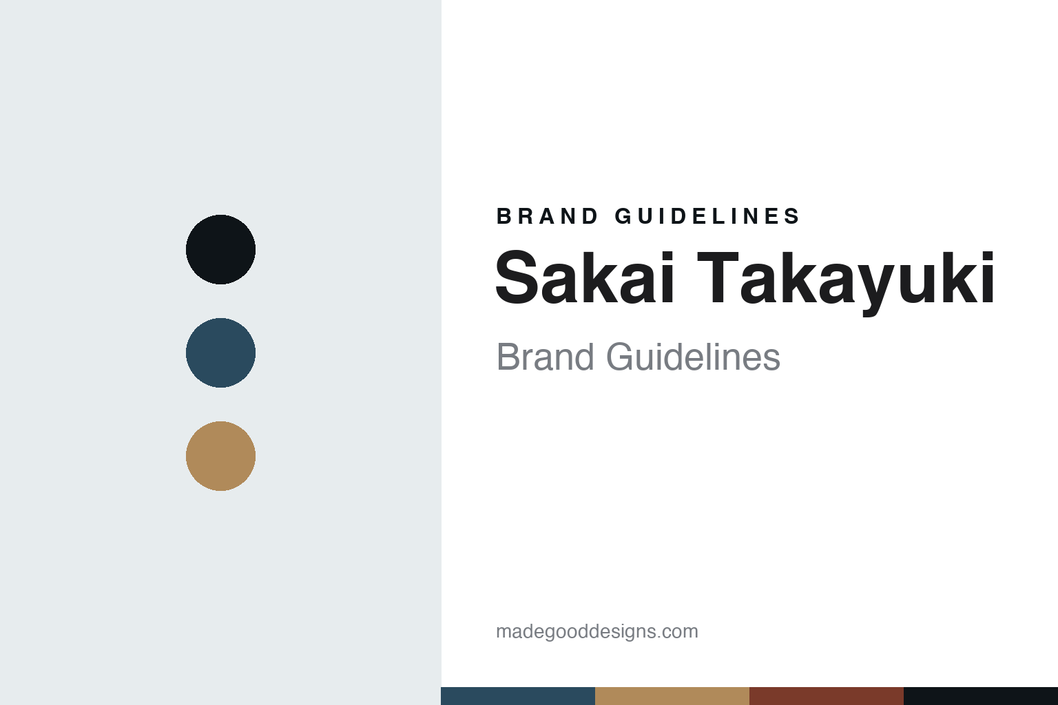
Sakai Takayuki Brand Guidelines
The Sakai division of labour.
Aa
Two constants: a steel-blue palette and a Sakai sans register. Abstract homage — not a Sakai Takayuki blade, pattern or wordmark.
The Sakai division of labour
Sakai Takayuki, a knife brand of Aoki Hamono, is made where the forging and the sharpening are separate crafts.
Sakai Takayuki is a lesson in the division of labour as the identity. It is a knife brand of Aoki Hamono, made in Sakai, near Osaka — the Japanese city whose blade tradition runs back roughly six hundred years, from swords to tobacco knives to today’s kitchen knives. Its answer to how a knife is made is the Sakai answer: not one maker doing everything, but a specialist blacksmith who forges the blade and a separate specialist sharpener who grinds and hones it, each owning a step, each a craft in itself. A knife made by more than one pair of expert hands.
Its identity is the steel and the edge, made by two crafts. Sakai Takayuki’s forged blades, its hand-sharpening and its broad traditional-and-Western range are the work it is known for. A city’s system, made a signature. A brand that lets the forger and the sharpener each be a master.
(Honest notes, so the story stays precise. Sakai Takayuki is the flagship knife brand of Aoki Hamono, in Sakai, Osaka, and it is genuinely made in Japan, in the Sakai tradition where forging and sharpening are separate specialist trades and each knife is hand-sharpened. Its range is broad — single-bevel traditional Japanese blades such as the yanagiba and deba, and double-bevel Western shapes such as the gyuto and santoku — across steels including White and Blue carbon, VG10 with Damascus cladding, Ginsan stainless and powder steel. Two honest limits: we do not state a specific founding year for Aoki Hamono, which we could not verify; and the roughly six-hundred-year figure is Sakai’s cutlery tradition, not the company’s age — so we call it a contemporary brand of Aoki Hamono working in Sakai’s long blade tradition. No steel or blade type here is exclusive to the brand. Its designs and wordmark are its IP, described but never reproduced, and there is no official brand hex — these tones are an unofficial interpretation. This is design commentary and does not promote any product.)
Colour
Sakai Takayuki lives in a steel-blue palette. Click a swatch to copy the hex.
Sakai Takayuki’s identity is precise, traditional and Japanese — a steel blue, an ink, a copper, a forge red, and a chalk. The palette leans steel blue and copper: the register of polished steel and the warm metal of a forge. It signals craft and material over show. The honest caveat: with no published brand hex, these values are an original, unofficial interpretation, not first-party colours.
The lesson is a steel-blue palette signals a precise, made-in-Japan identity. Sakai Takayuki’s world is a forged, hand-sharpened, made-in-Sakai object. For designers, it is a reminder that a cool steel blue and a warm copper can carry a brand built on the meeting of forging and sharpening — the blue of a ground edge and the copper of hot metal. Because these tones can fail as small text, keep type dark and let the colour live in the accents, palette and band. The takeaways: honour the two crafts; keep the making in Sakai; be precise about heritage; and treat any single hex as unofficial.
Typography
The register is a Sakai sans — clean, even, quietly technical.
Sakai Takayuki’s identity carries a clean, even, quietly technical spirit — a craft object, not a loud one. A calm Japanese sans captures the mood: legible, modern and precise, the register of a specialist workshop. Set in a steel-blue palette, the Sakai sans feels clean and even — exactly the personality the brand carries. It is technical rather than showy, mirroring a hand-sharpened blade. (Sakai Takayuki’s real designs and wordmark are things we describe but do not reproduce, and the exact typeface is not ours to use.) Because it is not ours to use, the honest description is “a Sakai-sans spirit,” shown here in a stand-in. The type behaves like the maker: clean, even and quietly technical.
Aa
A Sakai-sans spirit — clean and precise. (Specimen set in Zen Kaku Gothic Antique, a Japanese-sans STAND-IN; NOT the Sakai Takayuki wordmark or any blade design.)
How a knife is made
Sakai Takayuki stands for the division of labour.
Sakai Takayuki is a lesson in making the division of labour the identity. A steel-blue palette, a Sakai sans and a hand-sharpened blade make one thing — a knife built by a forger and a sharpener working as separate masters — the whole maker: precise, traditional and Japanese. The system is the differentiator. The differentiator is that no single person makes the whole knife: one specialist forges, another grinds and hones, and the edge is the sum of two crafts rather than one.
Put to work, the identity is specialisation as design. A maker building in this spirit would treat each stage as a discipline with its own master, keep the whole process in one place with its tradition, and let the customer feel the depth behind a single edge. It would offer both the traditional single-bevel blades and the Western double-bevel shapes, so the range shows the same hands across many forms. It would say plainly that the knife is forged and then hand-sharpened, without inflating its own age past what the city’s tradition supports. The lesson Sakai Takayuki teaches is that a division of labour can build a brand: the specialism gives it depth, and the Sakai making gives it substance. The system is the personality, and the two-craft edge is the proof.
For designers and brand-builders, Sakai Takayuki opens this round about how a knife is made on the specialisation pole: let a real division of expert labour be the story of the edge. The lessons: respect each craft; keep the making at home; be honest about heritage; and never reproduce a protected design. It is also a reminder to stay precise: Sakai Takayuki is a contemporary knife brand of Aoki Hamono, made in Sakai, Osaka, in the city’s long forging-and-sharpening tradition — with the palette here an unofficial interpretation. Sakai Takayuki made the division of labour the maker — proof that a shared craft can be the difference.
Explore & save
Keep Sakai Takayuki’s identity on hand — save it to a board in the Made Good inspiration library.
Sakai Takayuki identity set
Pin the steel-blue palette and the Sakai-sans register to your own board.