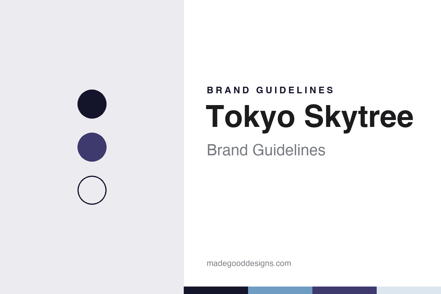
Tokyo Skytree Brand Guidelines
Sumida’s 634-metre tower and its Iki and Miyabi lights.
Aa
Two constants: a night, river blue and violet palette and a clean gothic sans register. Abstract homage — not a Tokyo Skytree asset; no logo, mascot or lighting design is reproduced.
A tower on a rail yard
Tobu Railway’s land in Sumida.
Tokyo Skytree is a broadcasting and observation tower in Oshiage, in Tokyo’s Sumida ward, east of the Sumida River. It opened on 22 May 2012 and rises to 634 metres, according to Time Out Tokyo, which notes that its main function is television broadcasting even though it has become one of the capital’s main visitor attractions. Monocle, writing in its June 2012 issue, called it the world’s tallest freestanding tower.
The tower stands on what Monocle described as an old train yard owned by Tobu Railway, the railway company that now operates the tower with a subsidiary. A lighting case study by Panasonic, which supplied the tower’s lights, names the operator as Tobu Railway Co., Ltd. together with Tobu Tower Skytree Co., Ltd., and lists Nikken Sekkei for design and supervision and the Obayashi Corporation for construction.
Its job was to take over from an older landmark. Monocle reported that the Skytree replaced Tokyo Tower as the capital’s main relay for television and radio and stands nearly twice as tall. Planning and building took more than seven years, the magazine said, and the steel frame was assembled from some 37,000 pieces, delivered on a just-in-time schedule so that parts went straight from the truck to the cranes. Hitachi made the lifts and the antenna spire, YKK AP built a glass-enclosed walkway for the upper deck, and JFE Steel supplied much of the steel for the three-legged base, with smaller firms making tubes, nuts and the welded skeleton.
The sculptor Kiichi Sumikawa joined the project in 2006, during planning, and later worked with the architect Tadao Ando on a model of the tower’s design, Monocle reported. At Sumikawa’s suggestion, the builders borrowed elements from Japan’s five-tiered wooden pagodas.
Colour
Sword, pagoda and two curves.
The shape answers a narrow site. Nippon.com, in a June 2022 feature, explained that the plot runs east to west and is too slim for a wide circular base, so the designers started with a triangle 70 metres on each side at ground level and let it morph gradually into a circle higher up, where round decks give 360-degree views. The magazine said the profile takes inspiration from the arc of a Japanese sword and the softly swelling round pillars of old temples, and that from different streets the tower can look symmetrical, relaxed or slightly inclined. It quoted the design concept as “the creation of a landscape transcending time.”
Two traditional terms describe those curves. The lighting designer Hirohito Totsune, interviewed by the web magazine OPENERS before the opening, explained sori, a line or surface that curves upward and inward, and mukuri, its outward-swelling opposite; because the section changes from triangle to circle, the tower shows one or the other depending on where you stand. Inside the structure runs a central pillar, the shinbashira, a device Nippon.com and Totsune both trace to pagoda building; Nippon.com names Atsuo Konishi of Nikken Sekkei as the project’s structural engineer.
Light is the tower’s second identity. Totsune told OPENERS that he took his cue from Mount Fuji as Edo woodblock prints show it, floating in the distance, and chose to make the top white and light the tower from above so the glow fades toward the ground, the reverse of a normal floodlit building. He built the scheme on the keywords “Tokyo” and “Edo” and ended up with twins: Iki, the chic, resolute style of Edo’s townspeople, which lights the central shaft in pale blue, and Miyabi, refined elegance, which lights the outer steel frame in purple. Panasonic’s case study says Iki takes its motif from the water of the Sumida River and Miyabi from the purple associated with Edo, and that the system uses 1,995 LED fixtures, some throwing light more than 140 metres.
Nippon.com reported in 2022 that an orange pattern, Nobori, meaning a banner, was added in 2017, that the lighting equipment and the three regular patterns were renewed in 2020, and that the tower is lit in modulated whites for an hour after sunset. A head lighting technician described the effect as “washing” the tower with colour.
Typography
Towers, decks and their owners.
Observation towers and decks across Asia-Pacific and the Gulf are owned and run by a wide mix of businesses: railway groups, broadcasters, property developers and listed leisure companies. Some are broadcasting towers in their own right; others are decks at the top of office or mixed-use buildings. This guide looks at how each one presents itself, in plain terms and with dates where sources give them.
The names, logos and mascots are usually published by the operators themselves. Tokyo Skytree, for example, introduced a mascot called Sorakara and staff uniforms designed by the textile designer Akira Minagawa, Monocle reported in 2012, while Tokyo Tower’s company history records each renaming of its decks and of the company itself. Where an architect or engineer is credited, this guide names them only as a dated source does.
Lighting is a large part of the identity for several of them. Tokyo Tower’s Landmark Light dates from 1989 and its LED Infinity Diamond Veil from 2019, according to the company, and Tokyo Skytree’s Iki, Miyabi and Nobori schemes draw on Edo-period ideas of style, Nippon.com reported in 2022. Tickets, wayfinding, deck names, souvenir shops and seasonal displays carry the same identity at a smaller scale, from deck signage to tower-shaped bottles and stamps.
Each guide sets out who opened the tower or deck and when, who owns and operates it now, how it has been renovated or renamed, and what its own corporate pages say about its history, marking clearly what rests on the operator’s word. The palettes and typefaces shown are unofficial interpretations; no logo, mascot or lighting design is reproduced.
Aa
A clean gothic sans for a tower named by its sky and its tree. (Specimen set in Zen Kaku Gothic New, a sans STAND-IN; NOT the Tokyo Skytree logo.)
Tokyo Skytree
Decks, a mascot and a uniform.
Visitors see the identity at two heights. Time Out Tokyo describes the Tembo Deck at 350 metres and, above it, the sloping Tembo Galleria, which climbs to the Sorakara Point at just over 450 metres; Monocle gave the highest observation point as 451.2 metres, and Nippon.com describes a glass floor in the Tembo Deck through which the twisting girders can be seen. At the main entrance, Nippon.com reported, visitors are met by a digital picture scroll of the Sumida River.
The tower sits inside a wider development. Time Out Tokyo says Tokyo Skytree Town at its base holds about 310 shops and restaurants, with school and office space, and lists the nearest stops as Tokyo Skytree Station on Tobu’s lines and Oshiage Station on the Hanzomon and Asakusa subway lines.
Monocle introduced the tower’s mascot, Sorakara, and reported that the textile designer Akira Minagawa, of the label minä perhonen, designed staff uniforms in ten categories, from reception and tower guides to café staff and cleaners. The guides’ dresses carry a tower pattern, the information staff wear a pointed hat made with the Tokyo milliner Hat, and the palette was drawn from the “sky” and “tree” of the name. Minagawa told the magazine he wanted something “warm and modern but also faintly nostalgic,” and he also designed T-shirts for the tower shop, each sold with photos of the factory that made it.
The colour of the steel is part of the same story by contrast. Nippon.com explained in 2022 that Tokyo Tower’s red and white is required by aviation rules for tall structures, and that Skytree is not painted the same way because it is fitted with high-luminosity aircraft warning lights instead.
For a design guide, Tokyo Skytree shows how one tower can carry several layers of identity at once: a silhouette drawn from swords and pagodas, a lighting language built on Edo vocabulary, and a staff wardrobe that turns the building into a pattern. Compare Tokyo Tower, the older broadcasting tower it took over from, and Shibuya Sky, the open-air deck across the city. For this guide we use a night tone, a river blue and a violet with a sans, an unofficial interpretation; no product or logo is reproduced.
Explore & save
Keep Tokyo Skytree’s identity on hand — save it to a board in the Made Good inspiration library.
Tokyo Skytree identity set
Pin the Tokyo Skytree night, river blue and violet palette and the clean gothic sans register to your own board.
Source & notes
Frequently Asked Questions
What font can I use to match the Tokyo Skytree look?
This guide describes Tokyo Skytree’s type as “A clean gothic sans for a tower named by its sky and its tree”. Its type specimen is set in Zen Kaku Gothic New from Google Fonts as a stand-in; Zen Kaku Gothic New is not Tokyo Skytree’s own lettering.
What colours are in the Tokyo Skytree palette?
This guide’s Tokyo Skytree palette is Edo night #14152A, River blue #6E9CC2, Court violet #3E3A6E, Snowcap #DCE6EE and Paper #F6F7F8. The tones are the guide’s own unofficial interpretation, not official Tokyo Skytree hex codes.
When did Tokyo Skytree open?
Tokyo Skytree opened on 22 May 2012, in Oshiage, Sumida, Tokyo.