Sydney Contemporary Brand Guidelines
The Carriageworks art fair founded in 2013.
Aa
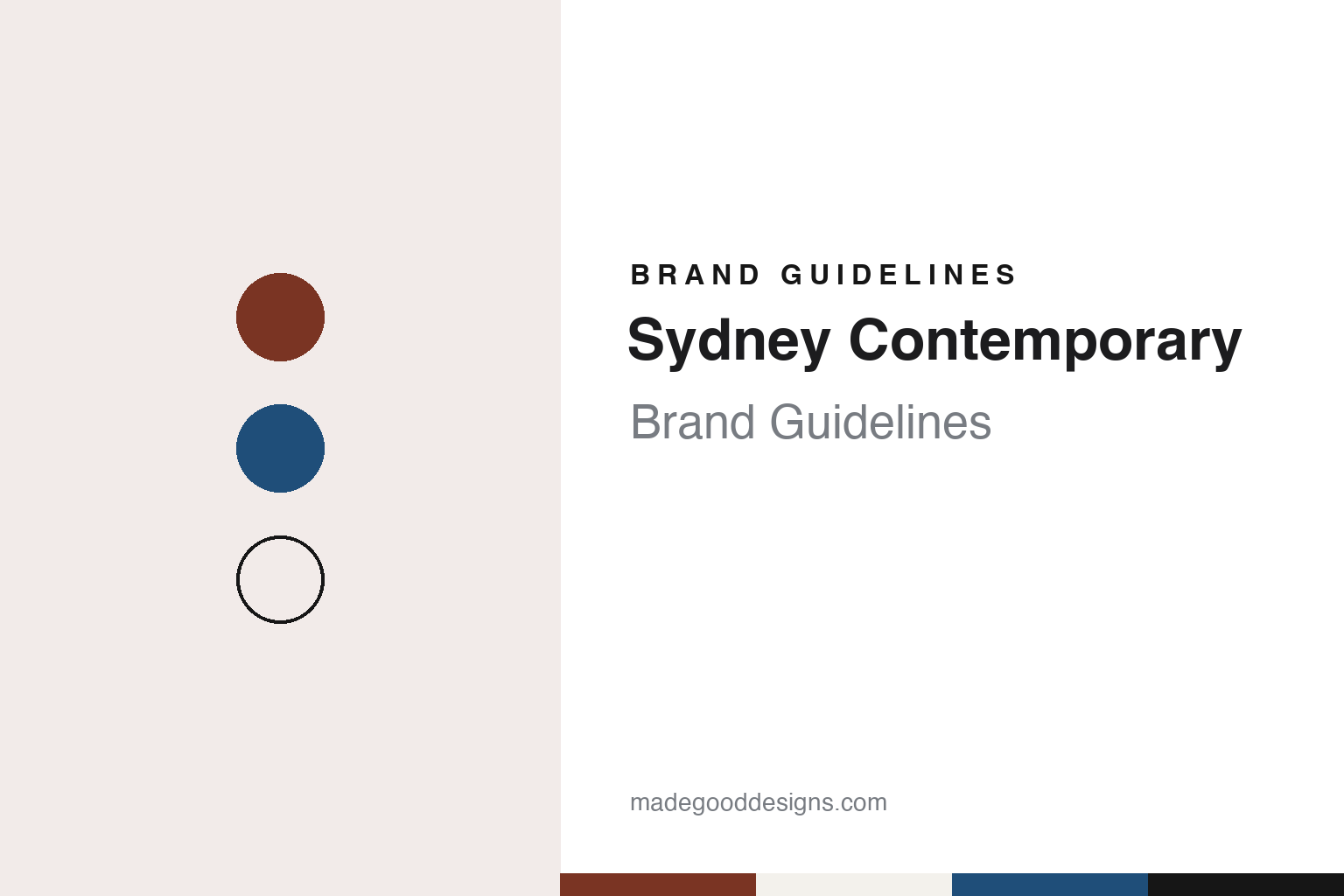
Two constants: a brick, harbour blue and gallery white palette and an industrial sans register. Abstract homage — not a Sydney Contemporary asset or mark; no logo, artwork or campaign image is reproduced.
A fair for Sydney
An events organiser, a former rail workshop and a September date.
Sydney Contemporary opened at Carriageworks in Redfern from 19 to 22 September 2013. Broadsheet, previewing that opening edition on 16 September 2013, reported that the fair had been established by Tim Etchells, whom it described as an art-world veteran and a co-founder of the Hong Kong art fair, and that it would take place every two years in tandem with the Melbourne Art Fair. The magazine counted more than 80 galleries from 11 countries for that edition, from established centres such as Berlin to cities including Cape Town and Jakarta.
Broadsheet named several of the 2013 exhibitors: Art Plural, a commercial gallery from Singapore; Neon Parc from Melbourne; and The Commercial, a gallery in Chippendale, a few streets from the venue. Alongside the booths, the 2013 programme included artist talks and a creative breakfast, and Alaska Projects, an artist-run space in a Kings Cross car park, hosted offsite exhibitions as part of the fair, the magazine reported.
The fair’s own website describes its founder’s background in events and trade fairs. It says Etchells developed the idea for Art HK in 2008, a fair now owned by MCH and renamed Art Basel Hong Kong, and that he launched Sydney Contemporary in 2013 on a two-yearly basis before it moved to an annual cycle in 2017. The same page lists ART SG in Singapore, Taipei Dangdai and Art Central in Hong Kong among the fairs in his portfolio. In November 2026 the website named Zoe Paulsen as fair director, alongside a chief executive and a finance director who, it says, also partners on the financial strategy of fairs in Singapore, Taiwan and Tokyo.
Colour
Booths, sectors and work that leaves the booth.
The venue is part of the fair’s character. Carriageworks occupies the former Eveleigh Carriage Workshops in Redfern, railway buildings that were converted into a multi-arts centre and officially opened in 2007, according to English Wikipedia, which describes it as a cultural facility of the Government of New South Wales. Broadsheet wrote in 2013 of the “industrial elegance” of the halls. The fair’s website describes Carriageworks as the place where it is staged each year over four days in September.
The 2025 edition shows how the fair is organised. A media release from Destination NSW, the state’s tourism and events agency, dated 22 July 2025, gave the dates as 11 to 14 September 2025 and called it the ninth edition, with 114 exhibitors, more than 500 artists and the debut of a new sector, Photo Sydney. It named MA Financial Group as principal partner and Carriageworks as the fair’s longstanding presenting partner. The curated programmes that year were Installation, Performance, Kid Contemporary and Talks.
The installation and performance programmes were curated by José da Silva, director of UNSW Galleries, the release said, with nine large installations by artists from Australia and Aotearoa New Zealand and works designed to extend beyond the traditional booth. One of them, by the New Zealand artist Lisa Reihana, was a kinetic sculpture fixed to the outside of the Carriageworks building: thousands of shimmering discs moved with the wind and caught the sun at the entrance, a piece the release said refers to the waharoa, the traditional Māori gateway, and to the pare, a carved lintel above a door.
The 2026 fair ran in early September. Broadsheet, writing on 3 September 2026, described it as the fair’s 10th anniversary, with more than 100 exhibitors and over 500 artists from Australia, New Zealand, Asia and the United Kingdom, and more than 1,000 artworks across the halls. It singled out the Futures sector, which presents artists and galleries at pivotal points in their careers, and quoted gallerists including Sullivan & Strumpf, which was showing work by 26 of its artists, and Neon Parc, which had also taken part in 2013.
Typography
The category.
A younger or regional contemporary art fair usually introduces itself with very few words. Many simply put “Art” in front of a city, as Art Paris and Art Rotterdam do; others use a short coined name or a single word for “contemporary” in a local language, attached to a place. The name is the part that stays put. Editions are counted rather than renamed, so a fair can say that it is holding its 27th or 28th edition and still look like itself.
Behind the name there is usually a small company, a trade-fair organiser or a group of gallerists. Art Paris is run by a company called France Conventions, according to French Wikipedia, and Art Rotterdam grew out of a free slot in a Rotterdam port building, as its director told De Kunstbode in 2020. Venues matter as much as owners: a glass-roofed exhibition palace, a listed factory or the halls of a large events complex become part of how a fair is pictured, and Art Paris and Art Rotterdam have both changed venue more than once.
Inside, the fairs are built from named sections. A main section for established galleries sits beside sections for younger galleries and emerging artists — Promises at Art Paris, the New Art Section at Art Rotterdam — and beside curated programmes for video, sculpture, design or photography, often with their own invited curators. These section names are short and are usually written as titles, and they recur on floor plans and in catalogues.
Around the fair itself sits a steady set of printed and online material: an exhibitor list, a catalogue, a floor plan or map, a programme of talks and, at some fairs, an online magazine. The campaign image and the themed programme usually change with every edition, while the name, the season and the city stay the same, and that combination is what lets a fair remain recognisable from one year to the next.
Aa
An industrial sans for a fair held in a former rail workshop. (Specimen set in Archivo, a sans STAND-IN; NOT the Sydney Contemporary logo.)
Sydney Contemporary
A city, a word and a venue.
The name pairs the host city with a single word for the kind of art on show. It says where the fair happens and what it shows, and it leaves the visual work to each edition’s programme and campaign. The fair’s website gives the opening night its own name, Art Night, and lists talks, guided tours, educational workshops, live performances and large-scale installations among the events around the gallery booths.
The structure has grown in steps that can be dated. The fair began as a two-yearly event in 2013, became annual in 2017 by its own account, added the Photo Sydney sector in 2025, according to the Destination NSW release, and presented the Futures sector in 2026, as Broadsheet described it. For a design system, each sector name is one more label to set beneath the city name on signs, floor plans and catalogues.
The venue does much of the visual work. The former workshop gives booths, installations and performances a shared industrial backdrop, and the 2025 programme used the building’s exterior as well as its halls. For a design system, that suggests a restrained palette and plain type that sit comfortably against industrial halls and white booth walls.
For a design guide, Sydney Contemporary shows how a fair can build its identity from a city name, a fixed September date and a single venue that it returns to each year. Compare ART SG and Taipei Dangdai, two Asian fairs that the Sydney fair’s website lists in its founder’s portfolio. For this guide we use workshop brick, harbour blue and gallery white with a sans, an unofficial interpretation; no product or logo is reproduced.
Explore & save
Keep Sydney Contemporary’s identity on hand — save it to a board in the Made Good inspiration library.
Sydney Contemporary identity set
Pin the Sydney Contemporary brick, harbour blue and gallery white palette and the industrial sans register to your own board.
Source & notes
Frequently Asked Questions
What font can I use to match the Sydney Contemporary look?
This guide describes Sydney Contemporary’s type as “An industrial sans for a fair held in a former rail workshop”. Its type specimen is set in Archivo from Google Fonts as a stand-in; Archivo is not Sydney Contemporary’s own lettering.
What colours are in the Sydney Contemporary palette?
This guide’s Sydney Contemporary palette is Workshop brick #7A3423, Ink #161616, Gallery white #F3F1EC, Harbour blue #1F4E79 and Paper #F9F8F5. The tones are the guide’s own unofficial interpretation, not official Sydney Contemporary hex codes.
When was Sydney Contemporary founded?
Sydney Contemporary was founded in 2013, in Sydney, Australia.
Who founded Sydney Contemporary?
Sydney Contemporary was founded by Tim Etchells in 2013.