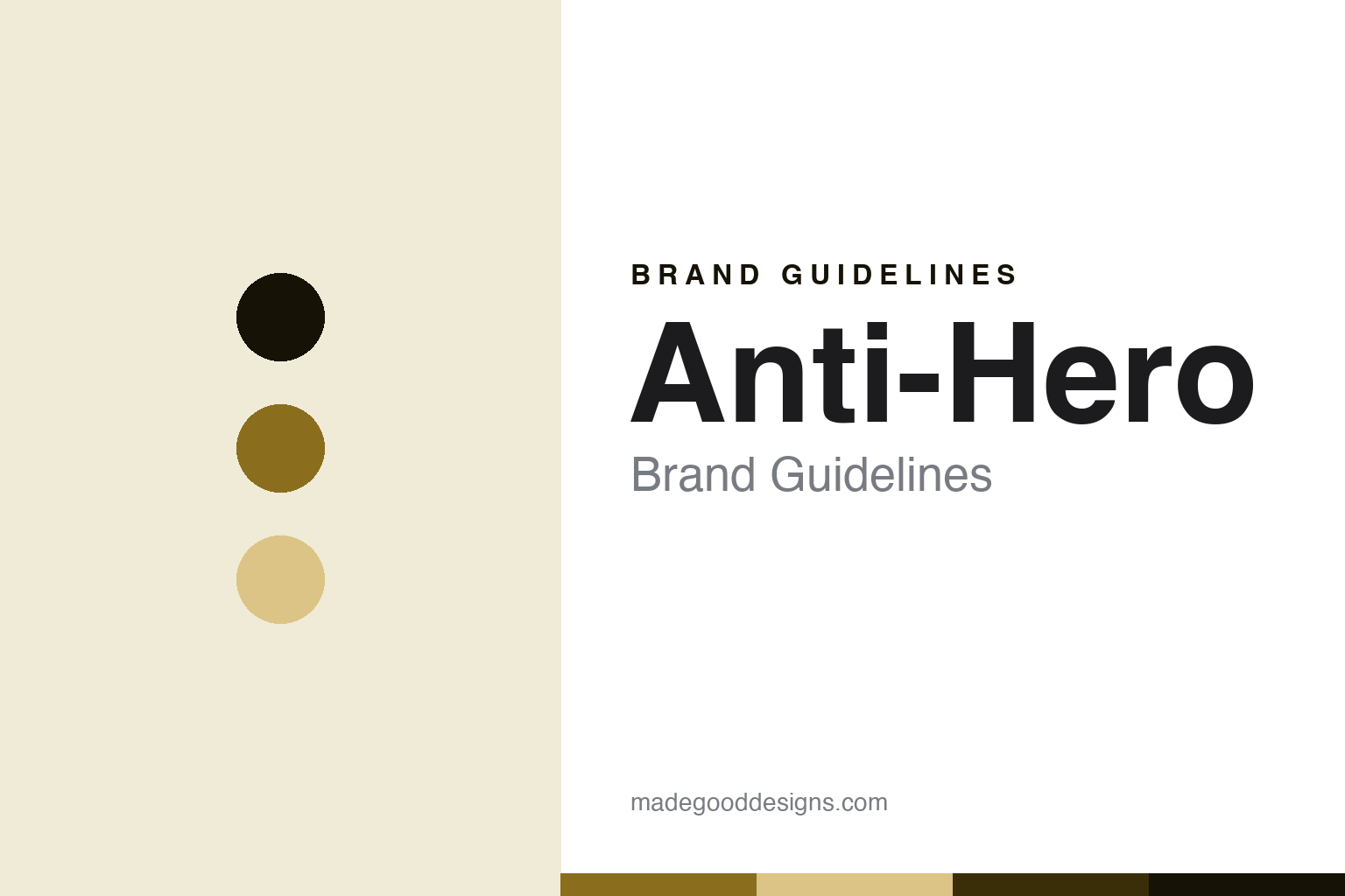
Anti-Hero Brand Guidelines
The raw one.
Aa
Two constants: an ochre palette and a raw-sans register. Abstract homage — not an Anti-Hero product or mark.
The raw one
Anti-Hero is the San Francisco skate brand of 1995 — raw street-skate under Deluxe, US-pressed.
Anti-Hero brings the round its raw, anti-establishment core — the San Francisco brand built on street skating and a refusal to polish, pressed in the USA through the Deluxe house. Anti-Hero makes skateboard decks, and its answer to a round about deck builders is attitude plus real US manufacturing: raw graphics, and boards pressed at home. A deck, with an edge.
Its identity is the raw one. Anti-Hero’s eagle, its raw street ethos and its US-pressed Deluxe manufacturing are the story here. A deck, made in the USA. The raw one.
(Honest notes, so the story stays precise. Anti-Hero — at antiheroskateboards.com, a brand of Deluxe Distribution — makes skateboard decks with a raw, punk, street-skate identity, marked by the eagle and a crude, hand-styled wordmark. It was founded in 1995 in San Francisco by Julien Stranger, reportedly at the prompting of Jim Thiebaud; John Cardiel is a legendary team rider, not a co-founder, a detail worth getting right. On where it is made — a theme of this round — Anti-Hero is pressed in the USA through Deluxe, the San Francisco manufacturing house; Deluxe’s Venture trucks are documented as US-made, and its decks are strongly reported as US-pressed, so we say US-pressed via Deluxe while noting the exact facility could not be re-confirmed live. On ownership, it is a brand of Deluxe Distribution, the entity Ermico Enterprises, whose sister brands include Real, Krooked, Spitfire, Thunder and Venture. Its marks — and the eagle — are IP we describe but do not reproduce, and there is no official brand hex; these tones are an unofficial interpretation. This is design commentary and does not promote any product.)
Colour
Anti-Hero lives in an ochre. Click a swatch to copy the hex.
Anti-Hero’s identity is raw, US-made and core — an ochre, an ink, a wheat, a deep ochre, and a paper. The palette leans ochre and wheat: a grimy, industrial register that nods to the brand’s raw, unpolished aesthetic. It signals a core street brand pressed at home. The honest caveat: with no published brand hex, these values are an original, unofficial interpretation, not first-party colours.
The lesson is an ochre palette signals a raw, core identity. Anti-Hero’s world is a raw, made object. For designers, it is a reminder that a grimy ochre and a soft wheat can carry a skate brand — the tone of an unpolished street graphic. Because these tones can fail as small text, keep type dark and let the colour live in the accents, palette and band. The takeaways: stay raw; press at home; keep the ownership straight; and treat any single hex as unofficial.
Typography
The register is a raw sans — blunt, direct, made.
Anti-Hero’s identity carries a blunt, direct, made spirit — a raw street brand, not a fashion. A raw sans captures the mood: plain, hard and a little crude, the register of a brand that refuses to polish. Set in an ochre palette, the raw sans feels blunt and direct — exactly the personality Anti-Hero carries. It is attitude rather than a logo, mirroring maple ply and screenprint ink. (Anti-Hero’s real wordmark, and the eagle, are things we describe but do not reproduce, and the exact typeface is not ours to use.) Because it is not ours to use, the honest description is “a raw-sans spirit,” shown here in a stand-in. The type behaves like the deck: blunt, direct and made.
Aa
A raw-sans spirit — blunt and direct. (Specimen set in Libre Franklin, a raw-sans STAND-IN; NOT the Anti-Hero logo.)
The deck builders
Anti-Hero stands for the raw one.
Anti-Hero brings the round its raw core. An ochre palette, a raw sans and a US-pressed deck make one thing — the raw one — the whole identity: raw, US-made and core. The Deluxe manufacturing is the differentiator, and the anti-establishment ethos is the meaning. The point is a San Francisco brand that refuses to polish and presses its boards at home through the Deluxe house.
Put to work, the identity is a raw core told straight, as design. A maker in this spirit would keep the attitude unpolished and the pressing at home, through a house that makes its own hard goods. A reader in this spirit would keep the facts right: it was founded in 1995 by Julien Stranger; John Cardiel is a team rider, not a co-founder; it is US-pressed via Deluxe; and Deluxe is the Ermico house of Real, Krooked, Spitfire, Thunder and Venture. Anti-Hero sits in the round’s where-made thread at the US-pressed end with Powell, and in the ownership thread at the core-distribution end with Girl — a raw counterpoint to Element’s corporate scale. The honest editorial moves are to credit Stranger, to correct Cardiel to team rider, to frame the making as US-pressed via Deluxe, and to keep the living individuals to public facts. The lesson Anti-Hero teaches is that rawness can be an identity, and that a core distribution house pressing its own goods is a real where-made claim.
For designers and brand-builders, Anti-Hero continues the deck builders: stay raw — and press it at home. The lessons: refuse to over-polish; keep manufacturing in a house you control; get the founder-versus-team detail right; keep individuals to public facts; and never reproduce a logo. It is also a reminder to stay precise: Anti-Hero is the San Francisco skate brand of 1995, raw street-skate under Deluxe, US-pressed — with the palette here an unofficial interpretation. Read that way, Anti-Hero is less a deck than a stance: a brand that stays unpolished on purpose and makes its boards where it lives. The lesson for a brand is that a refusal to gloss can be a genuine identity, and that a core house pressing its own hard goods earns a where-made claim the lifestyle brands cannot. Anti-Hero made the-raw-one the identity — proof that staying raw, at home, can be the whole point. It is the round’s reminder that where-made and attitude can reinforce each other: a brand that refuses to gloss its graphics and presses its boards through a house it belongs to is telling one consistent story, and that consistency is exactly what a fact-check rewards and a marketing gloss cannot fake.
Explore & save
Keep Anti-Hero’s identity on hand — save it to a board in the Made Good inspiration library.
Anti-Hero identity set
Pin the ochre palette and the raw-sans register to your own board.