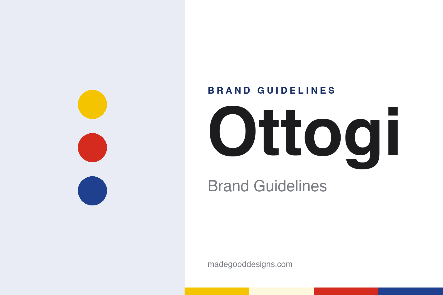
Ottogi Brand Guidelines
Korea’s curry yellow, on a roly-poly that never falls.
Aa
Two constants: a curry yellow, red and blue palette and a clean Korean gothic sans register. Abstract homage — not an Ottogi product or mark; no pack, logo or character is reproduced.
A curry for five
A chemicals heir, a small factory and a yellow powder.
Ottogi began with a single packet of curry. Its founder, Ham Tae-ho, was born in Wonsan, in what is now North Korea, served in the army during the Korean War and in 1959 joined Joheung Chemical, his father’s company, which made sweeteners and food additives, the company’s biography of him says. A decade later he struck out on his own. In May 1969 he set up a trading company called Punglim Sangsa, with a small factory in Mullae-dong in Seoul’s Yeongdeungpo district, and on 5 May 1969 it released a five-serving instant curry, the forerunner of today’s Ottogi Curry, the company says. English Wikipedia describes it as the first curry product made in Korea.
Curry was then an unfamiliar, Western-style dish in Korea, and the company says it built the market with television advertising aimed at families during holiday daytime viewing. Other firsts followed quickly. Korean Wikipedia, citing the business newspaper Hankyung, says Ham introduced tomato ketchup in 1971 and mayonnaise the following year, both new to Korean shelves; soups and vinegars came in the same years, the company says. The firm changed its name twice as it grew, to Punglim Sikpum Gongeop in June 1971 and to Ottogi Sikpum Gongeop in June 1973, according to the company’s timeline.
The name is a play on a toy. Ottogi is a variant spelling of ottugi, the Korean word for a roly-poly doll that rights itself when pushed over, English Wikipedia notes. The company has made that idea its motto: Ottogi, it says, should not merely get up after falling but never fall at all.
Colour
Three minutes in boiling water, then noodles.
Ottogi’s next big idea was convenience. In 1981 it launched what it calls Korea’s first retort-pouch meal, 3-Minute Curry, sold with the line “three minutes in boiling water,” and the company says the product made Ottogi a household name. The 3-Minute range grew from there. In the 1980s multinational rivals entered the Korean ketchup and mayonnaise market; Korean Wikipedia, citing Ajou Business Daily in 2011, names CPC International, maker of Best Foods mayonnaise, and Heinz, and says Ottogi held them off over more than a decade. The company says it was the first in Korea to use route sales, with salespeople visiting shops to stock shelves directly, and among the first to use in-store tasting and advertising on its delivery vehicles.
Noodles came through an acquisition. In December 1987 Ottogi bought Cheongbo Foods, a ramen maker that had gone out of business, and set up Ottogi Ramyon, according to the company’s biography of its founder and Korean Wikipedia. In March 1988 it launched Jin Ramen, in mild and spicy versions. Korean Wikipedia describes both packs as yellow, with the product name printed in blue on the mild and red on the spicy. The Korea Productivity Center’s National Customer Satisfaction Index ranked Ottogi first in the ramen category in 2017 and each year from 2023 to 2025, the company says.
Packaging has changed with the times as well. In September 2021 it began printing braille on its cup noodles, and in 2025 a braille container won a WorldStar award from the World Packaging Organisation, the company says.
Typography
Design and documentation.
The seven brands in this group are pantry, sauce, snack and cultured-drink names from Japan, China, South Korea and the United States: Yakult, Calpis, Kewpie, Lao Gan Ma, Huy Fong Foods, Ottogi and Pocky. Asian pantry and drink brands in general sit at many different points in the trade, from family firms that still carry a founder’s name to product names that belong to much larger food groups, and a single brand can be sold everywhere from a neighbourhood grocer to a supermarket shelf on another continent.
A pantry or drink brand’s identity is usually carried less by a single recipe than by a bottle, a jar, a box and the name printed on it, because the company behind the name may have changed hands, licensed its product abroad or grown far beyond the city where it started. That makes the questions behind each name worth asking plainly: who started it, who owns it now, and where its products are actually made and packed.
Each guide separates what independent sources record from what the company says about itself — its founding story, its owners over time, where its products are made and how its packaging has changed — and marks plainly what rests only on the company’s own word.
Aa
A clean Korean gothic sans for a curry-yellow pantry brand. (Specimen set in Gothic A1, a sans STAND-IN; NOT the Ottogi logo or the company’s OTOKI Sans.)
Ottogi
A yellow pack, a roly-poly logo and a new spelling.
Ottogi is unusually open about its identity. The company says yellow became its corporate colour because its first product was curry: it used yellow packaging to emphasise the colour of the curry, and most of its packs still carry it. Its colour system adds red, which it describes as passion, and blue, for trust. The logo is a roly-poly toy with the face of a smiling child licking its lips, which the company says stands for resilience, friendliness and the pursuit of taste. It also has its own typeface, OTOKI Sans, a gothic display face it describes as balancing straight lines and curves. It does not publish hex values for the colours.
The company has grown well beyond curry. It became Ottogi Sikpum in June 1980 and took its present Korean name, Ottogi Co., in May 1996, two years after listing on the Korea Exchange in August 1994, its timeline says. English Wikipedia lists it in the KOSPI 200, with its head office in Anyang, Gyeonggi Province, and the Ottogi Center in Seoul’s Gangnam district. It names its chairman as Ham Young-joon, the founder’s son, and its affiliates include Ottogi Ramyon, Ottogi Sesame Mills and Ottogi Frozen Foods. Abroad it set up a US office in 1981, a joint venture in China in 1994 and Ottogi America in 2005, the company says. At home its timeline records new plants at Samnam in 1992, Daepung in 2001 and Poseung in 2019.
In March 2025 the company changed its English corporate name from Ottogi Corporation to OTOKI Corporation, according to its timeline; the Korean name, 오뚜기, is unchanged.
For a design guide, Ottogi shows how one colour borrowed from a first product can become a whole company’s shelf presence. Compare Kewpie, the Japanese mayonnaise brand with its own doll mascot, and Lee Kum Kee, the Hong Kong sauce house. For this guide we use a curry yellow, a ketchup red and a trust blue with a clean gothic sans, an unofficial interpretation; no product or logo is reproduced.
Explore & save
Keep Ottogi’s identity on hand — save it to a board in the Made Good inspiration library.
Ottogi identity set
Pin the Ottogi curry yellow, ketchup red and trust blue palette and the clean Korean gothic sans register to your own board.