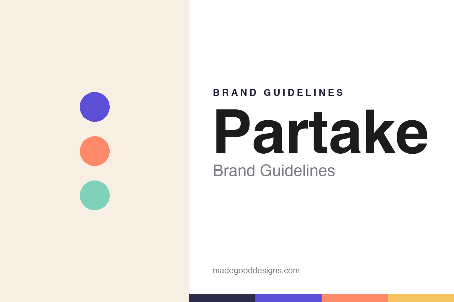
Partake Foods Brand Guidelines
Allergy-friendly cookies — so everyone can partake.
Aa
Two constants: a bright, friendly palette and a friendly sans. Abstract homage — not the Partake wordmark or logo.
So everyone can partake
Partake makes cookies everyone can eat.
Partake is a lesson in building a brand from a personal need. Founded in 2016 by Denise Woodard — who left a corporate career at Coca-Cola after her daughter Vivienne was diagnosed with multiple food allergies and safe, tasty snacks were nowhere to be found — it makes allergy-friendly cookies. Its very name encodes the mission: everyone can “partake.”
Its cookies are vegan, gluten-free and free from the top 9 allergens (peanuts, tree nuts, eggs, wheat, dairy, soy, fish, shellfish and sesame), baked in a dedicated gluten-free facility. Woodard’s journey is itself part of the story: after 80-plus investor “no”s, her first “yes” came from Jay-Z’s Marcy Venture Partners, and she is widely recognised as the first Black woman to raise more than $1 million publicly for a consumer packaged-goods food-and-beverage startup.
(Honest notes: the cookies are free from the top 9 allergens — “nine” since sesame was added as a major US allergen in 2023 (earlier packaging said “top 8”); the funding milestone is specifically first Black woman to raise $1M+ publicly for a CPG food/beverage startup; Jay-Z’s involvement is via Marcy Venture Partners, which led the 2019 round; and Partake is independent and founder-led, running the Black Futures Fellowship, an HBCU career-pipeline program. No official brand hex is published.)
Colour
Partake lives in a bright, friendly palette. Click a swatch to copy the hex.
Partake’s identity is bright, friendly and inclusive — a berry purple, a sunny coral, a fresh mint, a golden wheat, and a cookie cream. The palette reads like a joyful, welcoming snack: cheerful, colourful and clean. It signals inclusion and warmth rather than the clinical look of “free-from” foods. The honest caveat: with no published brand hex, these tones are an original, unofficial interpretation, not first-party values.
The lesson is a bright, friendly palette signals inclusive, allergy-friendly food. Partake’s world reads as cheerful and welcoming. For designers, it is a reminder that bright, joyful colour can make “free-from” food feel like a treat for everyone, matching a brand built on inclusion. The takeaways: use bright, friendly, joyful colour to reframe allergy-friendly as celebratory; keep it clean and warm; and treat any single hex as unofficial — using a deep ink plum for small text so the brights stay in the palette.
Typography
The wordmark spirit is a friendly sans — warm and inclusive.
Partake’s identity carries a warm, friendly, inclusive spirit — a “PARTAKE” wordmark whose approachable forms match a joyful, allergy-friendly brand. A friendly sans captures the mood: it is warm and legible, the register of an inclusive, everyone-welcome snack rather than a clinical “free-from” label. Set against a bright, friendly palette, the friendly sans feels warm and inclusive — exactly the everyone-can-partake personality Partake carries. It is welcoming rather than clinical, mirroring a joyful, safe treat. (Partake’s real wordmark is a trademark we describe but do not reproduce, and the exact typeface is not something we assert.) Because the specific mark is not ours to use, the honest description is “a friendly sans spirit,” not the Partake logo. The type behaves like the brand: warm, friendly and inclusive.
Aa
A friendly sans spirit — warm and inclusive. (Specimen set in DM Sans, a friendly geometric sans; NOT the Partake logo, which is a trademark.)
Inclusion as the difference
Partake stands for treats everyone can share.
Partake is a lesson in turning inclusion into a brand. It began with a real problem — a child who could not safely eat ordinary snacks — and solved it in a way that welcomes everyone: cookies free from the top allergens, joyfully designed so “free-from” feels like a treat, not a compromise. Its name, its mission and its founder’s barrier-breaking story all say the same thing: everyone can partake. The differentiator is genuine inclusion, backed by a founder who lived the need.
For designers and brand-builders, Partake offers a clear takeaway: solving a real need with inclusion can build a powerful brand. The lessons: start from an authentic problem (a child’s allergies); design so the “restricted” product feels joyful and welcoming; and let the mission (everyone can partake) run through name, look and story. It is also a reminder to stay accurate: the cookies are top-9-allergen-free, Denise Woodard is recognised as the first Black woman to raise $1M+ publicly for a CPG food/beverage startup, and Partake is independent and founder-led — with the palette here an unofficial interpretation. Partake made room for everyone — proof that inclusion can be the difference.
Explore & save
Keep Partake Foods’s identity on hand — save it to a board in the Made Good inspiration library.
Partake Foods identity set
Pin the bright, friendly palette and the friendly-sans spirit to your own board.


